Video Player
Use the Youtube Player to play YouTube videos and playlists.
How to use
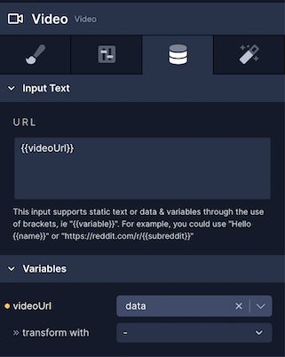
- To add the source of the video for the Video component to play, go to the Data tab (third tab) in the Properties Panel.
- Under Input Text > URL, you can add a static video URL.
- Go to the Styles tab (first tab), and make sure to add a value for the
widthproperty. A Video component needs to have awidthand aheightdefined. - If the Video URL is coming from an API endpoint, you can define a variable in curly braces
{{}}in Input Text > URL and then select the value of the URL from the dropdown menu under Variables.

Style Properties
Style properties allow you to customize the look and feel of the component. Combinations of styles applied to components can be saved as Stylesheets to easily reuse styles throughout your app. Styles can also be set dynamically using Variables. To learn more about all the different styling properties and how they work, take a look at Intro to Styling.
Configuration Properties
| Property | Description |
|---|---|
| Component Name | To alter the name of the component. The name is reflected in the Components tree. Defaults to Video. |
| Enable Thumbnail | Enable so that a thumbnail will appear when the video is not playing. |
| Resize Mode | How the video will be resized when its dimensions set for the component don't match the actual dimensions of the video. Refer to the Resize Mode table in the Image component to learn more about each setting. |
| Mute Audio | Enable to mute the video. |
| Use Native Controls | Enable to give users the ability to play/pause the video. |
| Play Automatically | Enable so that the video will play when loaded. |
| Loop Video | Enable to loop the video. |
| Starting Point | Add a value in milliseconds to play the video from that timestamp. |
| Playback Rate | Accepts a numerical value to set the Playback rate of the Video. |
| Volume | Accepts a numerical value to set the volume of the video on play. |
| Plays in Silent Mode | Whether video should play in silent mode or not. iOS only |
Data Properties
| Property | Description |
|---|---|
| Thumbnail URL | An optional URL to display as the video thumbnail |
| URL | The URL for the video to display |
Conditional Display
You can conditionally display a component based on a given condition. Learn more about conditionally displaying components in the Conditional Display doc.
Triggers
| Name | Description |
|---|---|
| On Playback Status Update | Runs the Actions when the playback status is updated. E.g. when it is played, paused, or stopped. |
| On Playback Finish | Runs the Actions when the video has finished playback. |
Actions
| Action | Description |
|---|---|
| Play Media | Plays the media associated with the selected Target Component |
| Pause Media | Pauses the media associated with the selected Target Component |
| Seek Media Position | Updates play play position for the media associated with the selected Target Component in milliseconds |
| Toggle Media Playback | Plays or pauses the media associated with a selected Target Component depending on the current playback state. |
Updated about 1 year ago
