FlashList
The FlashList component is used as a child of the Fetch component to display a list or grid of items from an API endpoint. It works like a List.
FlashList is made by Shopify and is optimized for large data sets and slow connections to provide better rendering and performance as an alternative to the List component.
How to use
A FlashList component receives an array of data that it will loop over to create an instance of the FlashList's child components for each item in the array. This can be a simple array of strings, or even an array of complex objects.
The data you pass to a FlashList component's Data prop can come from a Variable if, for example, you have a fixed array of values or one populated using an API Request Action. You can also pass data to a FlashList from a Fetch component on your Screen.
For each item in the array that you pass to a FlashList, the List will render an instance of all child components within the FlashList component. For example, if you have a FlashList component that contains a single nested Text component and you pass it an array which contains 20 items, the List will render 20 Text components - one for each item in the array passed to the List.
The data for each item in the array will be available to all child components within the FlashList component. The item data will be available as FlashList item in any variable dropdowns for props in the component's Data tab. Any keys for the item will also be listed if you didn't skip the Test step when saving your Endpoint.
That means that our Text component above will have access to the list item's data in their variable selection dropdowns in the Data panel. So, if your array contains objects with keys such as name and description, we could pass those values to our Text component inside the FlashList and each one would display their own data.
Learn how to set and use the Fetch and List component in Fetching Data.
Style Properties
Style properties allow you to customize the look and feel of the component. Combinations of styles applied to components can be saved as Stylesheets to easily reuse styles throughout your app. Styles can also be set dynamically using Variables. To learn more about all the different styling properties and how they work, take a look at Intro to Styling.
Component Specific Styles
Configuration Properties
Property | Description |
|---|---|
Component Name | To alter the name of the component. The name is reflected in the Components tree. Defaults to List. |
Estimated Item Size | A single numeric value that hints FlashList about the approximate size of the items before they're rendered. (read the docs) |
Horizontal | Enable so that the list's contents display horizontally. |
Inverted | Reverses the direction of scroll (read the docs) |
Number of columns | Define the number of columns the list should display. Accepts a number. By default, the value is set to |
End Reached Threshold | How far from the end (in units of visible length of the list) the bottom edge of the list must be from the end of the content to trigger the onEndReached callback. Thus a value of 0.5 will trigger onEndReached when the end of the content is within half the visible length of the list. |
Show Horizontal Scroll Indicators | When true, shows a horizontal scroll indicator. The default value is |
Show Vertical Scroll Indicators | When true, shows a vertical scroll indicator. The default value is |
Data Properties
Setup
Name | Description |
|---|---|
Data | The array of data to render in the list. Type a value directly into the input or select a value from the dropdown |
Unique Item Key | Provide a way to derive a unique key (e.g. an id or a name) for a given item in the list. Optional |
Conditional Display
You can conditionally display a component based on a given condition. Learn more about conditionally displaying components in the Conditional Display doc.
Triggers
| Trigger | Description |
|---|---|
| On Refresh | Starts the action when the element is refreshed |
| On End Reached | Starts the action when the end threshold is reached |
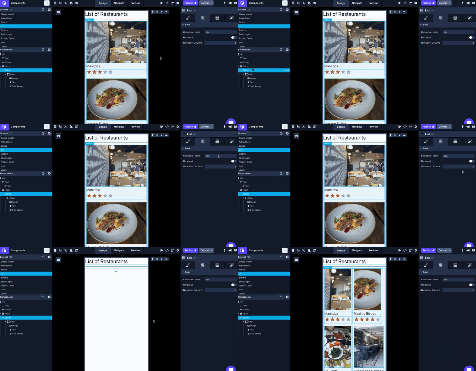
Modifying Number of Columns
You can modify the Number of Columns property on a List component to add more columns.
- Select the FlashList component in the Components tree.
- Go to Configs tab (second tab) in the Properties Panel.
- Specify a value for the property Number of columns.

Updated over 1 year ago
