
Blocks
Blocks are saved groups of components that you can reuse throughout your app. It helps reduce the need for duplication and makes your app more manageable.
Blocks are great for common design elements that are used throughout your app such as custom buttons, cards, list items, or even more complex UI elements.
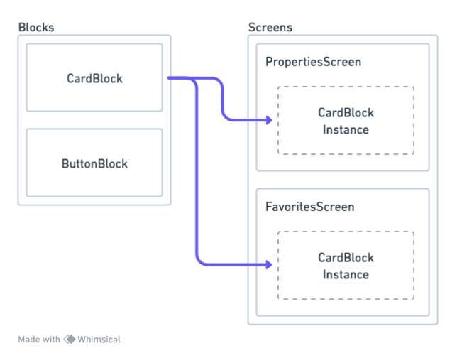
For example, you may have a group of components that represent a 'Card' in your UI and want to use that same design element on multiple Screens in your app. With Blocks, you can save that group of components as a single Block component and then add instances of the Block to your Screens or even other Blocks. Whenever you update the Block using the Block builder, all instances of that Block throughout your app will also be updated.
Combined with Stylesheets, Blocks can make building your app's UI much easier by requiring a lot less work when making design changes to shared components.
Here's a simple explanation of the concept
Sharing Blocks between different apps isn't possible yet, but we plan to add that ability in the future
Blocks View
To switch from viewing Screens to Blocks, toggle the switcher at the top of the left bar in the Builder.
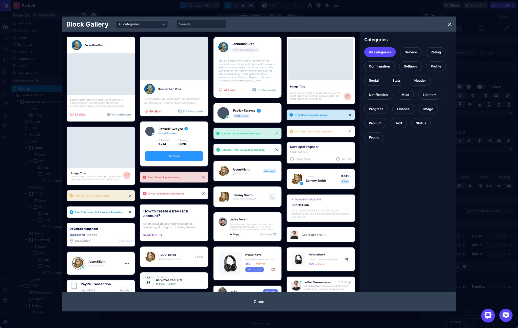
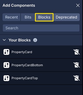
Block Gallery
The Block Gallery features many high-quality pre-built Blocks that are ready to drop in to your app. You can pass data into the available props right away and further customize their components to match the look and feel of your app.
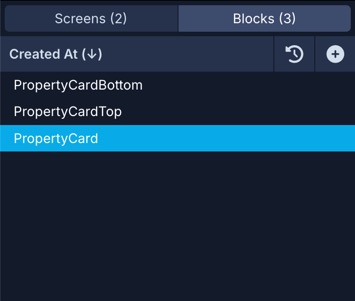
Block List
The Blocks list is very similar to the Screens list. It shows all the Blocks you've created in your app.
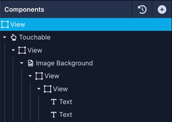
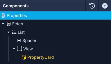
Block Components
Just like with Screens, your Block's components are listed in the bottom section of the left panel in the Builder once you've selected a Block from the Blocks list. You can add components to your Blocks in the same way they are added to Screens.
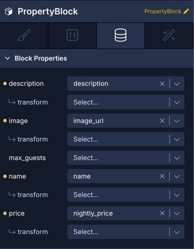
Block Properties
Block Properties allow you to pass data and functionality into your Blocks when using them on a Screen or in another Block. This is especially handy when you have a Block that represents an item in a List, for instance. You can pass data from the List on your Screen into the Block's props then use those values in your Block's components.
There are 4 types of Block properties:
| Property | Description |
|---|---|
| Data | Pass a string, number, boolean, or JSON, to a Block. You can then pass that value to any components, functions, etc inside the Block |
| Icon | Lets you select an Icon from the Block instance using the Icon picker to pass into your Block. You can then pass that value to the Icon prop of a component that supports an icon (Icon, Icon Button, Checkbox, etc) inside your Block. |
| Asset | Lets you pick an Asset from the Block instance using the Asset picker to pass into your Block. Then the Asset will be available to use in supported components (Image, Image Background, etc) within your Block. |
| Workflow | Workflow properties let you pass an Action Workflow into a Block instance. Read below for more details. |
Any variables that are referenced by components when creating a Block from existing components (see below) will be automatically added as Data properties. You can also create Block Properties manually as needed.
Block Properties are managed in the right panel Data tab when the Block's root (top-level) component is selected in the component tree.
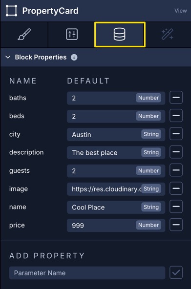
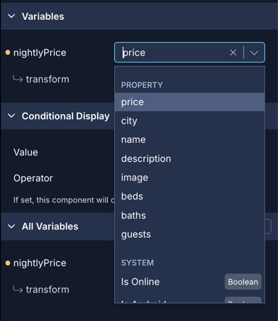
All Block Properties will be available in the Variables selector for any data-enabled components within your Block such as Text, Button, Image, etc.
Block Workflows
As mentioned above, Workflow properties on Blocks let you pass in an Action Workflow which you can then assign to one of the Block component's Triggers. Imagine you have a Block for a reusable Button and you want to trigger different Actions for that Button depending on where it’s being used. Now, you can create a Workflow prop on the Block.
So in the case of our example Button Block, you can use the Run Custom Function Action on our Button’s On Press Trigger and pass it the Workflow prop you created. Then on the Screen where you use the Button Block, for the Workflow prop you’re able to select the Workflow from the Block's Interactions tab to open the Action Editor and create an Action Workflow to pass into that Block.
Now, when the Button in the Block is pressed, it will trigger the Action Workflow you passed into the Block using the Workflow prop.
Block Variables
You can create Block Variables for your Blocks. These variables are scoped to the Block and are equivalent to Screen Variables on Screens.
Synced Variables
When you create a Block Variable, you have the option of making it a 'synced' variable. When enabled, the Block will expose this synced variable in the 'Synced Variables' section of the Blocks Data panel where you can pass in a Screen Variable. Once you've associated the Screen Variable with the synced Block Variable, the Block will keep both variables updated with the same value.
Block Functions
You can create Block Functions for Blocks. These functions are scoped to the Block and are equivalent to [Screen Functions](doc: custom-functions) on Screens.
When you create a Block Variable
Background Color Switcher
When editing a Block, you can switch the background color used in the Draft View using the selector above the app preview. This background is only applied when in Draft View while editing a Block.
You can choose between Transparent, Light, and Dark.

Creating Blocks
Blocks can be created in several different ways.
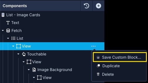
From Screen Components
If you have an existing set of components on a Screen that you'd like to convert to a Block, from the component tree open the overflow menu for the parent component you want to use as a Block and click Save Custom Block.
The component and any child components will be saved together as a new Block and you'll be given an option to immediately open the new Block.
Block Properties will be created for all variables referenced by the components included in the new Block.
From Block Components
In the same way you can create Blocks from groups of components on a Screen (as shown above), you can do the same from a component within an existing Block.
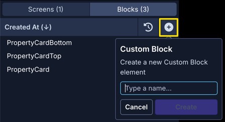
From Scratch
If you'd like to build a Block from a blank state, you can click the + button in the top right corner of the Blocks list.
This will create a new Block that's ready for you to build out.
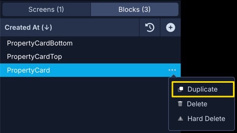
Duplicating a Block
You can duplicate a Block in the same way you can duplicate a Screen.
From the Blocks list, open the overflow menu for the Block you want to duplicate and click Duplicate
Using Blocks
In Screens
Blocks can be added to any Screen in your app, or even another Block, from the component picker. Blocks can also be nested inside other components.
Block instances will show up in yellow with a special icon in the Screen or Block's component tree so you can easily identify where your Blocks are being used.
In Other Blocks
You can use Blocks in other Blocks the same way you can use them in Screens as shown above.
Passing Data
As shown above, you can create data properties on your Blocks. Then when you add an instance of a Block to your Screen, you can pass any data into the Blocks data properties from the Block's Data tab
Conditional Display
You can conditionally display a component based on a given condition. Learn more about conditionally displaying components in the Conditional Display doc.
Updating Blocks
Select the Block you want to update from the list of Blocks in your app then make any changes to the components included in the Block.
When you make any changes to the Block and its child components all instances of that Block in any Screens or other Blocks in your app will be updated as well.
Deleting Blocks
From the Blocks list open the overflow menu for the Block you want to delete and click Delete.
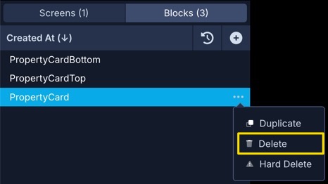
If instances of a Block exist on a Screen or other Block, you'll need to remove those instances before you can delete a Block.
Detaching Blocks
There may be times when you need to make a one-off customization of a Block and in that case you can detach instances from their Blocks. Detaching a Block instance will replace the Block with a copy of the Block's components.
Select the instance of the Block you want to detach in the component tree and open the overflow menu then click Unpack Block.
Once you detach a Block instance, you can't reattach it or use it to update the original Block, but you can use it to create a new Block.