Text
The Text component is used to display the text on the screen. It is one of the most frequently used components.
Style Properties
Style properties allow you to customize the look and feel of the component. Combinations of styles applied to components can be saved as Stylesheets to easily reuse styles throughout your app. Styles can also be set dynamically using Variables. To learn more about all the different styling properties and how they work, take a look at Intro to Styling.
Component Specific Styles
| Property | Description |
|---|---|
| Selection Color | Allows you to change the color of the highlight over selected text in the input. |
Configuration Properties
Basic
| Property | Description |
|---|---|
| Component Name | To alter the name of the component. The name is reflected in the Components tree. Defaults to Text. |
| Max # of Lines | Set the maximum number of lines to be displayed when Truncate Text is set. |
| disabled | Specifies the disabled state of the text view for testing purposes |
| Truncate Text | Determine how the text will be truncated if the Max # of Lines property is set in conjunction. |
Advanced
| Property | Description |
|---|---|
| Max Font Size Multiplier | Specifies largest possible scale a font can reach when allowFontScaling is enabled. |
| Adjusts Font Size to Fit | Specifies whether fonts should be scaled down automatically to fit given style constraints. |
| Allow Font Scaling | When enabled, font sizes in the input will scale to match with the text size the user has set in their accessibility settings. |
| Text Break Strategy | Allows you to set text break strategy on Android API Level 23+, possible values are 'simple', 'highQuality' and 'balanced'. The default value is 'highQuality' |
| Data Detector Type | Allows you to determine the types of data converted to clickable URLs in the text element. By default no data types are detected. You can provide only one type. Possible values for dataDetectorType are: 'phoneNumber', 'link' , 'email', 'none' , 'all' |
| Selectable | Allows you to select text, to use the native copy and paste functionality. |
| Suppress Highlighting | Allows you to prevent any visual change when text is pressed down. By default, a gray oval highlights the text on press down. |
Data Properties
Input Text
| Property | Description |
|---|---|
| Input Text | The text to display in the component. This input supports static text or data & variables through the use of brackets, ie "{{variable}}". For example, you could use "Hello {{name}}" or "https://reddit.com/r/{{subreddit}}" |
Conditional Display
You can conditionally display a component based on a given condition. Learn more about conditionally displaying components in the Conditional Display doc.
Using Text component for Dynamic Values
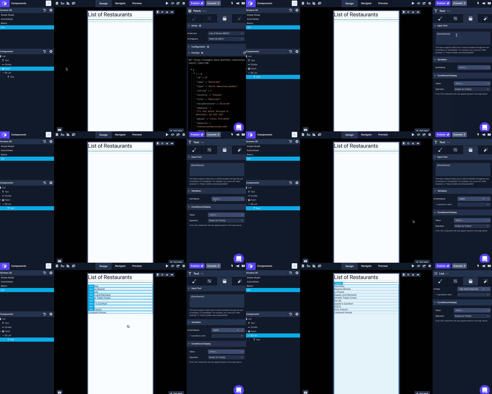
A Text component is a Data Enabled Component. This means that the property Input Text in the Data tab supports both static text or data and variables using double curly braces {{variable}}.
In this scenario, usually, a Text component is nested under a Fetch component.
- All you have to do is define a variable in double curly braces name under Input Text property. For example,
{{name}}. - Then, under the Variables property, the variable name you've defined in the previous step will appear.
- Next to the variable name, there is a dropdown where you can select the appropriate key name whose value you want it to display on the screen.

To customize styles of a Text component, check the Styles documentation.
Inline Text Editing
Inline Text Editing allows you to edit a Text component's content by double-clicking it when in Draft View mode. After editing the component's content, press the Tab key to save the changes.
Truncating Text
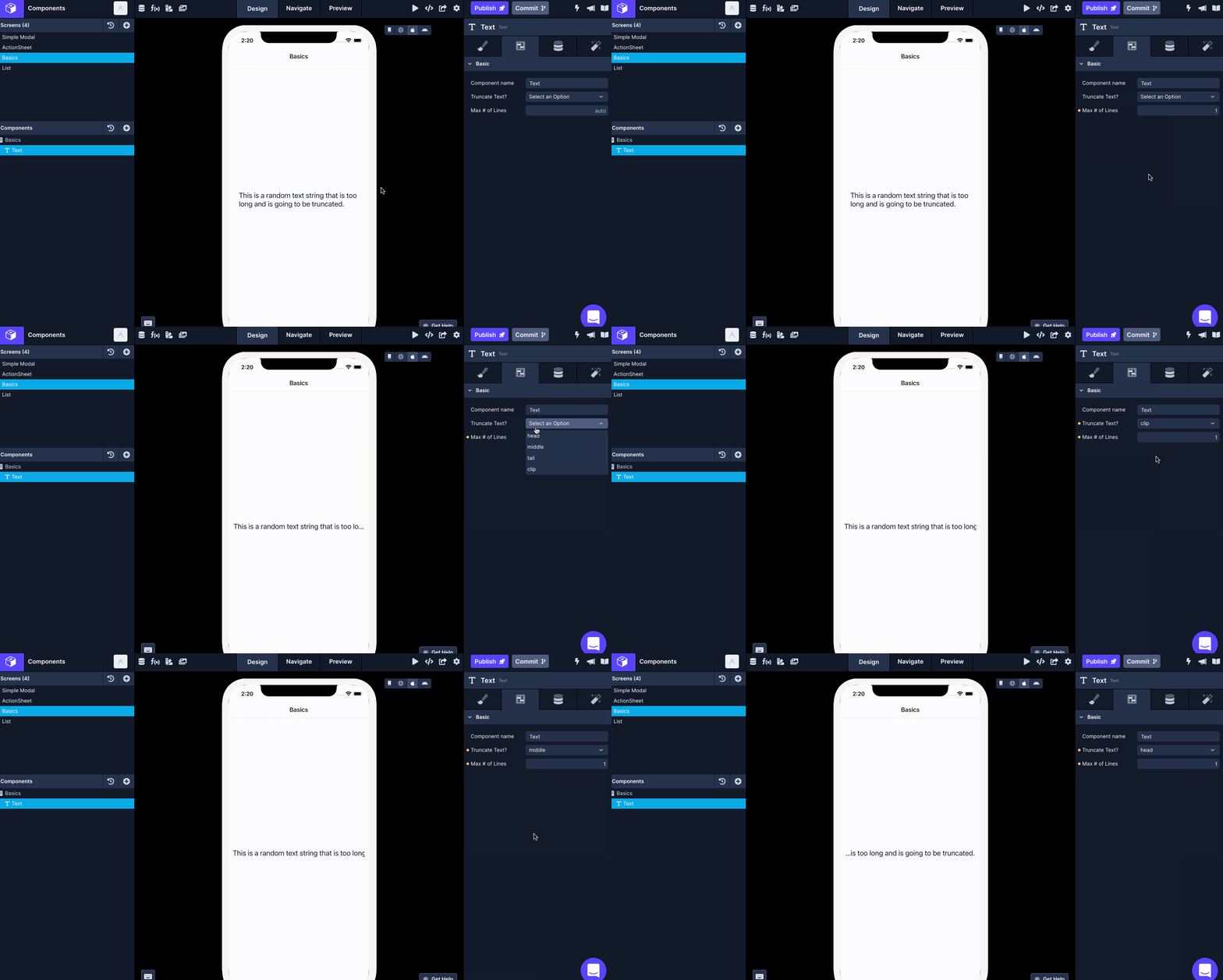
Truncate Text property under Configs tab (second tab) in Properties Panel supports the following values:
| Property | Description |
|---|---|
| head | The line is displayed so that the end fits in the container, and the missing text at the beginning of the line is indicated by an ellipsis glyph. e.g., "...wxyz". |
| middle | The line is displayed so that the beginning and end fit in the container, and the missing text in the middle is indicated by an ellipsis glyph. "ab...yz". |
| tail | The line is displayed so that the beginning fits in the container, and the missing text at the end of the line is indicated by an ellipsis glyph. e.g., "abcd...". This is the default value. |
| clip | Lines are not drawn past the edge of the text container. |

Note about using Truncate Text property on Android devicesOn Android, when Max # of Lines is set to a value higher than 1, only the
tailfrom Truncate Text value will work correctly.
Note about using Truncate Text property in Web PreviewOn Web, only the
tailfrom Truncate Text value is supported.
Updated over 1 year ago
