Intro to the Builder
Left Bar
Section titled “Left Bar”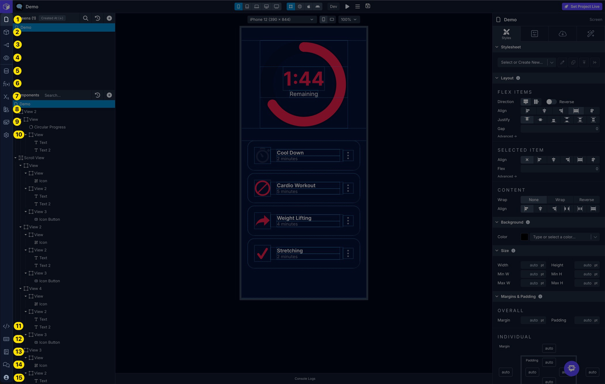
Top Menu
Section titled “Top Menu”| 1 | Screens | View and manage Screens |
| 2 | Blocks | View and manage Blocks |
| 3 | Navigate | View and manage Navigators |
| 4 | Preview | Preview your app in isolation within the Builder |
| 5 | Data | Manage API Services and Endpoints |
| 6 | Code | View and manage Functions and Files |
| 7 | Variables | View and manage App, Device, and Screen variables |
| 8 | Styles | View and manage Colors and Stylesheets |
| 9 | Assets | View and manage uploaded Assets |
| 10 | Settings | View and manage app project Settings |
Bottom Menu
Section titled “Bottom Menu”| 11 | App Code | View and Export the app’s source code |
| 12 | Keyboard Shortcuts | View available Keyboard Shortcuts or type ? |
| 13 | Docs | Go to the Draftbit Documentation |
| 14 | Community | Go to the Draftbit Community |
| 15 | Account | Go to your Draftbit Account |
Left Panel
Section titled “Left Panel”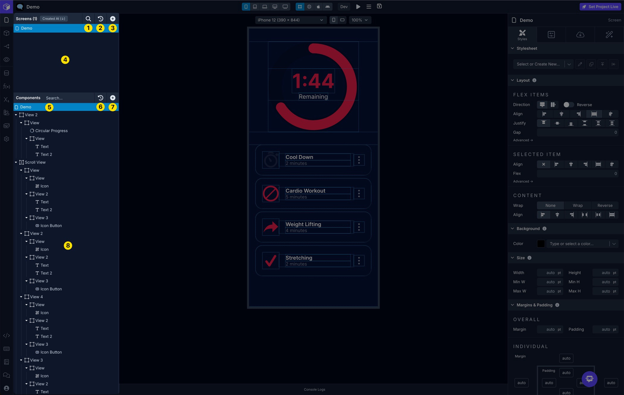
Top Section
Section titled “Top Section”| 1 | Search Screens/Blocks | Search your existing Screens and Blocks depending on which you’re viewing |
| 2 | Deleted Screens/Blocks | View and restore deleted Screens and Blocks depending on which you’re viewing |
| 3 | Add Screen/Block | Add Screens and Blocks depending on which you’re viewing |
| 4 | Screens/Blocks List | Displays a list of your existing Screens and Blocks depending on which you’re viewing |
Bottom Section
Section titled “Bottom Section”| 5 | Search Component Tree | Search the existing Components on the selected Screen or Block depending on which you’re viewing |
| 6 | Deleted Components | View and restore deleted Components from Screens and Blocks depending on which you’re viewing |
| 7 | Add Component | Add Components on the selected Screen or Block depending on which you’re viewing |
| 8 | Component Tree | View and manage Components on the selected Screen or Block depending on which you’re viewing |
Middle Panel
Section titled “Middle Panel”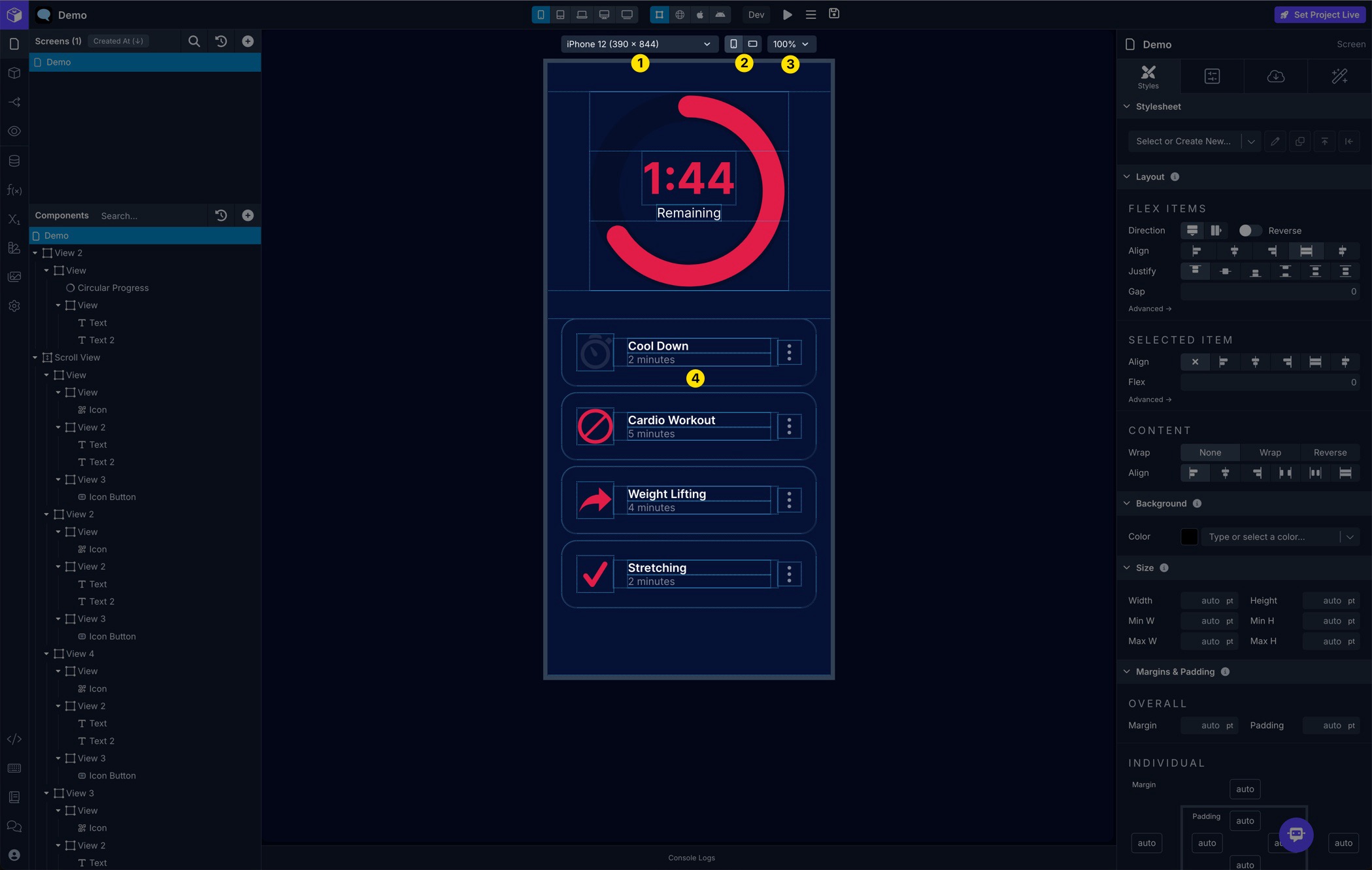
| 1 | Dimensions Selector | Switch between different device-specific screen dimensions for previewing your app in the Builder |
| 2 | Orientation Selector | Switch between portrait and landscape orientations for previewing your app in the Builder |
| 3 | Scale Selector | Switch between different zoom levels to reduce or enlarge the device when previewing your app in the Builder |
| 4 | App Preview | The web, iOS, or Android preview of your app |
Right Panel
Section titled “Right Panel”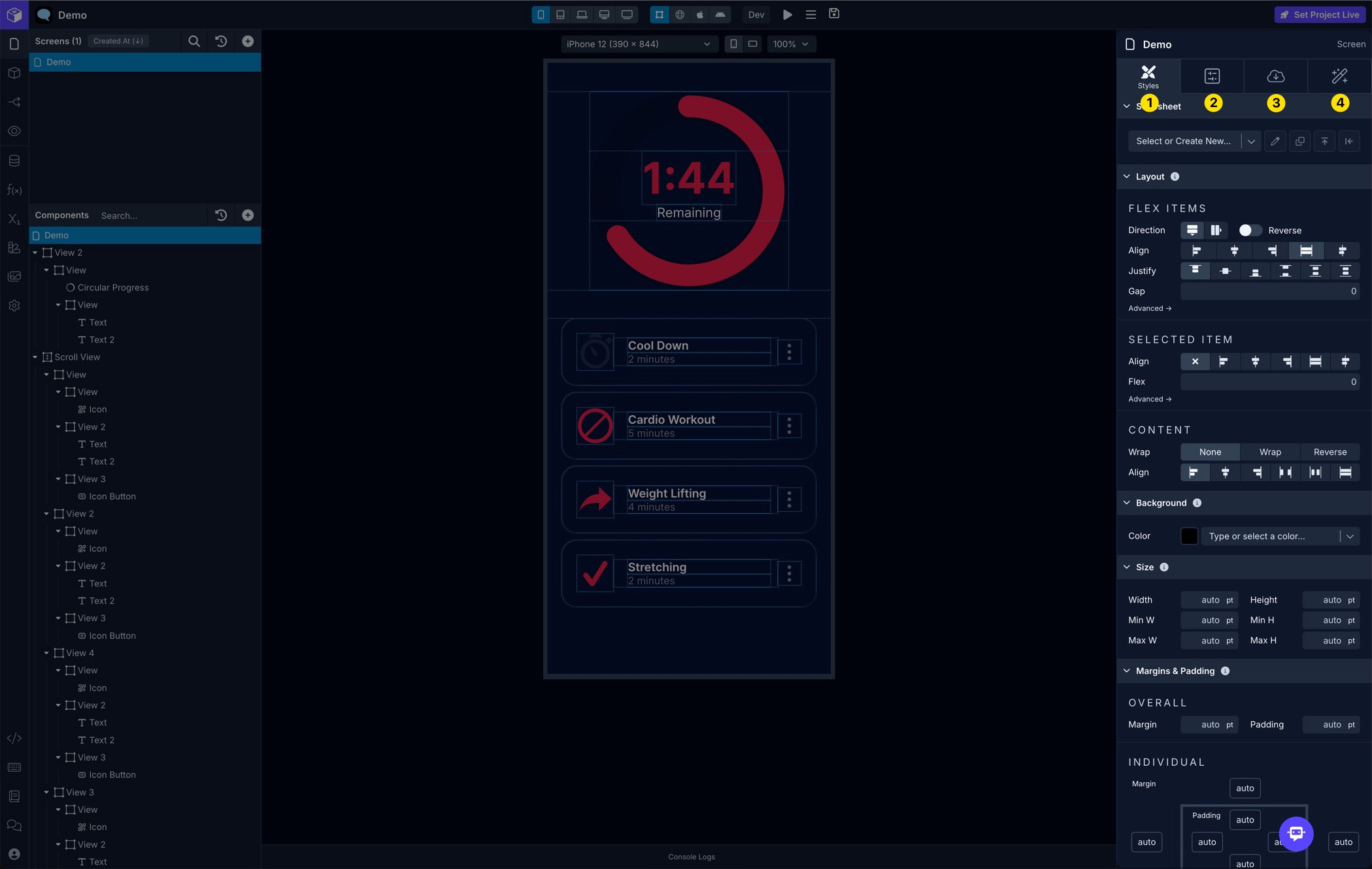
| 1 | Styles Tab | Customize Styles properties such as Flex Layout, Margins & Padding, Borders, Background, Effects, Typography, etc. |
| 2 | Configs Tab | Customize configuration properties available for a Component, Screen , Navigator , Block, etc. |
| 3 | Data Tab | Customize data properties available for a Component, Screen,Block, etc. |
| 4 | Interactions Tab | Customize Actions to run using available Triggers for a Component, Screen, Navigator, Block, etc. |
Top Bar
Section titled “Top Bar”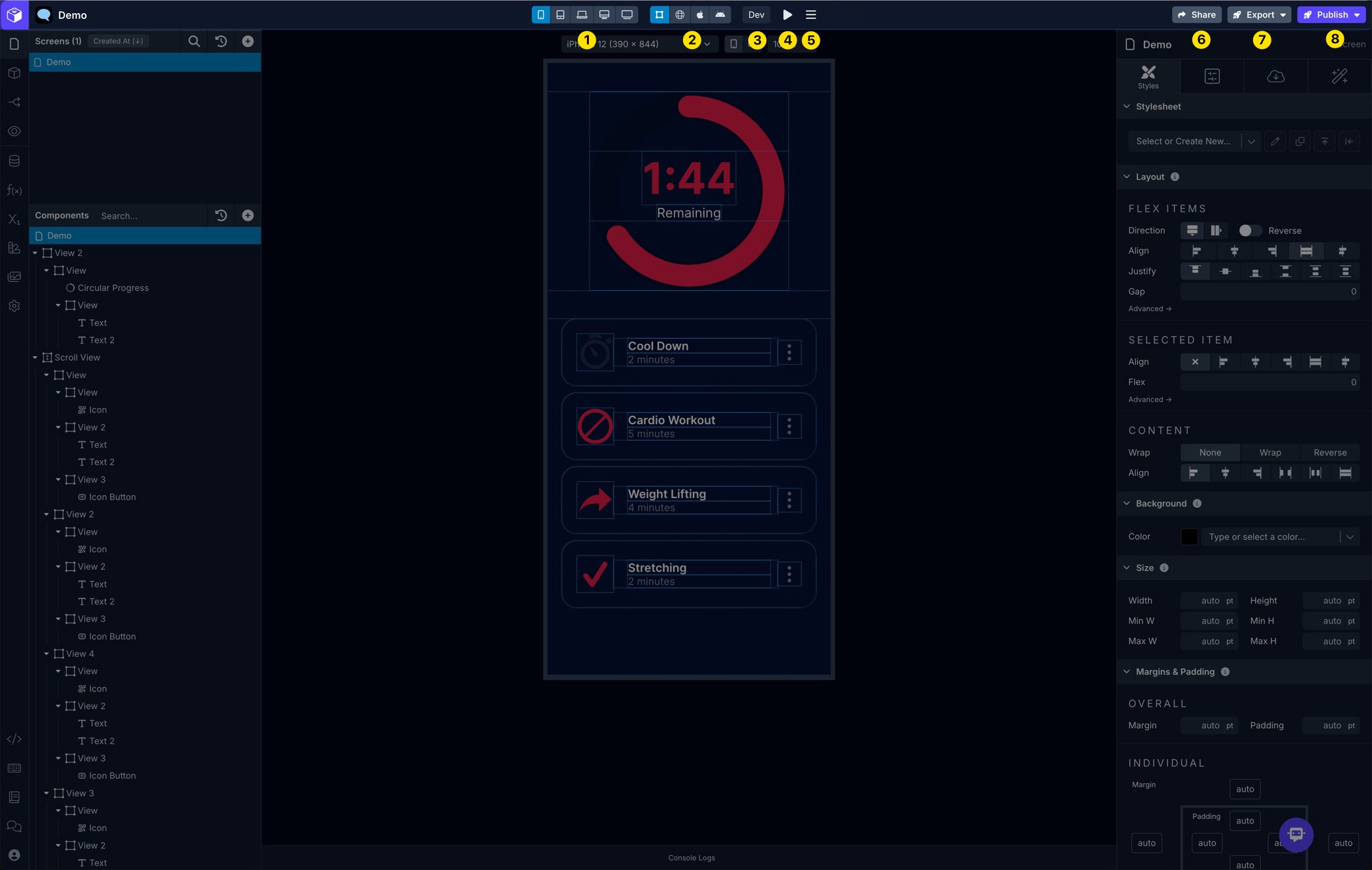
| 1 | Breakpoint Selector | Switch between different Breakpoints while building your app on different Screen sizes |
| 2 | Preview Mode Selector | Switch between different Preview modes while building your app |
| 3 | Environment Selector | Switch between different Environments to use while building and previewing your app |
| 4 | Live Preview | View the QR code to Live Preview your app on a physical device |
| 5 | Screen Menu | Provides an option to rebuild the current Screen |
| 6 | Share | Provides an option to Sharing Your Project with friends and colleagues using a private shareable link |
| 7 | Export | Provides options for Exporting Your Project source code and pushing your app code to GitHub |
| 8 | Publish | Provides options for Publishing your app to Web, Apple’s App Store, and Google’s Play Store |
Bottom Drawer
Section titled “Bottom Drawer”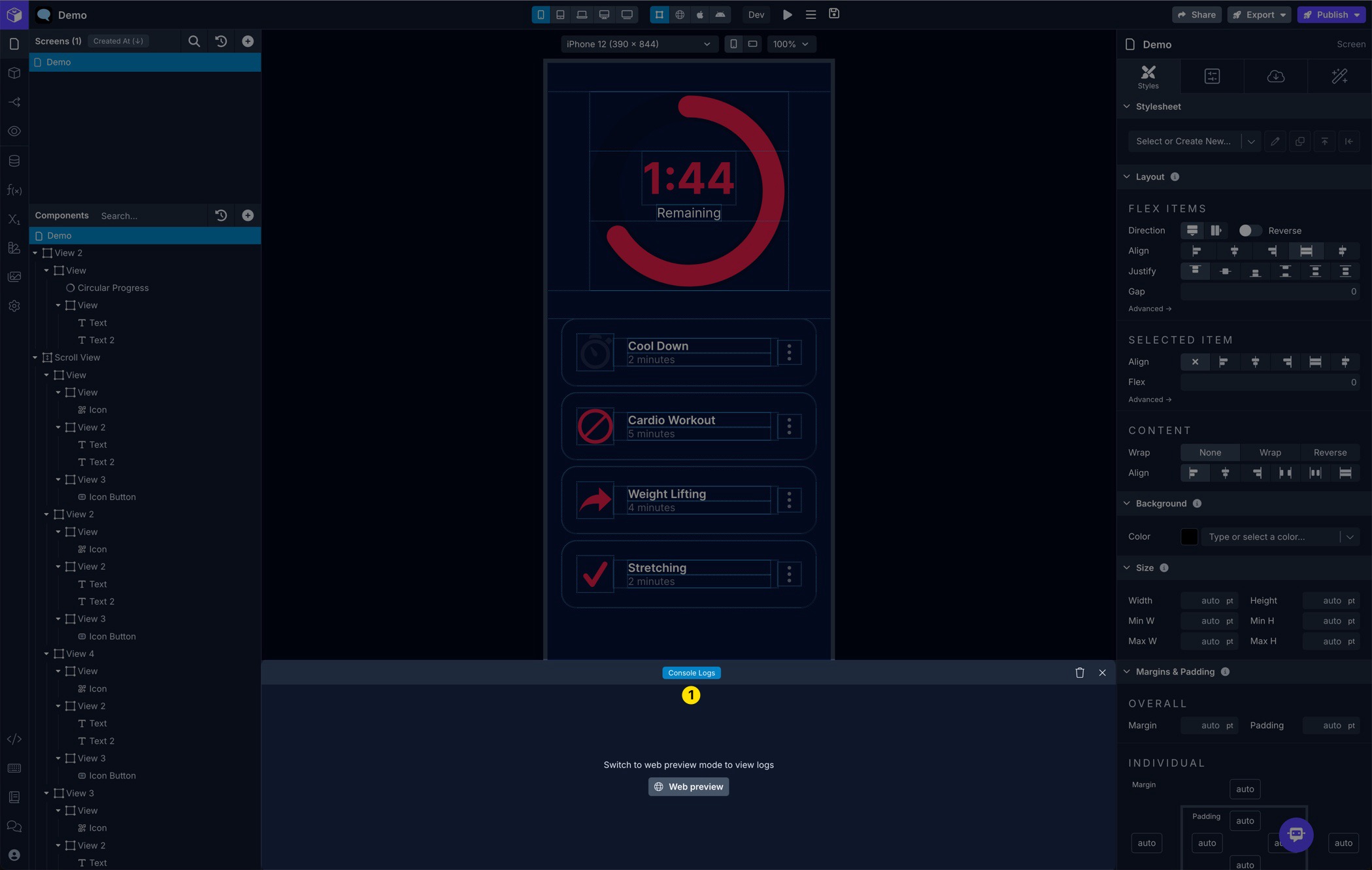
| 1 | Console Logs | View the Console Logs to help debug while building your app |
Command Palette
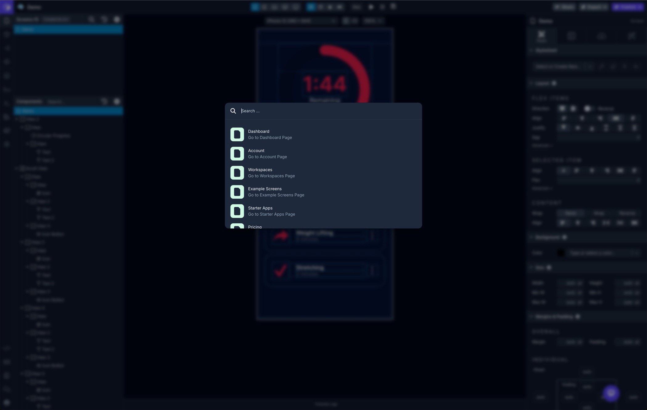
Section titled “Command Palette”The Command Palette lets you quickly navigate and perform various actions within the Draftbit Builder. Just hit CMD+K or CTRL+K to bring up the Command Palette and start typing. We’ll be adding to the available actions over time, plus include the ability to search our docs.
Draftbot Assistant
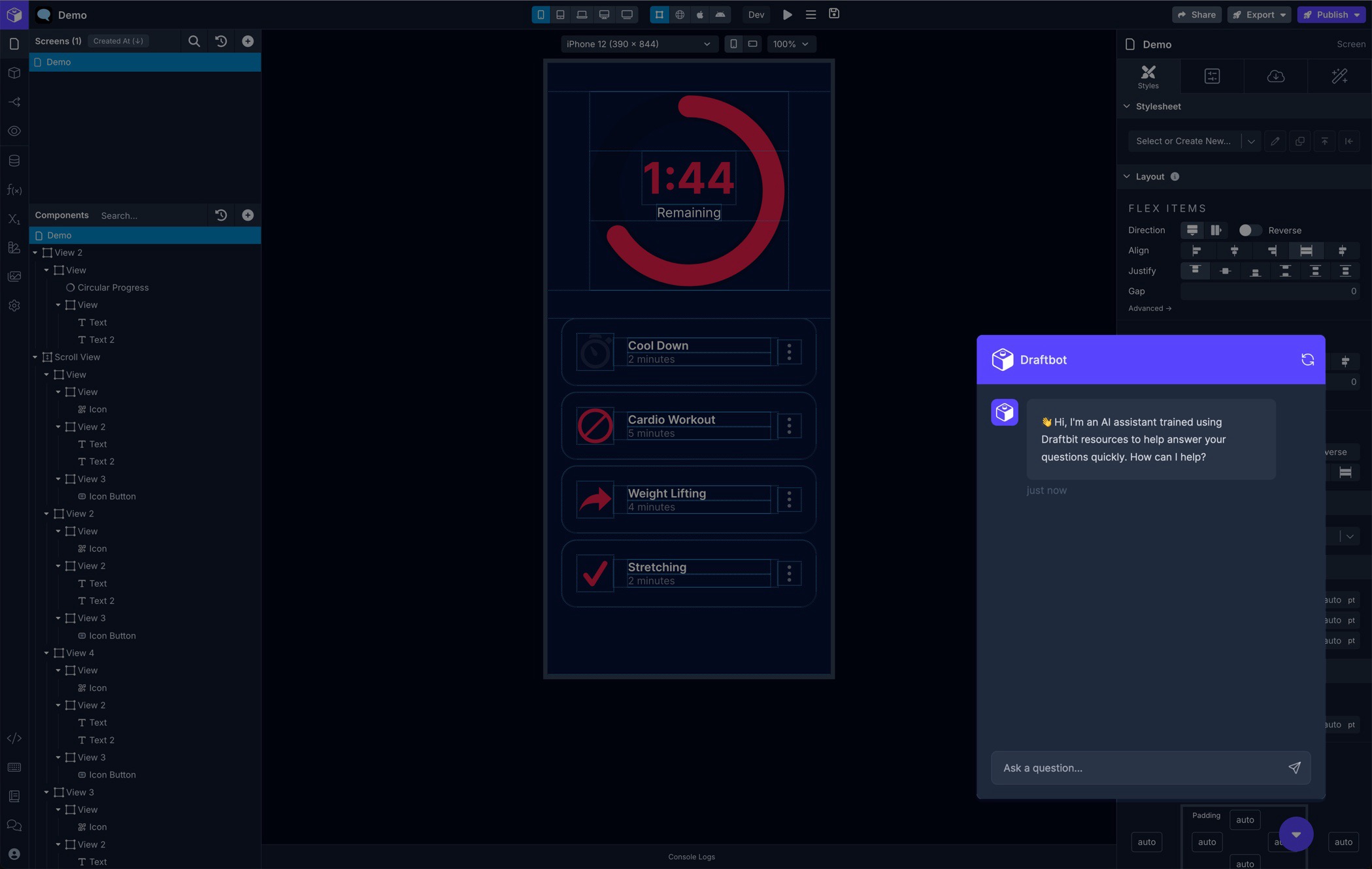
Section titled “Draftbot Assistant”You can chat with our AI support assistant right from within the Builder. Draftbot has been trained using our docs and some other resources like video transcripts and community posts. It’s available in the bottom-right corner of the Builder. We’ll be fine-tuning it as time goes on so be sure to try it out and rate your response.
Support Chat
Section titled “Support Chat”You can start a chat with our support team right from within the Builder. It’s available in the bottom-right corner of the Builder. You’ll get replies here and also via email.