
Typography
Typography applies to components such as Text, Text Input, Styled Text Area, Button , etc. It is available in the Styles Panel.
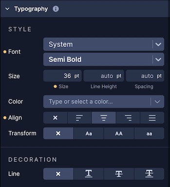
Style
Font
Draftbit supports Google Fonts. You can select the font of the Text with any of the pre-defined Google Fonts from the Font Picker.

For each font, you can also select the available font-weight on each font.

You can find look for a complete list of fonts at fonts.google.com.
Color
Select the color of the Text.
Align
Set the Text alignment.
| Property | Description |
|---|---|
| Auto | Default value. Aligns text in the context to the parent component. |
| Left | Aligns text to the left |
| Right | Aligns text to the right |
| Center | Aligns text in the center |
| Justify | Aligns text so it is spaced to line up its left and right edges to the left and right edges of the line box, except for the last line |
Transform
Transform the text.
| Property | Description |
|---|---|
| Capitalize | Capitalizes the first letter of each word |
| Uppercase | Makes all text uppercase |
| Lowercase | Makes all text lowercase |
Decoration
Line
| Property | Description |
|---|---|
| Underline | Adds a line under the text |
| Line-Through | Adds a line through the text |
| Underline Line-Through | Adds a line under the text and through the text |
Color
Select the color of the line decoration. Applicable only when a Line property is selected.
Style
Set the style of the line decoration.
| Property | Description |
|---|---|
| Solid | Sets a solid line |
| Double | Sets a double line |
| Dotted | Sets a dotted line |
| Dashed | Sets a dashed line |