
Linear Gradient
The Linear Gradient component allows you to apply a linear gradient background to elements in your app's UI.
You can think of the Linear Gradient component as essentially a View which has configuration options for styling the background with a color gradient.
How to use
Add one or more child components whose content you want to display inside.
In the example below, we have used it to create custom buttons and a card element.
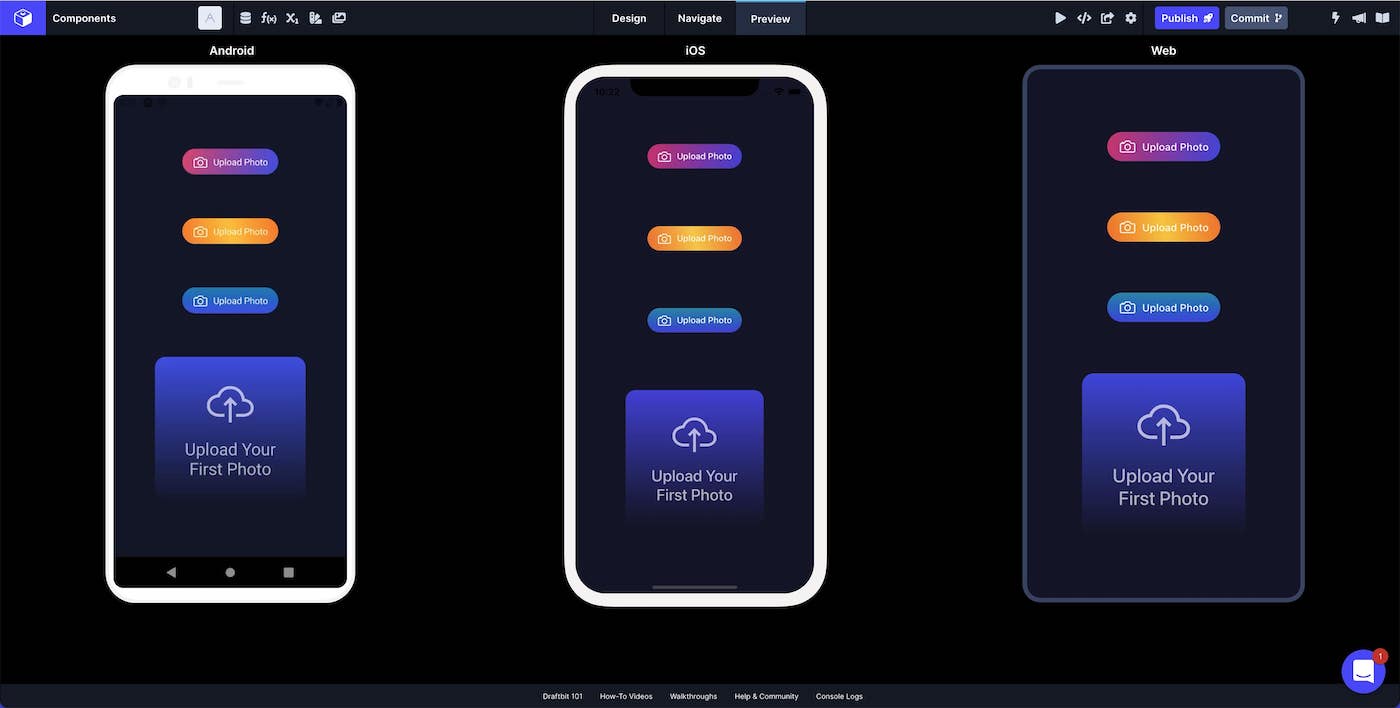
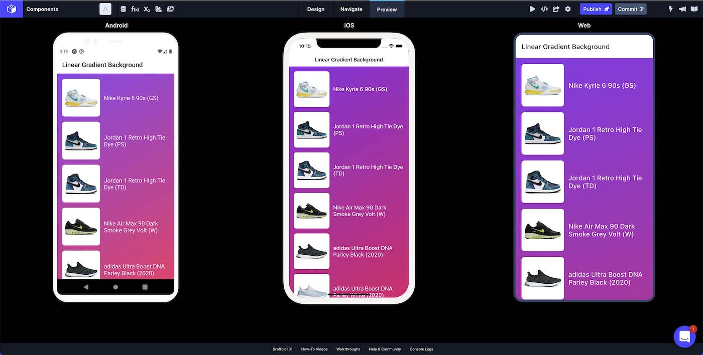
You can also use the Linear Gradient component as a background for your whole Screen.
Style Properties
Style properties allow you to customize the look and feel of the component. Combinations of styles applied to components can be saved as Stylesheets to easily reuse styles throughout your app. Styles can also be set dynamically using Variables. To learn more about all the different styling properties and how they work, take a look at Intro to Styling.
Component Specific Styles
| Property | Description |
|---|---|
| Color 1 | The first color in the gradient |
| Color 2 | The second color in the gradient |
| Color 3 | The third color in the gradient |
Configuration Properties
| Property | Description |
|---|---|
| Component Name | To alter the name of the component. The name is reflected in the Components tree. Defaults to 'Linear Gradient'. |
| End Y | The ending point of Y as a number 0 - 100 |
| End X | The ending point of X as a number 0 - 100 |
| Start Y | The starting point of Y as a number 0 - 100 |
| Start X | The starting point of X as a number 0 - 100 |
Web BehaviorOn web, the Start and End properties only change the angle of the gradient because CSS gradients don't support changing the start and end position.
Data Properties
Conditional Display
You can conditionally display a component based on a given condition. Learn more about conditionally displaying components in the Conditional Display doc.
Examples
| Configuration | Description |
|---|---|
| Start X: 10; Start Y: 20 | The gradient will start 10% from the left and 20% from the top |
| End X: 10; End Y: 20 | The gradient will end 10% from the left and 20% from the bottom |