
Section List
The Section List lets you categorize its items under headers based on a given common attribute in the data objects. It works like a List.
How to use
A Section List component receives data in the form of an array of objects that it will loop over to create an instance of the Section List's child components for each item in the array. Each object in the array should have a shared attribute with which to section the list data - for example a category, gender, or department attribute.
The data you pass to a Section List component's Data prop can come from a Variable if, for example, you have a fixed array of values or one populated using an API Request Action. You can also pass data to a Section List from a Fetch component on your Screen.
For each item in the array that you pass to a Section List, the List will render an instance of all child components within the Section List component. For example, if you have a Section List component that contains a single nested Text component and you pass it an array which contains 20 items, the Section List will render 20 Text components - one for each item in the array passed to the Section List.
The data for each item in the array will be available to all child components within the Section List component. The item data will be available as Section List item in any variable dropdowns for props in the component's Data tab. Any keys for the item will also be listed if you didn't skip the Test step when saving your Endpoint.
That means that our Text component above will have access to the list item's data in their variable selection dropdowns in the Data panel. So, if your array contains objects with keys such as name and description, we could pass those values to our Text component inside the Section List and each one would display their own data. Learn how to set and use the Fetch and List component in Fetching Data.
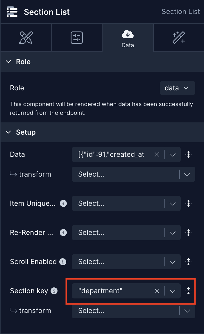
The Section Key Data prop is the most important prop as this specifies the key that is shared by all objects in the array passed to the component which is then used to render the named sections in the list.
For example, with an object like {name: "Burger", category: "Lunch"}, one could use the key category to create sections based on the value of category.
Example
We have a JSON data
[
  {
    "id": 91,
    "name": "John Doe",
    "role": "Sound",
    "department": "CREW"
  },
  {
    "id": 92,
    "name": "Jane Smith",
    "role": "Hair/MUA",
    "department": "GLAM"
  },
  {
    "id": 93,
    "name": "Alice Johnson",
    "role": "Executive Producer",
    "department": "PRODUCTION"
  }
  ...
]
The field I want to group is "department". We need to enter this key manually in the Section key prop:
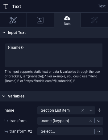
Next, we'll display the name information.
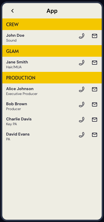
Finally, this is the result we'll receive.
Style Properties
Style properties allow you to customize the look and feel of the component. Combinations of styles applied to components can be saved as Stylesheets to easily reuse styles throughout your app. Styles can also be set dynamically using Variables. To learn more about all the different styling properties and how they work, take a look at Intro to Styling.
Component Specific Styles
| Property | Description |
|---|---|
| Refreshing color | Color of the refresh indicator displayed when refreshing. Requires assigning Actions to the On Refresh Trigger |
| Section Color | Sets the background color used for the sections headers. Use Section Header for complete control over the section header. |
Configuration Properties
| Property | Description |
|---|---|
| Component name | The name of the component as it appears in the Screen's component tree |
| Inverted | If true, reverses the direction. |
| Show horizontal scroll indicator | When true, shows a horizontal scroll indicator. The default value is true. |
| Show vertical scroll indicator | When true, shows a vertical scroll indicator. The default value is true. |
| Sticky header | When true, header will stick to top while scrolling. On web, sticky headers only work when this component or one of its parents has a static height. |
| Sticky header on scroll | When true, sticky header is hidden when scrolling down, and sticks only when scrolling up |
| List component | The underlying list component to be rendered. FlatList or FlashList |
| Horizontal | Render list horizontally |
| End reached threshold | How far from the end (in units of visible length of the list) the bottom edge of the list must be from the end of the content to trigger the onEndReached callback. Thus a value of 0.5 will trigger onEndReached when the end of the content is within half the visible length of the list. |
| Initial number to render | How many items to render in the initial batch |
| Estimated item size | Approximate size of the items before rendering. (Only applies when 'FlashList' is the selected list component) |
| Allow Touch Events | The default behavior of the Keyboard is to dismiss when a touch component (for example, a Button) is pressed. This default behavior is set by the value Never.Use the value Always when you want to continue to display the keyboard without dismissing the keyboard. In this scenario, to dismiss the keyboard after a touch component is pressed you will use the Dismiss Keyboard Action available on On Press trigger. |
Data Properties
| Property | Description |
|---|---|
| Data | Data to render in the list. Typically an array of objects |
| Item unique key | Provide an optional way to derive a unique key (e.g. an id or a name) for a given item in the list |
| Section key | Key of the data object to be used as the section |
| Number of Columns | Define the number of columns the list should divide the items into. Default value is set to 1. |
| Re-render Data | A marker property for telling the list to re-render. If any of the list children depend on anything outside of the 'Data' prop, put it here and the list will re-render when they change. |
| Scroll Enabled | When false, the view cannot be scrolled via touch interaction. |
Conditional Display
You can conditionally display a component based on a given condition. Learn more about conditionally displaying components in the Conditional Display doc.
Triggers
| Trigger | Description |
|---|---|
| On Refresh | Runs the Actions when the element is refreshed. (i.e. pull to refresh) |
| On End Reached | Runs the Actions when the threshold value is reached |
| On Scroll | Runs the Actions when the list is scrolled |