
JSX
Render custom JSX components on your Screens
With Custom Files, you can add custom JSX components into your Screens. These can be your own JSX components, or ones that are provided by Packages.
Adding Custom JSX Components
First, navigate to the Files tab in the Custom Code modal and select or create a new file.

Then, paste in or enter your custom code. Be sure to click Save when finished.
You need to make sure that you:
- Place any imports required by your component at the top of the file. Make sure you've added them asPackages (besides "react" and react-native"). Note that the first import,
import React from 'react'is required.. - Export a named reference so you can call this in your Custom Code Components. The syntax is
<Squircle.component />where component is the exported reference to your Custom Code Component. - Components should not be exported as 'default'
In this example, we've created a Custom File camed Squircle that renders a JSX component provided by an imported Package.

Adding Custom Components To A Screen
From the Components tree, click the '+' icon button to add a new component.
Select the Custom Code Component either by typing in the search bar or adding it from the Blocks tab.
In the Properties panel on the right side, you can import your Custom File then enter your custom JSX.
Here's how to add a Custom Code Component referencing our previously added Squircle example.

Note that you can't configure Custom Code Component in the Properties panelProperties can be passed into your JSX and used within your custom JSX components in your Custom Files.
Passing Variables to Custom Components
Custom Components are plain React Native components that are written using JSX. You can pass data like Screen Variables using the React's prop pattern.
When defining the Custom Component on an app screen, define the prop as shown below:

And then use the value of the prop inside the Custom Component:
export const MyCustomComponent = ({name}) => {
  console.log(name)
}
Note: In the example above, the name prop is an arbitrary Screen Variable. Replace it with your props. You can pass multiple props as well, given that a unique name identifies each prop.
Passing Data from a List to a Custom Component
There may be scenarios in which you will want to nest a Custom Component inside a List component. For example, take a look at the Components structure below:
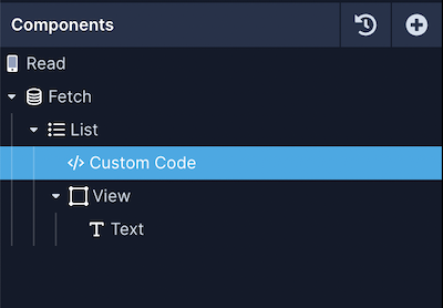
For this particular scenario, defining the Custom Component on an app screen you will have to include a field name or the key from your data object along with a prefix listData.
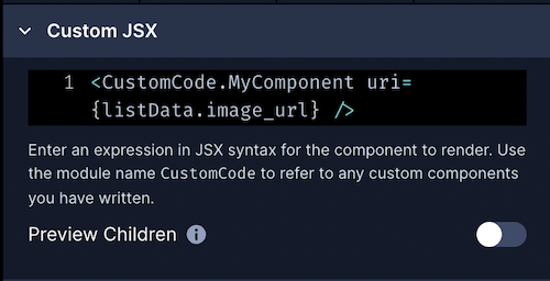
In the example below, the Custom Component MyComponent is receiving a prop that includes the image URL of an item in the list:
And then use the value of the prop inside the Custom Component:
export const MyComponent = ({uri}) => {
  // ...rest of the component's code
}
Using Navigation in Custom Components
Draftbit uses the react-navigation library under the hood to let you implement different navigation patterns such as Stack and Tab. You can pass useNavigation to a Custom Component when defining it in a screen.
<CustomCode.MyButton useNavigation={useNavigation}/>Then on a Button or a Touchable component from React Native, for example, you can pass navigation.navigate() method as the value of onPress prop on the button component to navigate to another screen with the name of the screen as the its argument:
// /custom-code/CustomCode.js

// This import is required if you are defining react components in this module.
import React from 'react';

// Add any other imports you need here. Make sure to add those imports (besides "react"
// and "react-native") to the Packages section.
import { Button } from 'react-native';

export const MyButton = props => {
  const { useNavigation } = props;
  const navigation = useNavigation();

  return (
     <Button
        accessible={true}
        iconPosition={'left'}
        onPress={() => {
          try {
            navigation.navigate('BlankScreen');
          } catch (err) {
            console.error(err);
          }
        }}
        title={'Get Started'}
      />
  );
};The suffix
Screenat the end ofSomeScreenNameScreenis required because any screen inside Draftbit app has this suffix added to the screen name by default.
Previewing Custom Components
Custom Code Components do not work in web preview "single screen" mode. Click the "Preview" icon in the third tab above your screen or the "Preview" button in the top navigation to view using Expo Go on your device.
Preview Children
Custom components can't be shown in Preview mode. However, when this setting is enabled, the page will render this component's child components.
Preview Children OFF

Preview Children ON

Themes in Custom Code
You can access the Themes and Color palettes from Custom Files and apply them to your custom JSX components. They are stored in /themes. Assuming your file is in the /custom-files directory it would look like this:
import * as draftbitThemeObj from '../themes/DraftbitDefault';
import * as palettesObj from '../themes/palettes';
Substitute the name of your theme in place ofDraftbitDefault