
Section Header
The Section Header component is allows you to build your own custom header for the Section List.
How to use
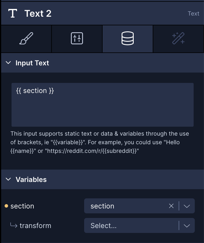
The Section Header is nested as a child of the Section List and acts just like a View, however any children nested inside of it have access to a local variable named section that can be rendered in a Text component, for example.
From the example Section List at the top
Style Properties
Style properties allow you to customize the look and feel of the component. Combinations of styles applied to components can be saved as Stylesheets to easily reuse styles throughout your app. Styles can also be set dynamically using Variables. To learn more about all the different styling properties and how they work, take a look at Intro to Styling.
Configuration Properties
| Property | Description |
|---|---|
| Component name | The name of the component as it appears in the Screen's component tree |
Data Properties
Conditional Display
You can conditionally display a component based on a given condition. Learn more about conditionally displaying components in the Conditional Display doc.