Keyboard Avoiding View
A View that adjusts itself to remain visible when the keyboard is open
This component will automatically adjust its height, position, or bottom padding based on the keyboard height to remain visible while the virtual keyboard is displayed.
How to use
Add any components that you want to avoid being hidden by the virtual keyboard inside the Keyboard Avoiding View.
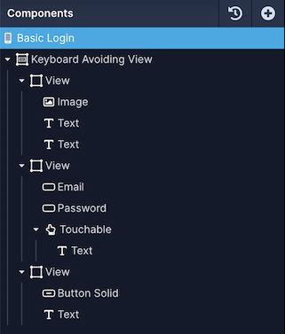
For example, a Login screen has two Text Input components and a Button. We want to make sure when one of the inputs are focused by the user that they aren't covered by the keyboard so we can wrap them inside the Keyboard Avoiding View in the Components tree.

Style Properties
Style properties allow you to customize the look and feel of the component. Combinations of styles applied to components can be saved as Stylesheets to easily reuse styles throughout your app. Styles can also be set dynamically using Variables. To learn more about all the different styling properties and how they work, take a look at Intro to Styling.
Component Specific Styles
| Property | Description |
|---|---|
| Resizing Behavior (Android) | The behavior for how the keyboard resizing interacts with the rest of the screen. Android override. |
| Resizing Behavior (iOS) | The behavior for how the keyboard resizing interacts with the rest of the screen. iOS override. |
| Keyboard Vertical Offset (Android) | The distance between the bottom of the view and the keyboard. Android override. |
| Keyboard Vertical Offset (iOS) | The distance between the bottom of the view and the keyboard. iOS override. |
| Keyboard Vertical Offset | The distance between the bottom of the view and the keyboard |
Device-specific behaviourAndroid and iOS both interact with the Resizing Behavior property differently. It's recommended to set these independently for each platform using the platform-specific properties.
Configuration Properties
Basic
| Property | Description |
|---|---|
| Component Name | To alter the name of the component. The name is reflected in the Components tree. Defaults to Keyboard Avoiding View |
| Enable | Enable the keyboard Avoiding View. By default, it is enabled. |
iOS Specific
These props will be used on iOS devices if set, otherwise the properties set in the Basic section will be used.
| Property | Description |
|---|---|
| Resizing Behavior | The behavior for how the keyboard resizing interacts with the rest of the screen. Padding is recommended |
| Keyboard Vertical Offset | Adjust the distance between the top of the user screen and the react native view. |
Android Specific
These props will be used on Android devices if set, otherwise the properties set in the Basic section will be used.
| Property | Description |
|---|---|
| Resizing Behavior | The behavior for how the keyboard resizing interacts with the rest of the screen. Height is recommended |
| Keyboard Vertical Offset | Adjust the distance between the top of the user screen and the react native view. |
Data Properties
Conditional Display
You can conditionally display a component based on a given condition. Learn more about conditionally displaying components in the Conditional Display doc.
Updated over 1 year ago
