
Themes
Create theme styles for dark/light modes
Each app project comes with a default 'Draftbit' theme, which you can rename, where you can configure how colors and typography are applied to your app's UI. Start from one of the predefined themes, import from another app, or build from scratch and create as many custom themes as you like. Access and manage your themes using the Styles & Colors option in the Left Bar of the Builder.
All changes to your theme can be previewed live as they're made in the preview panel on the right side. There you can also select the device and which Screen to preview as you tweak your theme.
While building your app in Draftbit and using either the previews within the Builder or physical devices, you can preview your app with different themes and switch between dark/light modes from the Top Bar of the Builder.
Using the Change Theme and Set Color Scheme Actions you can allow your app users to change the theme and color scheme which is applied to your app's UI - for example if you'd like to let your users customize their experience from a 'Preferences' Screen.
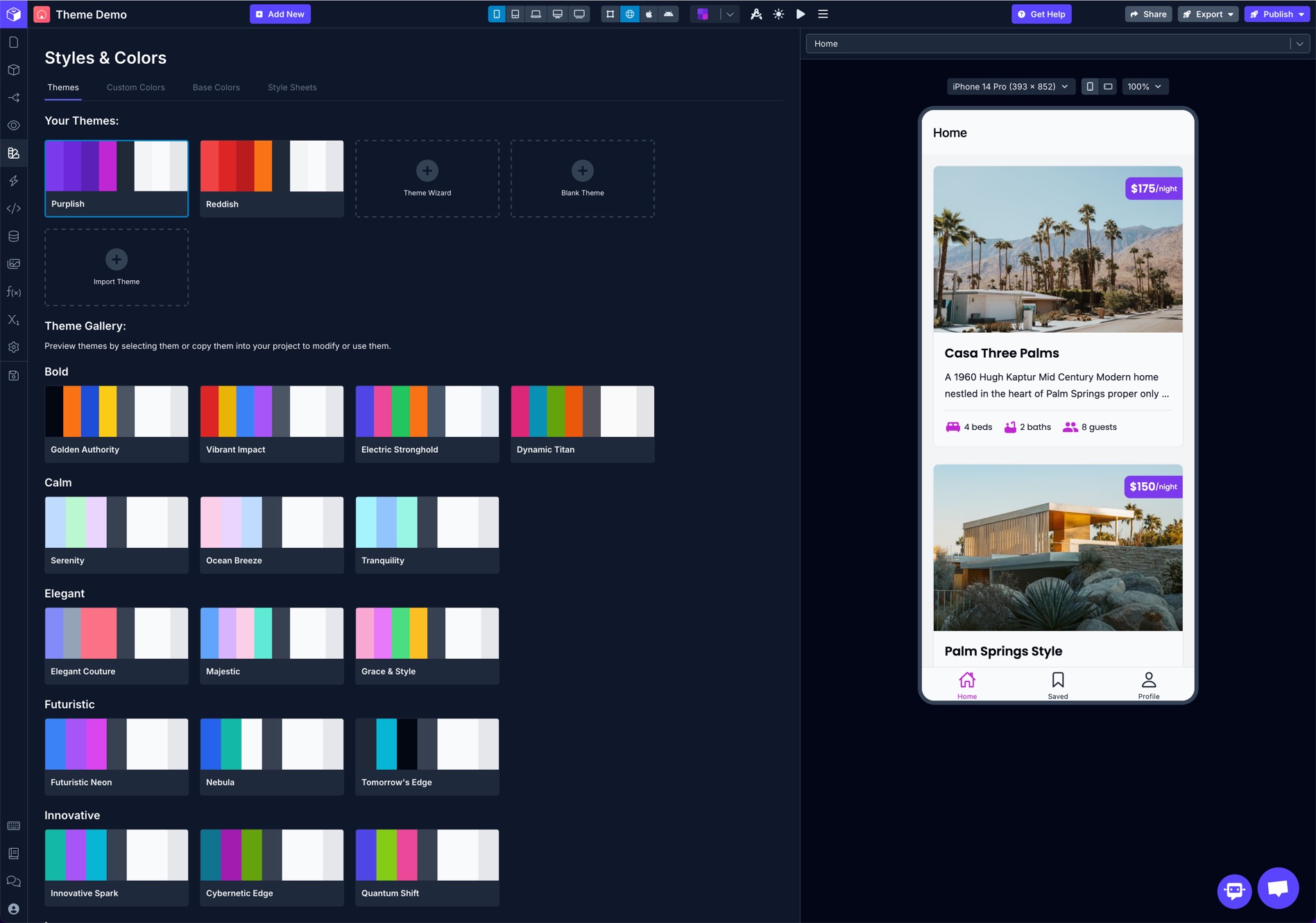
Theme Gallery
The Theme Gallery features several pre-configured themes that are ready to use out-of-the-box or as a starting point. You can click on a theme to preview how your Screens will look using the selected theme and choose to view details or import into your app project to further customize if you like.
Theme Colors
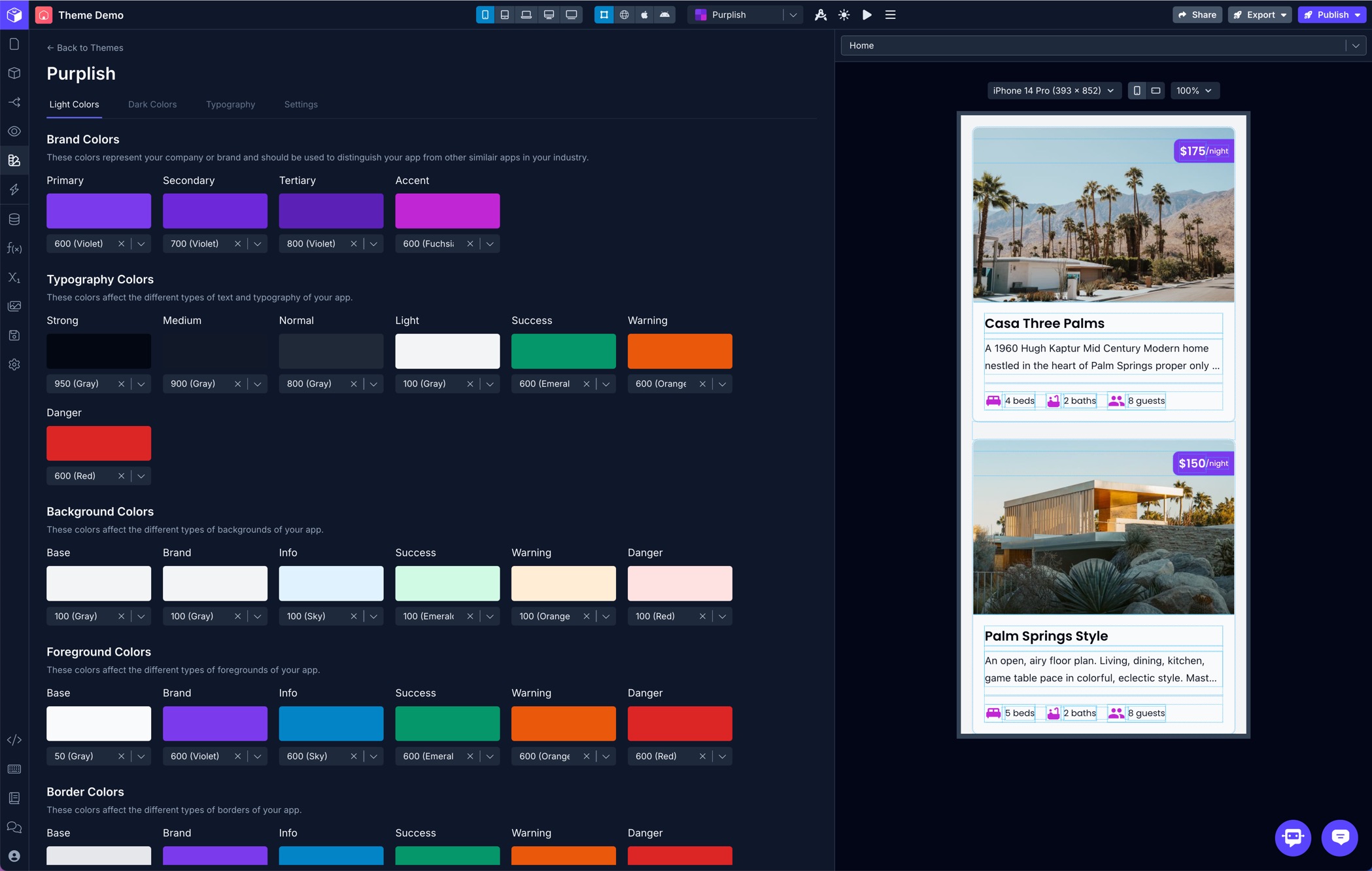
Each theme has named colors for both dark and light modes. When the device is set to dark mode in a live app, or you have switched to dark mode in the Builder during development, the dark colors will be applied anywhere your theme colors are used to style your app UI. Dark colors will always fallback to light colors when not specified.
Colors from all the Base Palettes and any Custom Palettes you've configured are available to select from when defining your app's theme colors.
Brand Colors
These colors represent your company or brand and should be used to distinguish your app from other similair apps in your industry.
| Color Name | Description |
|---|---|
| Primary | The main color that represents your brand, used for primary actions and highlights. |
| Secondary | A complementary color to the primary, often used for secondary actions or emphasis. |
| Tertiary | An additional color for nuanced UI elements or subtle highlights. |
| Accent | A pop of color to draw attention to specific elements or features. |
Typography Colors
These colors affect the different types of text and typography of your app.
| Color Name | Description |
|---|---|
| Strong | The boldest text color, used for important headers or standout text elements. |
| Medium | A slightly less bold text color for subheadings or prominent supporting text. |
| Normal | The default text color for standard body text throughout your app. |
| Light | A lighter text color for secondary or less emphasized content. |
| Info | A color used for informational or neutral messages within your app's typography. |
| Success | A color used to indicate success or positive outcomes in text. |
| Warning | A color used to signal warnings or caution in text. |
| Danger | A color used to represent errors or critical alerts in text. |
Background Colors
These colors affect the different types of backgrounds of your app.
| Color Name | Description |
|---|---|
| Base | The background color applied to app Screens by default |
| Brand | The background color that reinforces your brand identity across the app. |
| Info | A background color for informational or neutral sections of the app. |
| Success | A background color to highlight success or positive states. |
| Warning | A background color to caution users or indicate a warning state. |
| Danger | A background color for error messages or critical states. |
Foreground Colors
These colors affect the different types of foregrounds of your app.
| Color Name | Description |
|---|---|
| Base | The base foreground color applied to some components by default |
| Brand | The foreground color that reflects your brand identity in UI elements. |
| Info | A foreground color for informational or neutral UI elements. |
| Success | A foreground color to signify success or positive actions. |
| Warning | A foreground color to indicate warnings or cautionary elements. |
| Danger | A foreground color for error indicators or critical elements. |
Border Colors
These colors affect the different types of borders of your app.
| Color Name | Description |
|---|---|
| Base | The base border color applied to some components by default |
| Brand | The border color that aligns with your brand identity for consistent styling. |
| Info | A border color for informational or neutral boundaries. |
| Success | A border color used to indicate success or positive interactions. |
| Warning | A border color to signal warnings or cautionary elements. |
| Danger | A border color for errors or critical boundaries. |
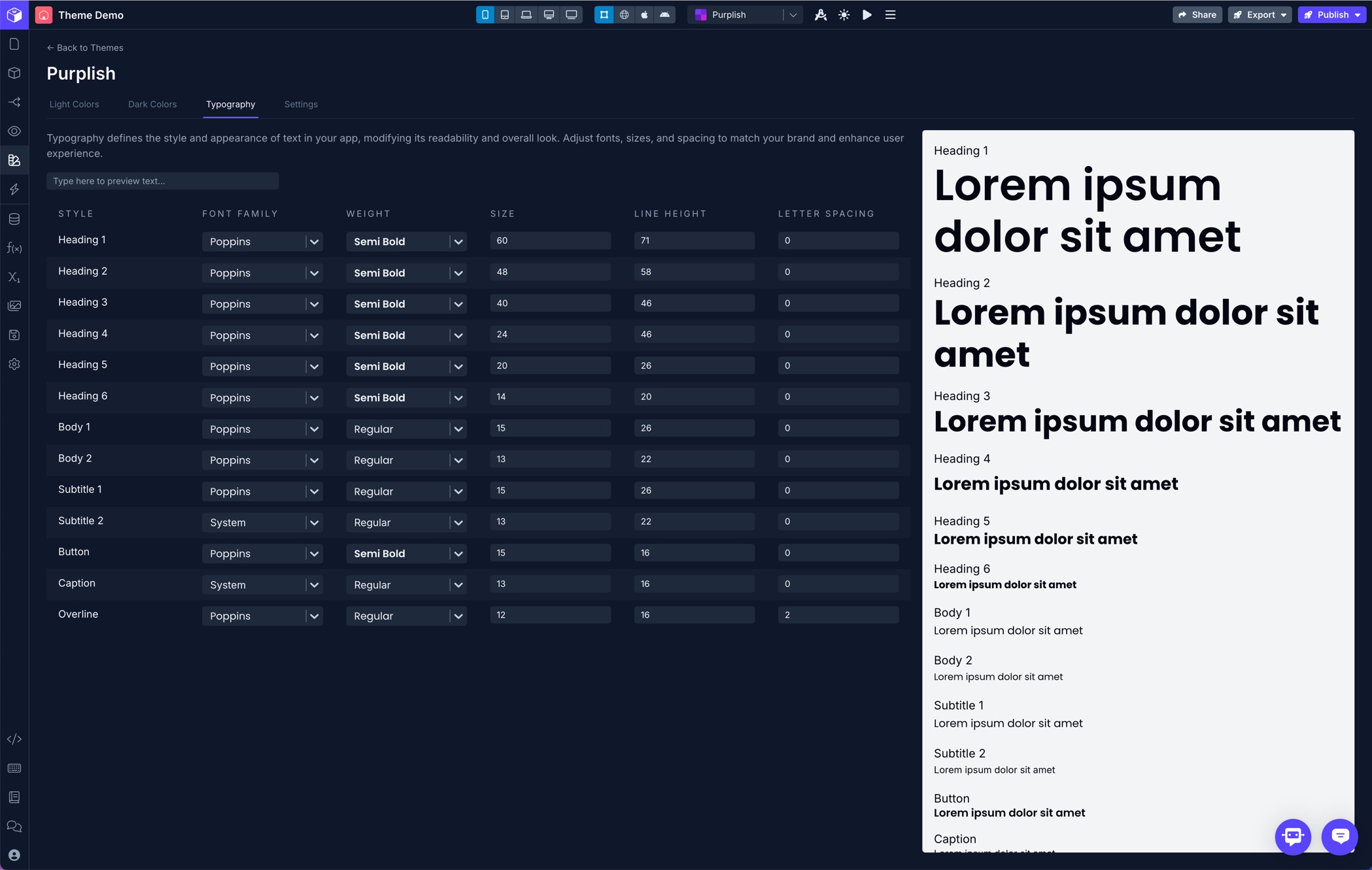
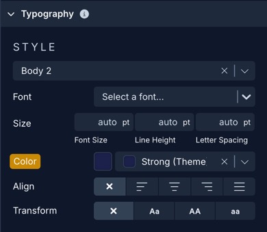
Theme Typography
In addition to defining colors for each theme, you can also define typography styles. Each named typography style can be applied to any component which supports Typography props in the Styles panel. All the common styles are available such as H1-H6, Subtitle, Body, Button, etc.
| Property | Description |
|---|---|
| Style | The name of the typography style as it appears in the theme style dropdown in the Typography section of the Styles panel for compatible components |
| Font Family | The font family to use for the typography style. Draftbit supports Google Fonts |
| Weight | The weight of the font for the typography style. Options will vary depending on the selected Font Family |
| Size | The size of the font for the typography style |
| Line Height | The line height of the font for the typography style |
| Letter Spacing | The letter spacing of the font for the typography style |
Theme Settings
| Property | Description |
|---|---|
| Name | The name of the theme |
| Default Theme | Set the theme as the default for the app |
Applying Theme Styles
Once you have your theme's colors and typography settings defined, you can then choose from the theme's styles when customizing the components in your app's UI.
Colors
Theme colors are available in all color selectors along with the colors in the Base and Custom Palettes. You can choose them when applying color styles to components in your app.
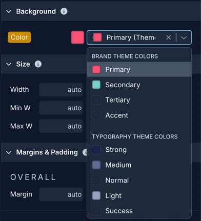
Any color props in the Styles panel which use a theme value will update according to the theme you have selected for previewing. So, if in 'ThemeOne' you have the Brand background color set to Red and in 'ThemeTwo' it's set to Blue, any components that use the Brand background color will update automatically to use the color defined in the selected theme.
Typography
The Typography section in the Styles panel of compatible components includes a selector to choose a base typography Style from the theme's typography settings. This will apply the typography style's default configuration, however you can still override these by setting individual typography props on the component.
Any typography props which use a theme value will update according to the theme you have selected for previewing. So, if in 'ThemeOne' you have the Heading 1 set to use the Inter font family and in 'ThemeTwo' it's set to use Roboto, any components that use the Heading 1 will update automatically to use the typography settings defined in the selected theme.
Themes in Custom Code
You can access the themes and color palettes from Custom Files. They are stored in /themes. Assuming your file is in the /custom-files directory it would look like this:
import * as themeObject from '../themes/DraftbitDefault';
import * as palettesObject from '../themes/palettes';

export const logThemeData = () => {
    console.log(themeObject)
    console.log(palettesObject)
}
Substitute the name of your theme in place ofDraftbitDefault