Flex Layout
Some components, such as a Screen or View, can specify the layout of its children using the Flexbox algorithm. Flexbox is designed to provide a consistent layout on different screen sizes. A component's Layout properties are available under the Styles tab in the right panel.
Flex settings will define how your items are going to “fill” the available space along your main axis. Space will be divided according to each element's Flex property.
You will generally use a combination of Flex Direction, Align Items, and Justify Content to achieve the right layout.
Flex Items
Flex Direction
Flex Direction controls the direction in which the children of a node are laid out. This is also referred to as the main axis. The cross axis is the axis perpendicular to the main axis, or the axis which the wrapping lines are laid out in.
| Property | Description |
|---|---|
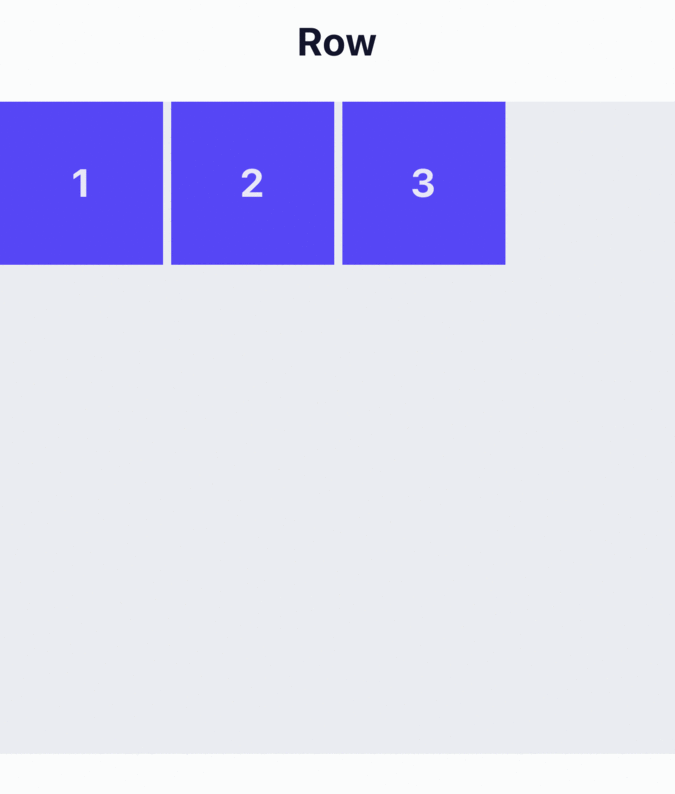
| Column | Align children from top to bottom. If wrapping is enabled, then the next line will start to the right of the first item on the top of the container. Default |
| Row | Align children from left to right. If wrapping is enabled, then the next line will start under the first item on the left of the container. |
| Row Reverse | Align children from right to left. If wrapping is enabled, then the next line will start under the first item on the right of the container. |
| Column Reverse | Align children from bottom to top. If wrapping is enabled, then the next line will start to the right of the first item on the bottom of the container. |
Example
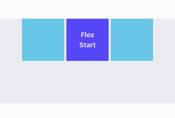
Align Items
Align Items describes how to align children along the cross axis of their container. It is very similar to Justify Content but instead of applying to the main axis, Align Items applies to the cross axis.
| Property | Description |
|---|---|
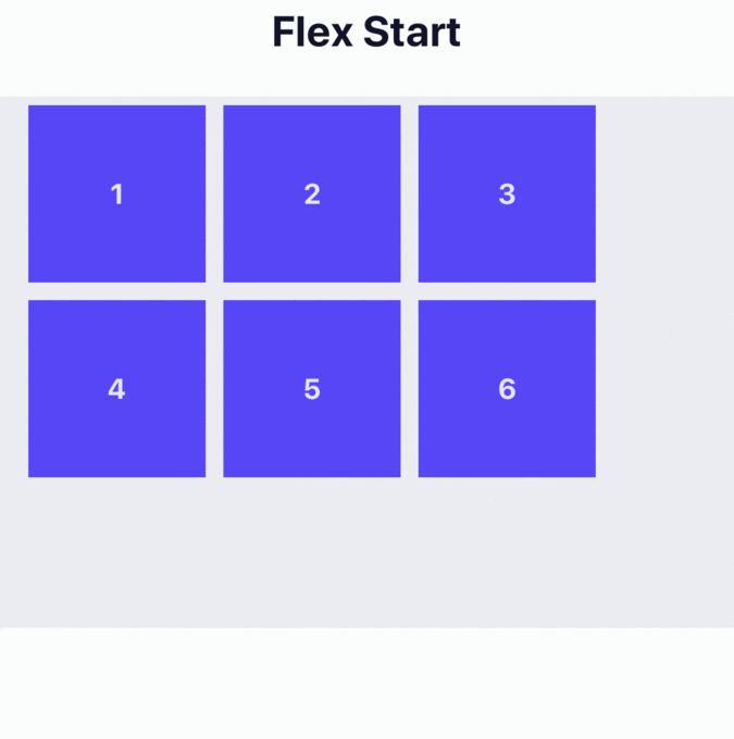
| Flex Start | Align children of a container to the start of the container's cross axis. |
| Center | Align children of a container in the center of the container's cross axis. |
| Flex End | Align children of a container to the end of the container's cross axis. |
| Stretch | Stretch children of a container to match the height of the container's cross axis. Default |
| Baseline | Align children of a container along a common baseline. Individual children can be set to be the reference baseline for their parents. |
For
Stretchto have an effect, children must not have a fixed dimension along the secondary axis.
Example
Justify Content
Justify Content describes how to align children within the main axis of their container. For example, you can use this property to center a child horizontally within a container with Flex Direction set to Row or vertically within a container with Flex Direction set to Column.
| Property | Description |
|---|---|
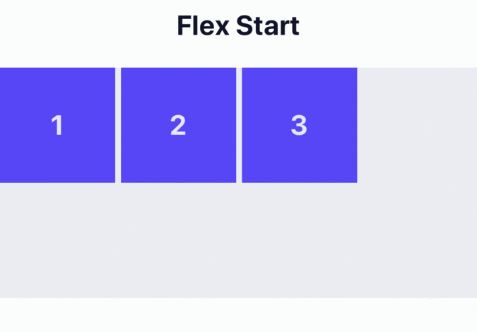
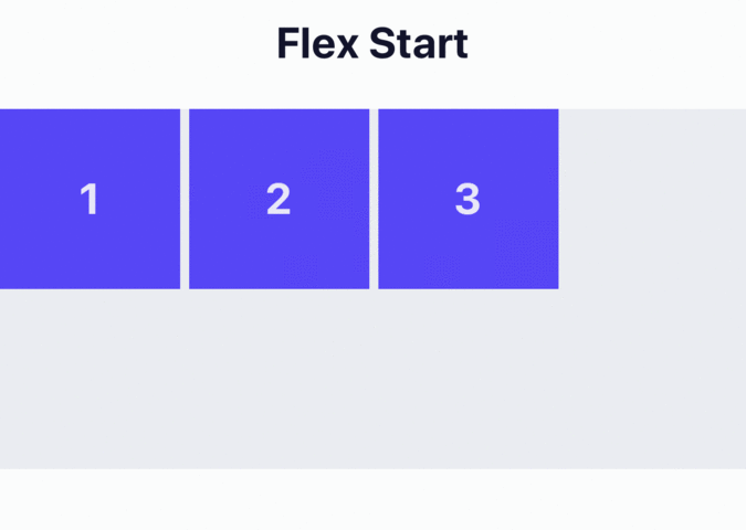
| Flex Start | Align children of a container to the start of the container's main axis. Default |
| Flex End | Align children of a container to the end of the container's main axis. |
| Center | Align children of a container in the center of the container's main axis. |
| Space Between | Evenly space off children across the container's main axis, distributing the remaining space between the children. |
| Space Around | Evenly space off children across the container's main axis, distributing the remaining space around the children. Compared to space-between, using space-around will result in space being distributed to the beginning of the first child and end of the last child. |
| Space Evenly | Evenly distribute children within the alignment container along the main axis. The spacing between each pair of adjacent items, the main-start edge and the first item, and the main-end edge and the last item, are all exactly the same. |
Example
Gap
Gap sets the size of the gap (gutter) between rows and columns. In the Advanced section, you can set the value of Row Gap and Column Gap independently.
| Property | Description |
|---|---|
| Row Gap | Sets the size of the gap (gutter) between an element's rows. |
| Column Gap | Sets the size of the gap (gutter) between an element's columns. |
Selected Item
Align Item
Align Item for the Selected Item has the same options and effect as Align Items for Flex Items, but instead of affecting the children within a container, you can apply this property to a single child to change its alignment within its parent. This overrides any alignment option set by the parent for the specific item.
| Property | Description |
|---|---|
| Flex Start | Align item to the start of the container's cross axis. |
| Center | Align item in the center of the container's cross axis. |
| Flex End | Align item to the end of the container's cross axis. |
| Stretch | Stretch item to match the height of the container's cross axis. Default |
| Baseline | Align item along a common baseline. Individual children can be set to be the reference baseline for their parents. |
Example
Flex Item
Flex Item will define how your items are going to “fill” over the available space along your main axis. Space will be divided according to each element's flex property.
In the Advanced section, you can also set value for the following properties:
| Property | Description |
|---|---|
| Basis |
|
| Grow |
0, with 0 being the default value. A container will distribute any remaining space among its children weighted by the children’s Grow values. |
| Shrink |
|
Content
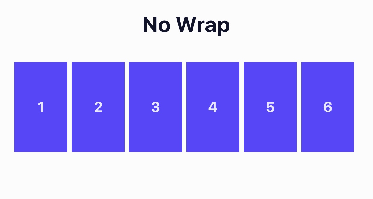
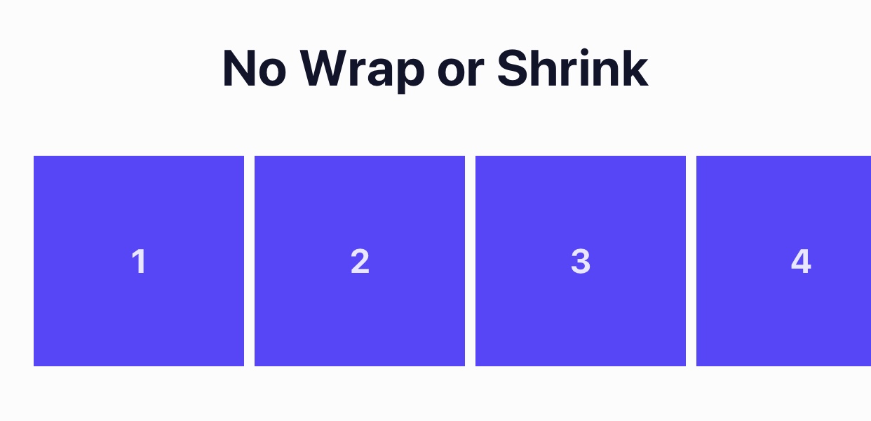
Wrap Content
The Wrap property is set on containers and it controls what happens when children overflow the size of the container along the main axis. By default, children are forced into a single line (which can shrink elements). If wrapping is allowed, items are wrapped into multiple lines along the main axis if needed.
When wrapping lines, Content Align can be used to specify how the lines are placed in the container.
| Property | Description |
|---|---|
| None | Forces all of the child elements onto one line and which has the potential to force shrink the elements in order to make them fit on the same line. |
| Wrap | The child elements will be placed along multiple lines, as needed, allowing them to retain their intended sizes. |
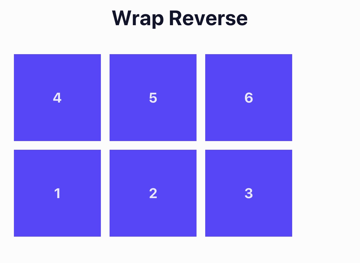
| Reverse | The same as Wrap, however the order of the child elements is reversed. |
No Wrap Example
Wrap Example
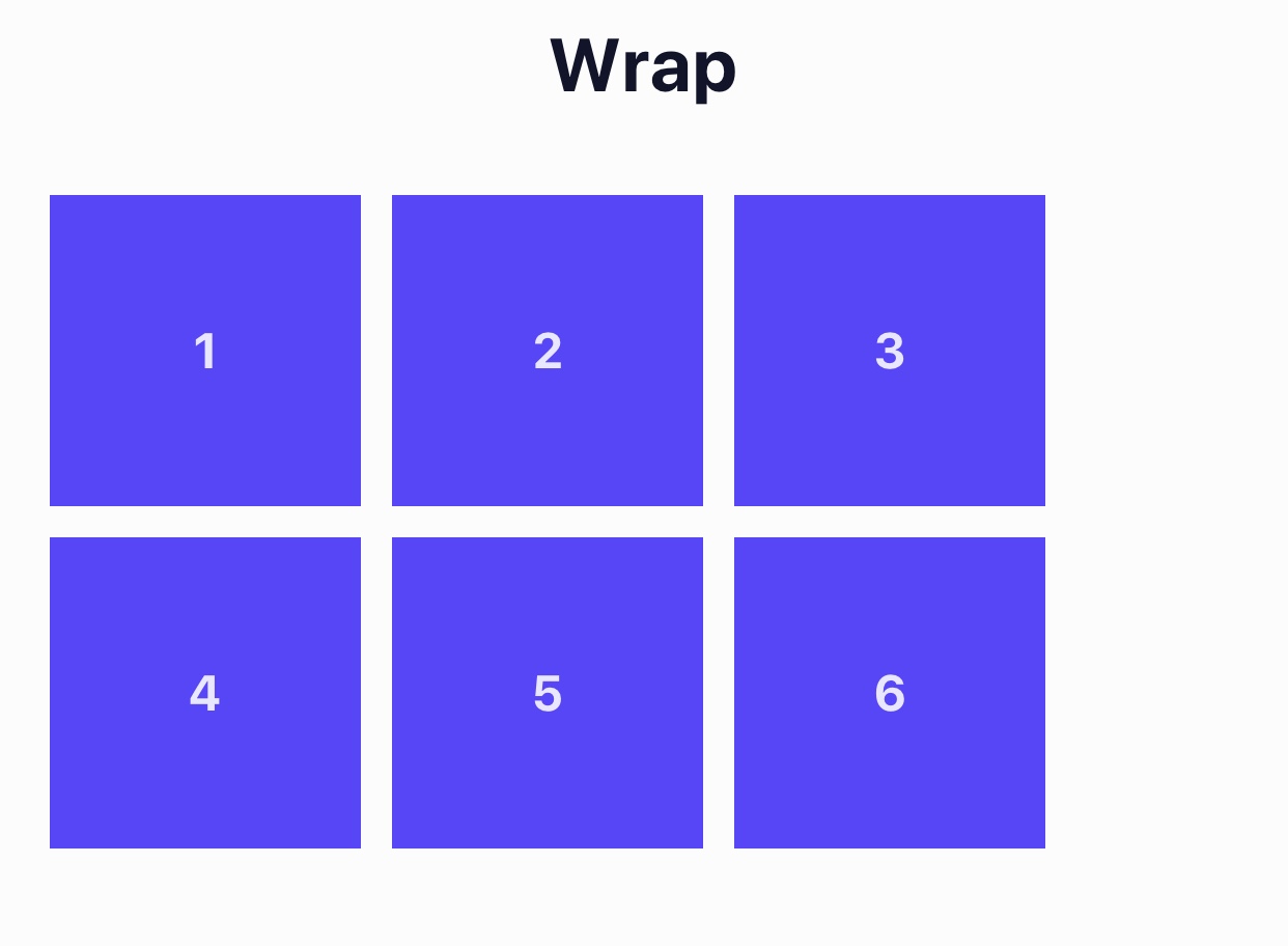
Wrap Example
Align Content
Align Content is only applicable when children elements are in a container that is set to Wrap Content and there are multiple lines of children elements. Setting the Align Content property determines how the lines of elements are positioned on the cross-axis (the axis opposite of the main axis defined in Flex Direction).
| Property | Description |
|---|---|
| Flex Start | Lines are grouped together and positioned at the beginning of the cross axis. |
| Flex End | Lines are grouped together and positioned at the end of the cross axis. |
| Stretch | Lines are stretched to the height of the container's cross axis. |
| Center | Lines are grouped together and positioned in the center of the container's cross axis. |
| Space Between | The first line is positioned at the beginning of the cross axis, the last element is positioned at the end of the cross axis, and all remaining lines are spread out evenly in between. |
| Space Around | All the lines are spread out across the cross axis of the container with equal amounts of space surrounding them. |
Example