Keyboard Aware Scroll View
Keyboard Aware Scroll View is a component that allows solving the common problem of views that need to move out of the way of the virtual keyboard. It handles keyboard appearance and automatically scrolls to the focused Text Input component. With additional configuration, it will automatically adjust the position of the input fields on the screen for a better fit for a seamless user experience.
How to use
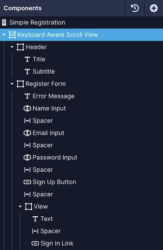
For example, a Signup screen has three input fields and two buttons. These are the contents of the screen that need to be wrapped inside the Keyboard Aware Scroll View in the Components tree.

Once you've wrapped all other components:
- Select the Keyboard Aware Scroll View from the components tree
- Go to the Configs tab (second tab) in the Properties Panel
- Enable Automatic Scroll property. If you are building your application for Android, also Enable on Android property
- You can also use the Extra Scroll Height property to provide an offset between the input field and the keyboard on the device
Style Properties
Style properties allow you to customize the look and feel of the component. Combinations of styles applied to components can be saved as Stylesheets to easily reuse styles throughout your app. Styles can also be set dynamically using Variables. To learn more about all the different styling properties and how they work, take a look at Intro to Styling.
Configuration Properties
Property | Description |
|---|---|
Component Name | To alter the name of the component. The name is reflected in the Components tree. Defaults to Keyboard Aware Scroll View. |
Shows Vertical Scroll Indicator | It displays a vertical scroll indicator when scrolling is enabled. Enabled by default. |
Allow Touch Events | The default behavior of the Keyboard is to dismiss when a touch component (for example, a Button) is pressed. This default behavior is set by the value never. Use the value Always when you want to continue to display the keyboard without dismissing the keyboard. In this scenario, to dismiss the keyboard after a touch component is pressed you will use the Dismiss Keyboard Action available on On Press trigger. |
View is inside TabBar | If the screen component is used inside a TabBar, enable this option so that it has an extra offset that represents the height of the TabBar. Disabled by default. |
Enable Automatic Scroll | When a Text Input component is focused, it will automatically scroll the position. Disabled by default. |
Extra Height | Adds an extra offset when focusing on the Text Input component. |
Extra Scroll Height | Adds an extra offset to the keyboard. |
Enable Reset Scroll To Coordinates | Enable this property to reset the scroll when the keyboard hides. |
Opening Time | Using this property, set a delay (in milliseconds) to open the keyboard before scrolling to a new position. The default delay is 250. |
Enable On Android | To use this component on an Android device, enable this option. Disabled by default. |
Data Properties
Conditional Display
You can conditionally display a component based on a given condition. Learn more about conditionally displaying components in the Conditional Display doc.
Updated over 1 year ago
