
Checkbox Row
Just like Checkbox, but accompanied by a label in a row format.
How to use
- Select the Checkbox row component in the Components tree.
- Go to the Data tab (third tab) in the Properties Panel.
- On Label, you can change the text body of the Checkbox row. This can be set through a variable that is created under Variables modal.
Just like in the Checkbox component, to manipulate the value of the Checkbox row in an API request, you will use the Screen variable mapped to its Data Source property value to send as the body of the API request action. The 'Data Source' property value is available in the third tab. By default each Checkbox row component you add has its own defined screen variable.
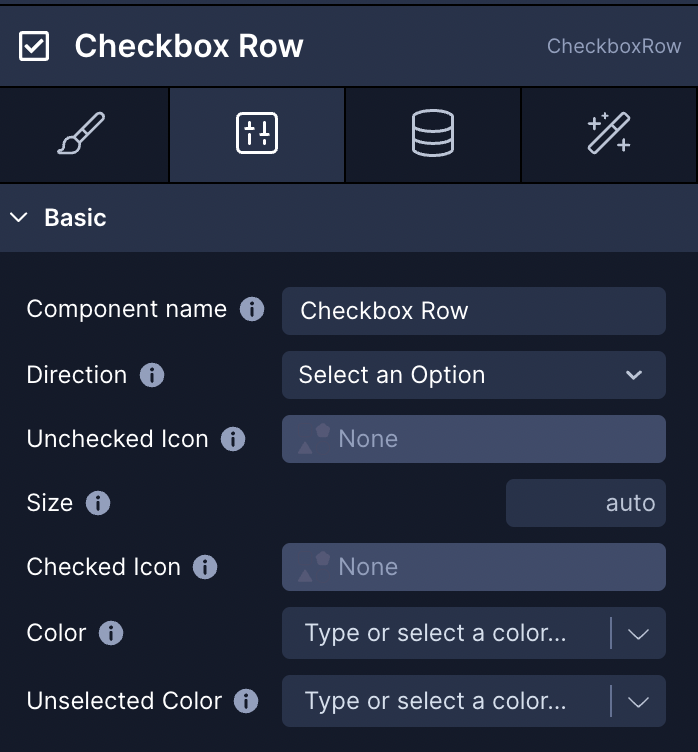
Style Properties
Style properties allow you to customize the look and feel of the component. Combinations of styles applied to components can be saved as Stylesheets to easily reuse styles throughout your app. Styles can also be set dynamically using Variables. To learn more about all the different styling properties and how they work, take a look at Intro to Styling.
Component Specific Styles
| Property | Description |
|---|---|
| Color | Set the background color of the checkbox for its selected state. |
| Unselected Color | Set the background color of the checkbox for its unselected state. |
| Size | Size of the checkbox. |
| Direction | Sets the direction so that the element will appear on the left or righ |
Configuration Properties
| Name | Description |
|---|---|
| Component name | To alter the name of the component. The name is reflected in the Components tree. Defaults to Checkbox row. |
Data Properties
Property | Description |
|---|---|
Data Source | Initialize the stateful component with a value from a data source. |
Label | Label to show with the checkbox row |
Disabled | Initialize by a boolean value from a data source. Remove check functionality, gray out the checkbox, and sets it as unselected. Accepted values: |
Checked Icon | Select an icon from the icon picker to display when for the selected state. |
Custom Checked Icon | Render an icon using a string of the icon's identifier. Overrides the 'icon' property. Full list of icons here. Ex: 'Foundation/align-right', 'Feather/check' |
Unchecked Icon | Select an icon from the icon picker to display when for the unselected state. |
Custom Unchecked Icon | Render an icon using a string of the icon's identifier. Overrides the 'icon' property. Full list of icons here. Ex: 'Foundation/align-right', 'Feather/check' |
Conditional Display
You can conditionally display a component based on a given condition. Learn more about conditionally displaying components in the Conditional Display doc.
Triggers
The Checkbox row component offers several ways for you to trigger Actions when a user interacts with it in your app.
| Name | Description |
|---|---|
| On Press | This Trigger will fire every time the Checkbox row is clicked/tapped and runs the associated Actions |
| On Check | This Trigger will fire every time the Checkbox row's state changes to 'checked' and runs the associated Actions |
| On Uncheck | This Trigger will fire every time the Checkbox row's state changes to 'unchecked' and runs the associated Actions |