
Loading Indicator
Animated loading indicators
The Loading Indicator displays a configurable loading animation
Style Properties
Style properties allow you to customize the look and feel of the component. Combinations of styles applied to components can be saved as Stylesheets to easily reuse styles throughout your app. Styles can also be set dynamically using Variables. To learn more about all the different styling properties and how they work, take a look at Intro to Styling.
Component Specific Styles
| Property | Description |
|---|---|
| Color | Set the color of the animation. |
| Size | Set the size of the animation in pt |
| Type | Set the type of loading animation to display (see below) |
Animation Types
Plane
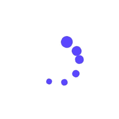
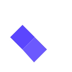
Chase
Bounce
Wave

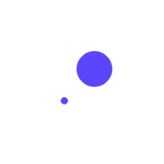
Pulse

Flow
Swing
Circle

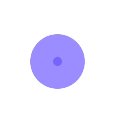
Circle Fade

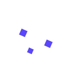
Grid

Fold
Wander
Configuration Settings
| Property | Description |
|---|---|
| Component Name | To alter the name of the component. The name is reflected in the Components tree. |
Data Properties
Conditional Display
You can conditionally display a component based on a given condition. Learn more about conditionally displaying components in the Conditional Display doc.
Showing/Hiding the Loading Indicator
In order to control when the Loading Indicator is displayed to your user you need to assign the Conditional Display value to a boolean (true/false) variable. Typically this would be an App Variable or Screen Variable named is_loading, for example.