
Breakpoints
A Breakpoint refers to a specific device width, or range of widths, to which styling can be applied. Each Breakpoint can have it's own independent styling or inherit styles from a smaller breakpoint
Best PracticeIt is recommended to start developing the app at the Mobile breakpoint and make changes to component styles at other Breakpoints as needed to make the design look better across different breakpoints.
Breakpoint Switcher
The Breakpoint Switcher is located in the top bar of the Builder. This lets you switch the Device Preview between Mobile, Tablet, Laptop, Desktop, Big Screen.
Breakpoint Styles
All styles have their own breakpoint-specific values which lets you really dial in your design to look just right on the most common screen sizes across Web, iOS, and Android. Super cool.
Component styles are inherited starting from the Mobile breakpoint and applied automatically to each larger breakpoint. That means that style props you set while at the Mobile breakpoint will be applied to larger breakpoints unless those styles are explicitly set on the other breakpoints. This is also true for the other breakpoints - their styles are applied to larger breakpoints automatically. So, you'll generally want to start at Mobile and adapt your design for each subsequent breakpoint.
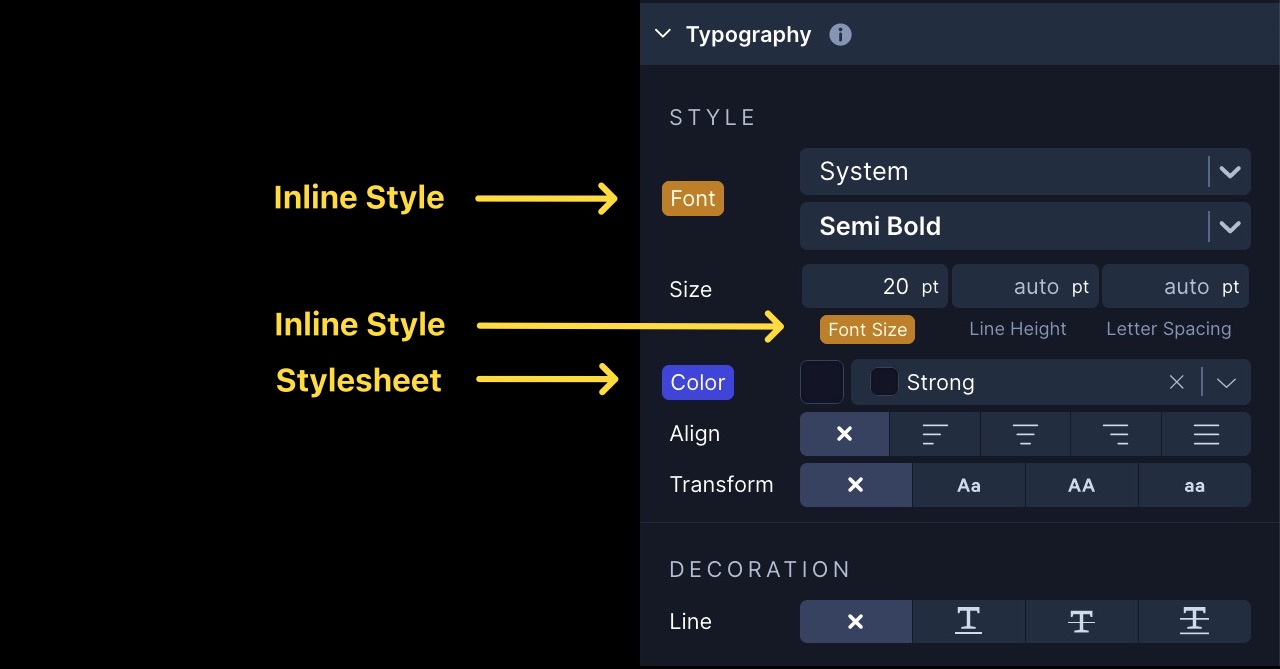
You can click the label to see info about where the style is coming from and reset it if needed.
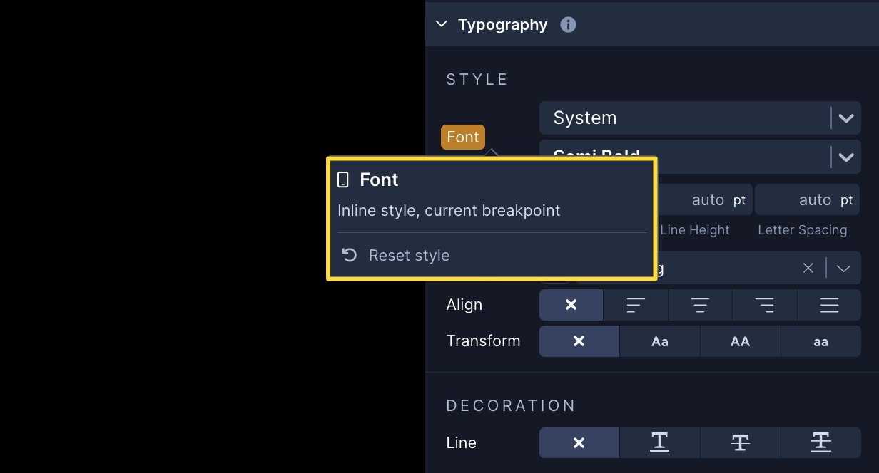
A yellow label indicates that a style prop value is being set directly on the selected component. A purple label tells you that the style value is coming from the Stylesheet that's applied to the selected component.
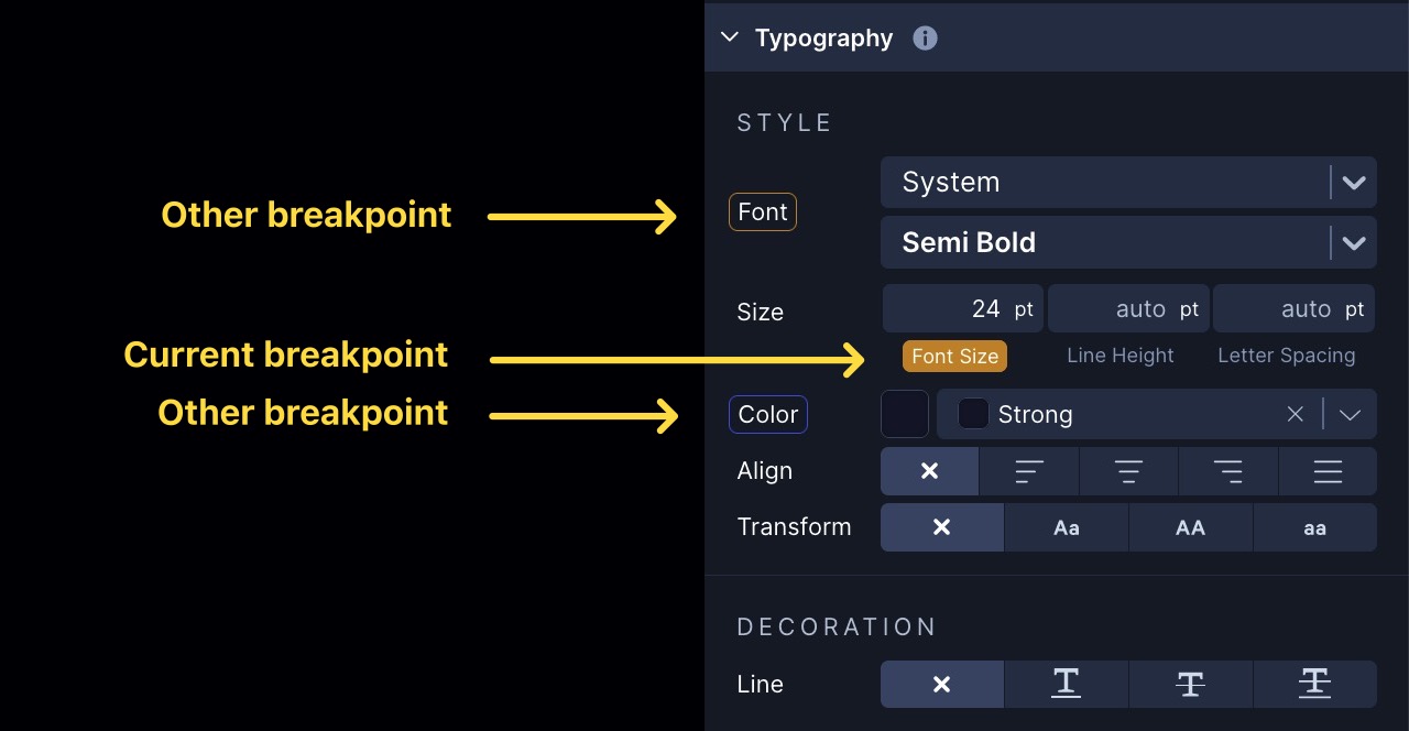
When you see a label with just a yellow or purple outline, that is letting you know that the style prop value is coming from a breakpoint other than the one you're currently previewing.
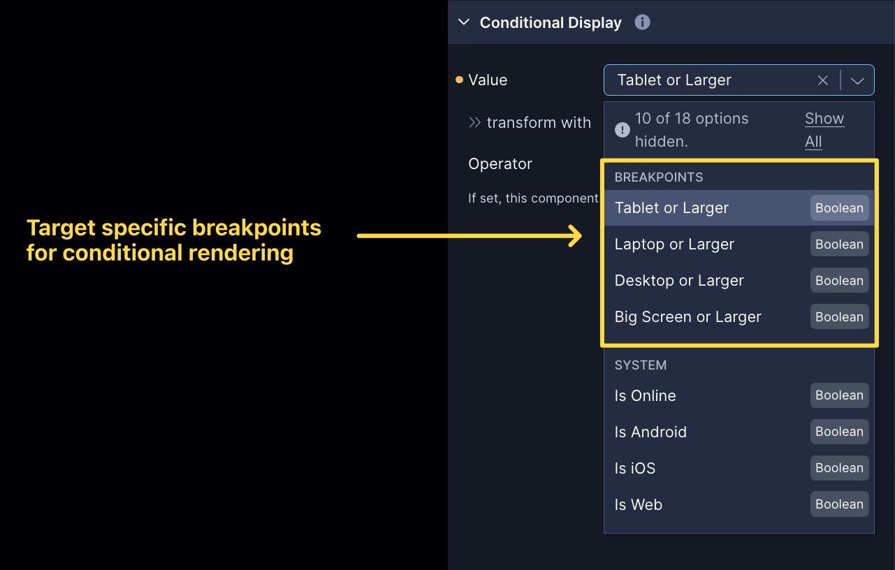
Breakpoint Variables
There is also a few System Variables for breakpoints so that you can conditionally display components or perform other logic based on which breakpoint your app is being viewed at.
Available Breakpoints
| Breakpoint Name | Applied Width | Simulators in Draftbit |
|---|---|---|
| Mobile | 0 and up | • iPhone 8 (390 x 844) • iPhone 8 Plus (414 x 736) • iPhone 11 Pro (375 x 812) • iPhone 12 (375 x 667) • iPhone 13 Pro (390 x 844) • iPhone 13 Pro Max (428 x 926) • iPhone 14 Pro (393 x 852) • iPhone 14 Pro Max (430 x 932) • iPhone 15 Pro (393 x 852) • iPhone 15 Pro Max (430 x 932) • Nexus 5 (360 x 640) • Pixel 4 (360 x 760) • Pixel 4 XL (480 x 1013) • Pixel 6 (360 x 800) • Pixel 6 Pro (480 x 1040) • Pixel 7 (412 x 732) • Pixel 7 Pro (412 x 892) • Web |
| Tablet | 480 and up | • iPad (810 x 1080) • iPad Air (820 x 1180) • iPad Pro 12.9in (1024 x 1366) • Galaxy Tab 7 (640 x 1024) • Web |
| Laptop | 992 and up | • Web |
| Desktop | 1440 and up | • Web |
| Big Screen | 1920 and up | • Web |