An Audio Player component is used to play audio. It accepts a URL as its value.
The Audio Player has a default UI that has some customization options. You can also disable the Audio Player UI and create your own using any of the available components and Actions.
Style properties allow you to customize the look and feel of the component. Combinations of styles applied to components can be saved as Stylesheets to easily reuse styles throughout your app. Styles can also be set dynamically using Variables. To learn more about all the different styling properties and how they work, take a look at Intro to Styling.
| Property | Description |
|---|
| Completed track color | Color of the completed portion of the track |
| Hide duration | Whether the current duration text should be hidden or not |
| Hide toggle playback icon | Whether the toggle playback icon/button should be hidden or not |
| Hide Slider | Whether the slider should be hidden or not |
| Remaining track color | Color of the remaining portion of the track |
| Thumb color | Select or create a color |
| Toggle playback icon color | Color of the toggle playback icon (pause/play icon) |
| Toggle playback icon size | Size of the toggle playback icon (pause/play icon) |
| Property | Description |
|---|
| Component Name | To alter the name of the component. The name is reflected in the Components tree. Defaults to Audio Player. |
| Mode | The mode of the audio player. 'interface' to render an interface for the player, 'headless' to render nothing an be controlled only thorough actions and triggers. |
| Loop | Automatically replays the source from the beginning once the end is reached. |
| Interruption mode | How the player should interact with the audio from other apps |
| Plays in background | Determines if audio playback should stay active even when the app goes into background |
| Volume | Sets the default volume level for the Audio Player. Accepts a number from from 0.0 (muted) to 1.0 (full volume). |
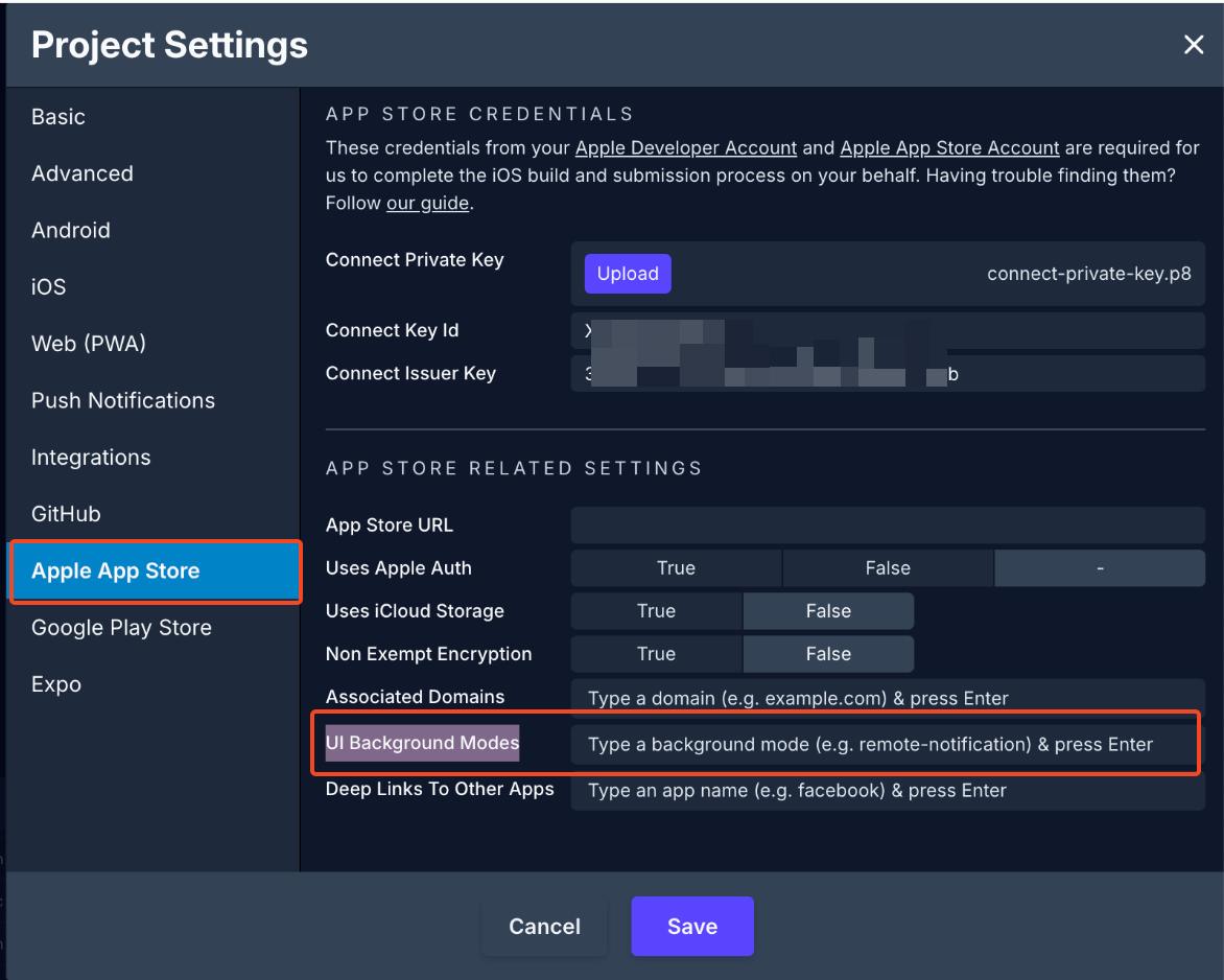
⚠️When using the Plays in background prop on an Audio Player component, iOS automatically adds the Background Modes capability in Project Settings:

| Property | Description |
|---|
| Plays in silent mode | Whether audio should play in silent mode or not |
| Property | Description |
|---|
| Plays through earpiece | Whether audio should be routed to the earpiece or not |
You can conditionally display a component based on a given condition. Learn more about conditionally displaying components in the Conditional Display doc.
| Trigger | Description |
|---|
| On Playback Status Update | Starts the action when playback status is updated |
| On Playback Finish | Starts the action when playback is finished |
| Action | Description |
|---|
| Play Media | Plays the media associated with the selected Target Component |
| Pause Media | Pauses the media associated with the selected Target Component |
| Seek Media Position | Updates play play position for the media associated with the selected Target Component in milliseconds |
| Toggle Media Playback | Plays or pauses the media associated with a selected Target Component depending on the current playback state. |

