Live Preview
Preview your app in real-time as you make changes

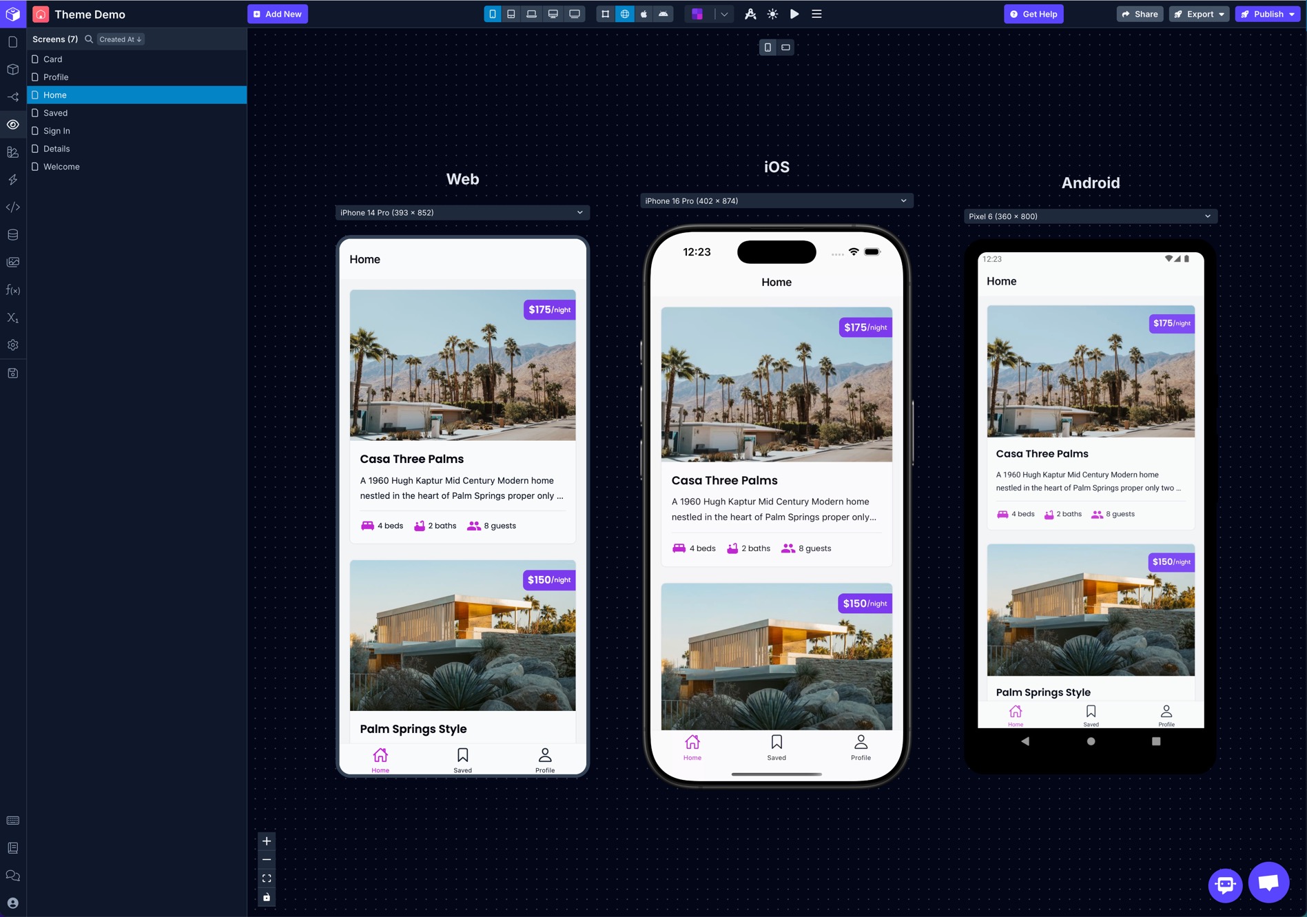
3-in-1 app preview to run and test your app on web, iOS, and Android
You can preview your app in several different ways while building in Draftbit. Changes that you make in the Builder are immediately reflected in the previews.
To switch between different preview modes, use the selector in the top bar of the Builder.
By default the preview is set to the Mobile Breakpoint, but you can switch to larger ones to preview on tablet, laptop, and desktop screen sizes.
You can also choose which Environments to use when previewing your app.
Draft Preview
The Draft preview is the default preview mode. In this mode, the components can be selected in the preview which will highlight the component in the component tree and also update the Properties panel on the right side of the Builder. It does not let you fully preview the functionality of your app.
Web Preview
The Web preview lets you see and interact with your app just as it would be as a published PWA.
iOS Simulator Preview
The iOS preview lets you see and interact with your app just as it would be as a published iOS app.
See the list of available device simulators below.
Android Simulator Preview
The Android preview lets you see and interact with your app just as it would be as a published Android app.
See the list of available device simulators below.
Physical Device Preview
In addition to the live previews available directly in the Builder, you can also live preview your app on physical iOS and Android devices using the Draftbit Preview app.
- Download the Draftbit Preview app to your device. You can download it for iOS and Android.
- Click the ▶️ Live Preview button in the top bar of the Builder. It will open the Live Preview session QR code.
- Open the Draftbit Preview app on your device, tap the 'Scan Project' button, and scan the QR code in the Builder.
- When detected, this QR code will open the project in the Draftbit Preview app and will let you (or anyone you know) live preview the project you're working on.
Simulators
For each of the iOS and Android previews, you can select from a range of devices. The native previews are only available for Mobile and Tablet Breakpoints.
Type | Mobile | Tablet |
|---|---|---|
iOS | • iPhone 8 (390 x 844) • iPhone 8 Plus (414 x 736) • iPhone 11 Pro (375 x 812) • iPhone 12 (375 x 667) • iPhone 13 Pro (390 x 844) • iPhone 13 Pro Max (428 x 926) • iPhone 14 Pro (393 x 852) • iPhone 14 Pro Max (430 x 932) • iPhone 15 Pro (393 x 852) • iPhone 15 Pro Max (430 x 932) | • iPad (810 x 1080) • iPad Air (820 x 1180) • iPad Pro 12.9in (1024 x 1366) |
Android | • Nexus 5 (360 x 640) • Pixel 4 (360 x 760) • Pixel 4 XL (480 x 1013) • Pixel 6 (360 x 800) • Pixel 6 Pro (480 x 1040) • Pixel 7 (412 x 732) • Pixel 7 Pro (412 x 892) | • Galaxy Tab 7 (640 x 1024) |
Updated about 1 year ago
