Link
A Link is a button component without any background or border. You can use it in places where your app screens require a borderless button. You can use it to Trigger Actions.
Style Properties
Style properties allow you to customize the look and feel of the component. Combinations of styles applied to components can be saved as Stylesheets to easily reuse styles throughout your app. Styles can also be set dynamically using Variables. To learn more about all the different styling properties and how they work, take a look at Intro to Styling.
Component Specific Styles
| Property | Description |
|---|---|
| Selection Color | Android only. The highlight color of the text. |
Configuration Properties
| Property | Description |
|---|---|
| Component Name | To alter the name of the component. The name is reflected in the Components tree. Defaults to Link. |
| Max # of Lines | Set the maximum number of lines to be displayed when Truncate Text is set. |
| Truncate Text | Determine how the text will be truncated if the Max # of Lines property is set in conjunction. |
| Disabled | Removes button functionality. |
How to Truncate Text on a Link component?Here are the instructions on customizing a Link component using
Truncate TextandMax # of Linesproperties.
Data Properties
| Property | Description |
|---|---|
| Input Text | The text to display for the link |
Conditional Display
You can conditionally display a component based on a given condition. Learn more about conditionally displaying components in the Conditional Display doc.
Triggers
| Name | Description |
|---|---|
| On Press | Runs the Actions when the component is pressed |
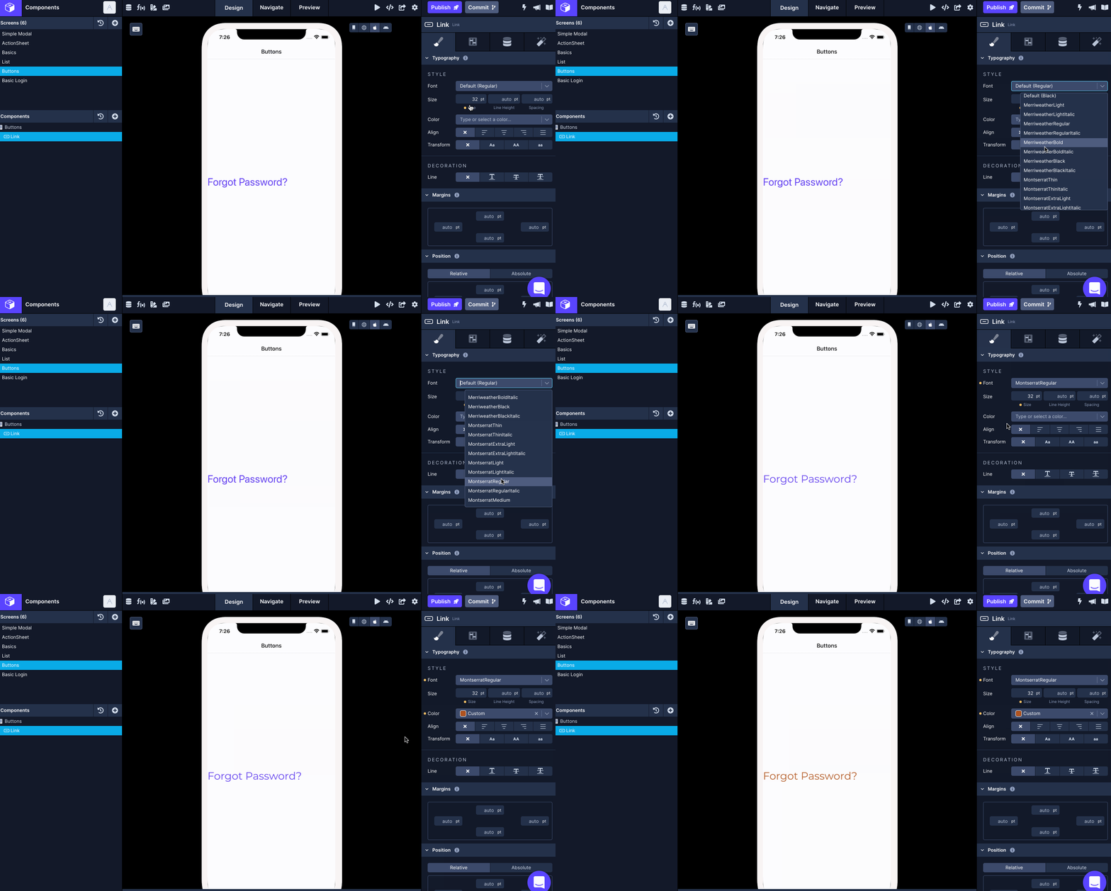
Changing the Label color, Font, and Font Size
To change the font, font size, or color on a Link component:
- Select the Button Outline component in the Components tree.
- Go Styles tab (first tab) in the Properties Panel > Style.
- Add the desired value for the Color, Font, and Size property from the color picker or enter a custom color value in hexadecimal or rgba format.

Updated over 1 year ago
