

Settings
All of your app-level settings are located in the settings modal. You can open it from the left menu bar.
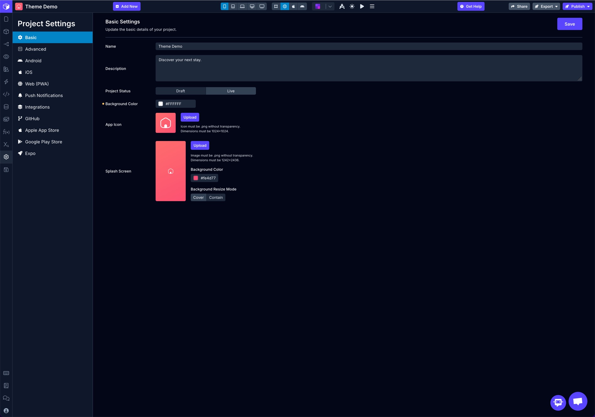
Update the basic details of your project.
| Property | Description |
|---|---|
| Name | Set the name for your app. This name will also be the name of the folder that is downloaded when you export your project. |
| Description | Add more information about your application and state its purpose. |
| Project Status | Apps are set to Draft by default. To publish an app, it must be set to Live. Once set to Live, and app cannot be set back to Draft. |
| App Icon | Upload a .png image to use as your app’s icon that will be displayed on a phone’s home screen. Additionally, the icon will be displayed in Draftbit on the Dashboard. |
| Splash Screen | Upload a .png image that will be displayed while the application is loading. |
| Background Color | The colour will appear on the loading screen if a Splash Screen is not uploaded. |
| Background Resize Mode | Cover: The image is resized to fill the container while retaining its proportions, even if the container is larger than the dimensions of the image. Contain: The image is resized so that the picture fits within the container and is fully visible, even if that means the image will not fill the entire container. |
Advanced
Section titled “Advanced”Configure the advanced settings for your app.
General
Section titled “General”| Property | Description |
|---|---|
| Scheme | Allows you to define a URL scheme to link into your app. To use Deep Linking in your app, you will need to define a Scheme. From other apps or links, the value of the Scheme property is used to open the app. For example, if you set the scheme myapp://, then any myapp://URL will open your app when tapped on that link. |
| Slug | If you are planning on publishing your application on Expo, the slug refers to the application’s URL ending. Since this will be used in a URL, make sure to separate words with ’-’ instead of spaces. An example: https://expo.io/@community/my-draftbit-app where the slug is my-draftbit-app. |
| Project ID | A unique project ID for your app |
| Platform Specific App | Define if your application supports Android, iOS, Web or All platforms. Defaults to All. |
| Preview App | Switch between which preview app is supported during development. Defaults to Draftbit Live Preview |
Styling
Section titled “Styling”| Property | Description |
|---|---|
| Force Orientation | Select how your application is oriented on the screen. Defaults to ‘Default’ means the application will not be constrained to just one mode, either portrait or landscape. |
| User Interface Style | Configuration to force the app always to use the light or dark user-interface appearance, such as “dark mode”, or make it automatically adapt to the system preferences. Defaults to Light. |
Settings
Section titled “Settings”| Property | Description |
|---|---|
| Offline Mode | Used to display a message to the app user when the application goes offline or there is no internet availability. Provides three options to select from: None (default), Banner, and Full. |
| Offline Mode Message | Enter a custom message to be displayed when device is offline and Offline Mode is enabled. |
Android
Section titled “Android”These settings are used to configure Android versions of your project.
Styling
Section titled “Styling”| Property | Description |
|---|---|
| Background Color | To set the Background color of the app. Defaults to white (#ffffff) |
| User Interface Style | Configuration to force the app always to use the light or dark user-interface appearance, such as “dark mode”, or make it automatically adapt to the system preferences. Defaults to Light. |
Adaptive Icon
Section titled “Adaptive Icon”The Android Adaptive Icon is formed from two separate layers — a foreground image and a background color or image. This allows the OS to mask the icon into different shapes and also supports visual effects. For Android 13 and later, the OS supports a themed app icon that uses a wallpaper and theme to determine the color set by the device’s theme.
| Property | Description |
|---|---|
| Foreground Image | Specify the foreground image. Must be a.png file. |
| Monochrome Image | Specify the foreground image. Must be a.png file. |
| Background Color | Specify a background color. Default is white |
Status Bar
Section titled “Status Bar”| Property | Description |
|---|---|
| Bar Style | Select bar style: Light Content or Dark Content. |
| Background Color | Update the Android app status bar color from here. |
| Hidden | The status bar can be made hidden using this setting. |
| Translucent? | Whether the Status bar needs to be translucent or not. |
Navigation Bar
Section titled “Navigation Bar”| Property | Description |
|---|---|
| Bar Style | Select bar style whether needed to be Light Content or Dark Content. |
| Visible? | The navigation bar Visibility setting can be updated from here: * leanback:* This behavior hides the navigation bar until the user interacts with the screen. * immersive:* This behavior keeps the navigation bar hidden until the user swipes upwards from the bottom edge of the screen where the navigation bar would typically reside. * *sticky-immersive: **This behavior is similar to immersive, with the key difference being that the navigation bar remains partially visible even when hidden. |
| Background Color | The background color of the Navigation bar can be updated from here. |
Permissions
Section titled “Permissions”Define what permissions the app will ask for when installed. All permissions are disabled by default. You will have to set permissions manually for each device functionality.
If your application uses a device/hardware feature (an example: Camera), it is required to enable that permission under this section before publishing the app to the Google Play Store.
You can enter a custom message for each notification.
These settings are used to configure iOS versions of your project.
Styling
Section titled “Styling”| Property | Description |
|---|---|
| Background Color | To set the Background color of the app. Defaults to white (#ffffff) |
| User Interface Style | Configuration to force the app always to use the light or dark user-interface appearance, such as “dark mode”, or make it automatically adapt to the system preferences. Defaults to Light. |
Device Support
Section titled “Device Support”| Property | Description |
|---|---|
| Supports Tablet | Define if your application supports tablets. Defaults to No. |
| Tablet Only? | If your application supports tablets only. Defaults to No. |
| Require Fullscreen | Defaults to No. |
Permissions
Section titled “Permissions”Define what permissions the app will ask for when installed. All permissions are disabled by default. You will have to set permissions manually for each device functionality.
Note: If your application uses a device/hardware feature (an example: Camera), it is required to enable that permission under this section before publishing the app to the Google Play Store.
You can enter a custom message for each notification.
Web (PWA)
Section titled “Web (PWA)”These settings are used to configure Web (PWA) versions of your project.
PWA Publishing
Section titled “PWA Publishing”| Property | Description |
|---|---|
| Show PWA Wrapper | Defaults to Yes. |
Settings
Section titled “Settings”| Property | Description |
|---|---|
| Force Orientation | Select the preferred orientation of the app from the available options: 1. Any 2. Natural 3. Landscape 4. Landscape Primary 5. Landscape Secondary 6. Portrait 7. Portrait Primary 8. Portrait Secondary |
| Display Mode | Select the prefered display mode of PWA from the below options: 1. Fullscreen 2. Standalone 3. Minimal UI 4. Browser |
| Prefer Related App? | Defaults to No. |
Styling
Section titled “Styling”| Property | Description |
|---|---|
| PWA Theme Color | Sets the theme_color option in the PWA manifest file. Used to customize the PWA’s status bar color. Leave blank to use default system black/white depending on whether dark mode is enabled on the device. |
| Background Color | Sets the background_color option in the PWA manifest file. This color appears in the application window before your application’s stylesheets have loaded. |
| Bar Style | Select the Bar Style: Default, Black or Black Translucent. |
Push Notifications
Section titled “Push Notifications”Configure the push notification settings for your app.
General
Section titled “General”| Property | Description |
|---|---|
| Color | The colour of the Notification bar can be updated from here. |
| Should Show Alert | Shows the notification alert whenever a notification is delivered. By default, it is enabled. |
| Should Play Sound | Plays the device’s notification sound when the notification is delivered. By default, it is disabled. |
| Should Set Badge | Display a badge depending on the number of notifications. By default, it is disabled. |
| Always Clear Badge? | Clears the badge of notification. By default, it is disabled. |
| Property | Description |
|---|---|
| iOS Display in Foreground | You can enable the iOS notification Display while the app is in Foreground. Defaults to NO. |
| Allow Background Push? | Allows the app to deliver notifications in the background. By default, it is disabled. |
Android
Section titled “Android”| Property | Description |
|---|---|
| Android Notification Mode | Set a notification appearance mode for Android devices. Defaults to Default that displays an expanded notification. The Collapse mode displays a notification in non-expanded mode. |
| Android Notification Icon | Set a custom icon to use for push notifications on Android devices. For your notification icon, make sure you follow Google’s design guidelines (the icon must be all white with a transparent background and 96px x 96px) or else it may not be displayed as intended. |
Integrations
Section titled “Integrations”These keys are used to enable external integrations in your project.
Google Maps
Section titled “Google Maps”| Property | Description |
|---|---|
| Android Maps Key | Add Google Maps Key here to enable Google maps Android. |
| iOS Maps Key | Add Google Maps Key here to enable Google maps on iOS. |
| Web Maps Key | Add Google Maps Key here to enable Google maps on web |
OpenAI
Section titled “OpenAI”Use your own API key for the Code Assistant and Image Generation.
| Property | Description |
|---|---|
| OpenAI API Key | Add an OpenAI API key here to use AI features beyond plan limits |
GitHub
Section titled “GitHub”Connect your GitHub repo to Draftbit and commit code directly to a branch.
| Property | Description |
|---|---|
| Repository URL | The repository can live under a user or organization account. |
| Branch Name | Add the Branch Name here. Make sure the branch exists in your repository. |
| GitHub Token | Add GitHub token here. Create a personal access token with “repo” scopes here. |
Apple App Store
Section titled “Apple App Store”This information is required for us to publish to the Apple App Store on your behalf.
Build Configuration
Section titled “Build Configuration”Please choose a unique package name for your app, preferably using the reverse-DNS name structure. For example, if the domain you will use for this app is example.com, set your package name to com.example.appname
| Property | Description |
|---|---|
| Bundle Identifier | The app bundle identifier is to be updated here. |
| App Store App ID | add App Store App ID here. |
| iOS Build Type | Select build type from: Build, Publish or Custom. |
App Store Credentials
Section titled “App Store Credentials”These credentials from your Apple Developer Account and Apple App Store Account are required for us to complete the iOS build and submission process on your behalf. Having trouble finding them? Follow our guide.
| Property | Description |
|---|---|
| Connect Private Key | Generating an API key allows you to configure, authenticate, and use one or more Apple services for that key. Keys don’t expire, but can’t be modified to access more services once created. You can have a maximum of 50 active keys at a time. |
| Connect Key Id | Connect key ID is the ID of Connect private key. |
| Connect Issuer Key | Identifies the issuer who created the authentication token. |
App Store Related Settings
Section titled “App Store Related Settings”| Property | Description |
|---|---|
| App Store URL | Need to add the app store URL of the app here. |
| Uses Apple Auth | A boolean indicating if the app uses Apple Sign-In. Defaults to NO. |
| Uses iCloud Storage | A boolean indicating if the app uses iCloud Storage. Defaults to NO. |
| Non-Exempt Encryption | Apple App Store Connect prompts you to select the type of encryption algorithm your app implements. This is known as Export Compliance Information. It is asked when publishing the app or submitting for TestFlight. When using expo-secure-store, you can set the value to No Setting this property automatically handles the compliance information prompt. |
| Associated Domains | An array that contains Associated Domains for the standalone app. |
| UI Background Modes | Allows configuring a notification in background mode. |
| Deep Links To Other Apps | Allows Deep Linking to another application. |
Google Play Store
Section titled “Google Play Store”This information is required for us to publish to the Google Play Store on your behalf.
EXPO EAS Account
Section titled “EXPO EAS Account”We use Expo EAS to complete the Android build and submission process on your behalf. You will need to create a free Expo account to get started. Once your account has been created, please invite buildservices@draftbit.com to your Expo account.
| Property | Description |
|---|---|
| Expo Account Name | Need to add the expo account name here. |
| What kind of build? | Select the build option: 1. Build 2. Build & Submit 3. Disabled |
Build Configuration
Section titled “Build Configuration”Please choose a unique package name for your app, preferably using the reverse-dns name structure. For example, if the domain you will use for this app is example.com, set your package name to com.example.appname.
| Property | Description |
|---|---|
| Package Name | Need to add the package name here. |
| Release Status | To select the release status of the app: 1. In Progress 2. Draft 3. Halted 4. CompletedDefaults to Draft. |
Google Service Account
Section titled “Google Service Account”We require this to upload builds to your Google Play Console. Note: Google requires you manually upload a binary to any new app you create. We’ll handle uploading all future binaries using this key. Having trouble? Follow our guide.
| Property | Description |
|---|---|
| Service Account File | Need to upload the Service account file here. |
Play Store Related Settings
Section titled “Play Store Related Settings”| Property | Description |
|---|---|
| Play Store URL | To add the play store URL. |
| Allow Backup | Allows users’ app data to be automatically backed up to their Google Drive. Defaults to NO. |
We use Expo and Expo EAS to build, preview and publish your application. Expo is regularly updated with new features, performance improvements and bug fixes. We advise using the recommended version of Expo.
Update Expo Version
Section titled “Update Expo Version”Select the version of Expo you want to use in previews, publishing, and code export.
| Property | Description |
|---|---|
| Expo version | Select the Expo version of the app. Defaults to latest available version. |