

Picker
The Picker component is a type of input that lets the user select an item from a list of options. You’ve used them a million times on websites and apps. You might also know them as Dropdowns or Select inputs.
In some cases, the Picker might be part of a longer form with other types of inputs whose data gets sent to your backend using a REST API Endpoint when a Button is pressed. For example, to let users select a size, color, and quantity of a shirt from predefined options in an online store you likely want a Picker.
It could also be used on it’s own as a way to let users sort a list or maybe switch between different settings, for example. Any time you need to let the user select from a list of specific options and store their selection, the Picker is a good choice.
How it works
Section titled “How it works”When you add any new input component to a Screen Draftbit automatically creates a new Screen Variable and associates that variable with the input component’s Data Source prop in the Data tab of the right panel.
A Set Variable Action is also added to the component’s On Value Change Trigger which updates the Screen Variable that was automatically created for the input.
With this default setup, the input will update the value held by the variable whenever an item is selected from the available options. Of course, you can rename these variables to whatever you like and adjust the created Action flow in the Action Editor.
Picker Options
Section titled “Picker Options”The options that are displayed to the user are passed to the Picker as a JSON object array where each object in the array has a label and value key. In this case, the label will be shown to the user and the value will be available to the Actions on the Picker’s Triggers.
The most flexible and convenient way to pass options into the Picker component is to have a REST API Endpoint that returns the options already formatted. Using this approach means you don’t need to worry about reformatting in the app and also allows you to dynamically change those options from your backend.
Alternatively, you can also enter the object array as the default value of a Variable and pass that variable to the Picker, or enter it directly in the Picker’s Options Data prop. You can even get more complicated and store your options in a File, then populate a variable with those values using a Screen’s On Screen Load Trigger.
Example
Section titled “Example”[ { "label": "Red", "value": "#e11d48" }, { "label": "Yellow", "value": "#facc15" }, { "label": "Blue", "value": "#2563eb" }]Picker Modes
Section titled “Picker Modes”Native mode
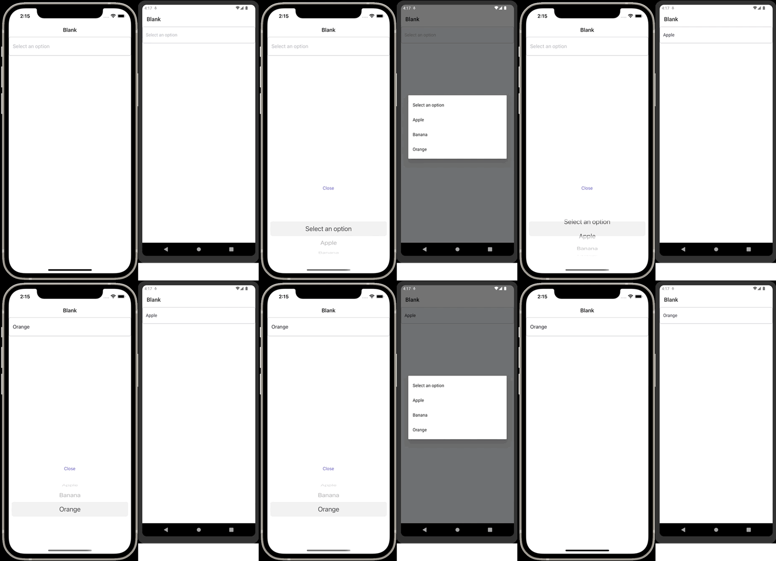
Section titled “Native mode”This mode provide a seamless, platform-specific user experience. It has the native look and feel of pickers on Web, iOS, and Android. See below for an example.
Dropdown mode
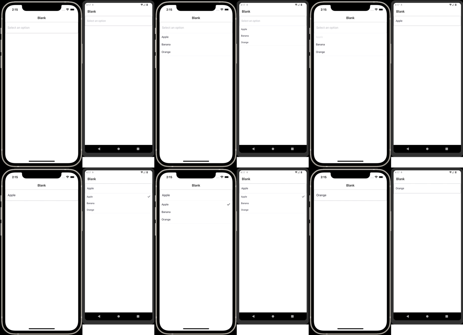
Section titled “Dropdown mode”This mode creates a dropdown-style interface as commonly seen on the web. This mode ensures a consistent UI across iOS and Android platforms. See below for an example.
In this mode you can use the Picker Item to further customize how the options are styled in the dropdown.
Style Properties
Section titled “Style Properties”Style properties allow you to customize the look and feel of the component. Combinations of styles applied to components can be saved as Stylesheets to easily reuse styles throughout your app. Styles can also be set dynamically using Variables. To learn more about all the different styling properties and how they work, take a look at Intro to Styling.
Component Specific Styles
Section titled “Component Specific Styles”| Name | Description |
|---|---|
| Icon Size | Size of the icon. |
| Left Icon Mode | Allows you to select the placement of the left icon, if one is selected. Inset displays the icon inside the border of the picker and outset displays the icon outside of the picker border. |
| Appearance | Appearance of the picker modal. Available values: sold or underlined. |
| Placeholder Text Color | Allows you to set the color of the placeholder text. |
| Left Icon Name | The name of the icon selected from the icon picker to be displayed on the left. |
| Right Icon Name | The name of the icon selected from the icon picker to be displayed inset on the right. |
| Selected Icon Name | The icon to display on selected items. (dropdown mode only) |
| Selected Icon Color | The color of the icon displayed on selected items. (dropdown mode only) |
| Selected Icon Size | The size of the icon displayed on selected items. (dropdown mode only) |
| Dropdown Background Color | The background color of the dropdown container. (dropdown mode only) |
| Dropdown Border Color | The border color of the dropdown container. (dropdown mode only) |
| Dropdown Border Width | The border width of the dropdown container. (dropdown mode only) |
| Dropdown Border Radius | The border radius of the dropdown container. (dropdown mode only) |
Configuration Properties
Section titled “Configuration Properties”| Name | Description |
|---|---|
| Component name | To alter the name of the component. The name is reflected in the Components tree. Defaults to Picker. |
| Placeholder | Placeholder text to display in the picker when the user has not made a selection. |
| Assistive Text | Helper text to be displayed underneath the picker, useful for providing additional instructions. |
| Auto Dismiss Keyboard | Automatically dismiss keyboard when Picker is opened |
| Mode | Choose between native ,dropdown and dropdown-modal modes. Default: native native - shows the native platform picker\ dropdown - shows a standard dropdown menu across all platforms that is customizable. dropdown-modal shows the picker within a modal that appears on top of all other components. |
Data Properties
Section titled “Data Properties”| Name | Description |
|---|---|
| Options | Here you are able to pass an array of objects representing each option to display. The source of data can be static or remote (coming from an API). For example, you can pass the options as [{"label":"foo","value":42},{"label":"bar","value":126}]. The label is the key for each value displayed in the Picker component. The value of the selected option will be available to Triggers on the component. |
| Error | When enabled, an outline matching the theme’s defined Error color will appear around the picker. Must be a boolean value: true or false. |
| Disabled | Whether the picker should be disabled. Will prevent selection and show a greyed out state. |
| Label | The label of the picker which is displayed directly above the selected date. |
| Data Source | Initialize the stateful component with a value from a data source. |
Conditional Display
Section titled “Conditional Display”You can conditionally display a component based on a given condition. Learn more about conditionally displaying components in the Conditional Display doc.
Triggers
Section titled “Triggers”| Name | Description |
|---|---|
| On Value Change | Runs when the value is changed |
Examples
Section titled “Examples”Native mode
Section titled “Native mode”This mode provides a seamless, platform-specific user experience. It has the native look and feel of pickers on Web, iOS, and Android.
Dropdown mode
Section titled “Dropdown mode”This mode creates a dropdown-style interface as commonly seen on the web. This mode ensures a consistent UI across Web, iOS, and Android platforms. You can further customize the dropdown items using the Picker Item component.
Dropdown-modal mode
Section titled “Dropdown-modal mode”This mode is similar to dropdown mode. It’s useful in situations where the picker options could become hidden by other components, as can happen with dropdown mode, ensuring better visibility and user experience.