Blur View
A Blur View component is placed adjacent to the Component whose content you want to blur. It also wraps children components such as Text. The content of a child component on a Blur View will be displayed above to the adjacent component.
Style Properties
Section titled “Style Properties”Style properties allow you to customize the look and feel of the component. Combinations of styles applied to components can be saved as Stylesheets to easily reuse styles throughout your app. Styles can also be set dynamically using Variables. To learn more about all the different styling properties and how they work, take a look at Intro to Styling.
Component Specific Styles
Section titled “Component Specific Styles”| Property | Description |
|---|---|
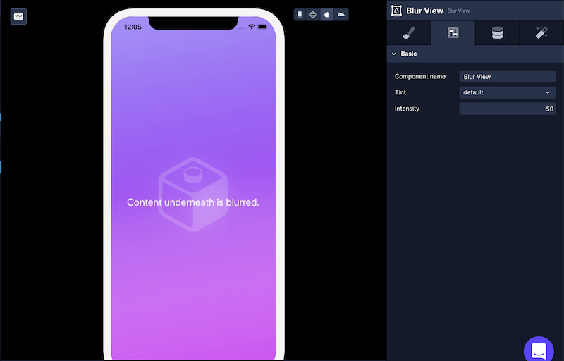
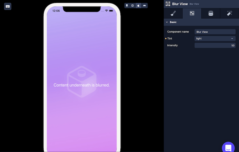
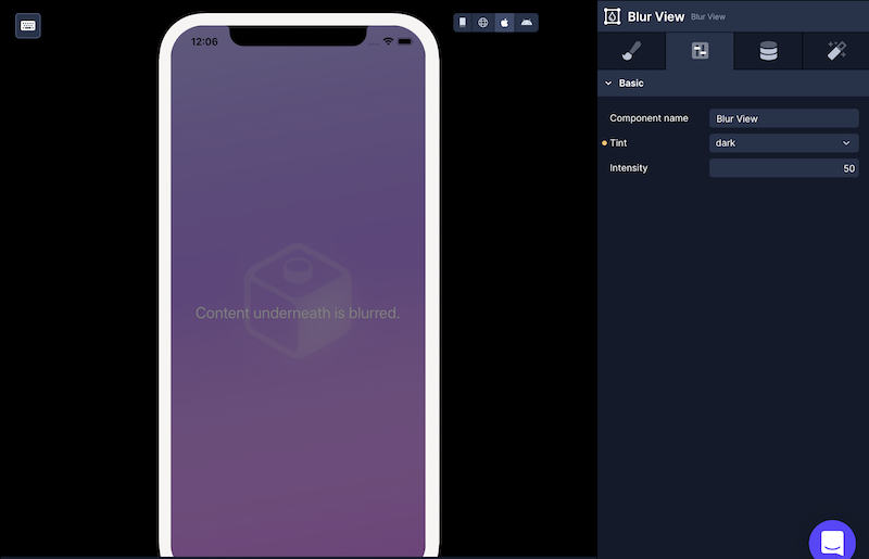
| Tint | A tint is a mode that is applied to the whole blur view. Select the type of tint to be applied to the blur view. |
| Intensity | A number between 1 and 100 that controls the how intense the blur is. Defaults to 50. |
Configuration Properties
Section titled “Configuration Properties”| Property | Description |
|---|---|
| Component Name | To alter the name of the component. The name is reflected in the Components tree. Defaults to Blur View. |
| Blur Method | Blur method to use on Android. none - falls back to a semi-transparent view. dimezisBlurView - uses native blur implementation but may impact performance during transitions. |
Data Properties
Section titled “Data Properties”Conditional Display
Section titled “Conditional Display”You can conditionally display a component based on a given condition. Learn more about conditionally displaying components in the Conditional Display doc.
Modifying Tint
Section titled “Modifying Tint”There are three types of values for Tint property available:
defaultlightdark
Modifying Intensity
Section titled “Modifying Intensity”To increase or decrease the blur effect, you can modify the value of the Intensity property.
In the example below, the intensity is set to 100.

In the example below, the intensity is set to 30.
