

AI App Builder
Switch to Visual Editor using the
icon in the main menu.
AI is at the heart of Draftbit, allowing you to use natural language to instruct the AI what to build without needing to write a single line of code.
The Visual Editor is the full design surface where you can chat with the AI Agent, adjust component styles, preview changes in real-time, manage screens, and more. The Builder’s default Home view opens a focused workspace with the preview, agent, and editor panel; open Visual Editor when you need the Screens list and component tree. Home opens your app’s home screen, so the Styles, Properties, Code, and Config tabs are ready without switching views.
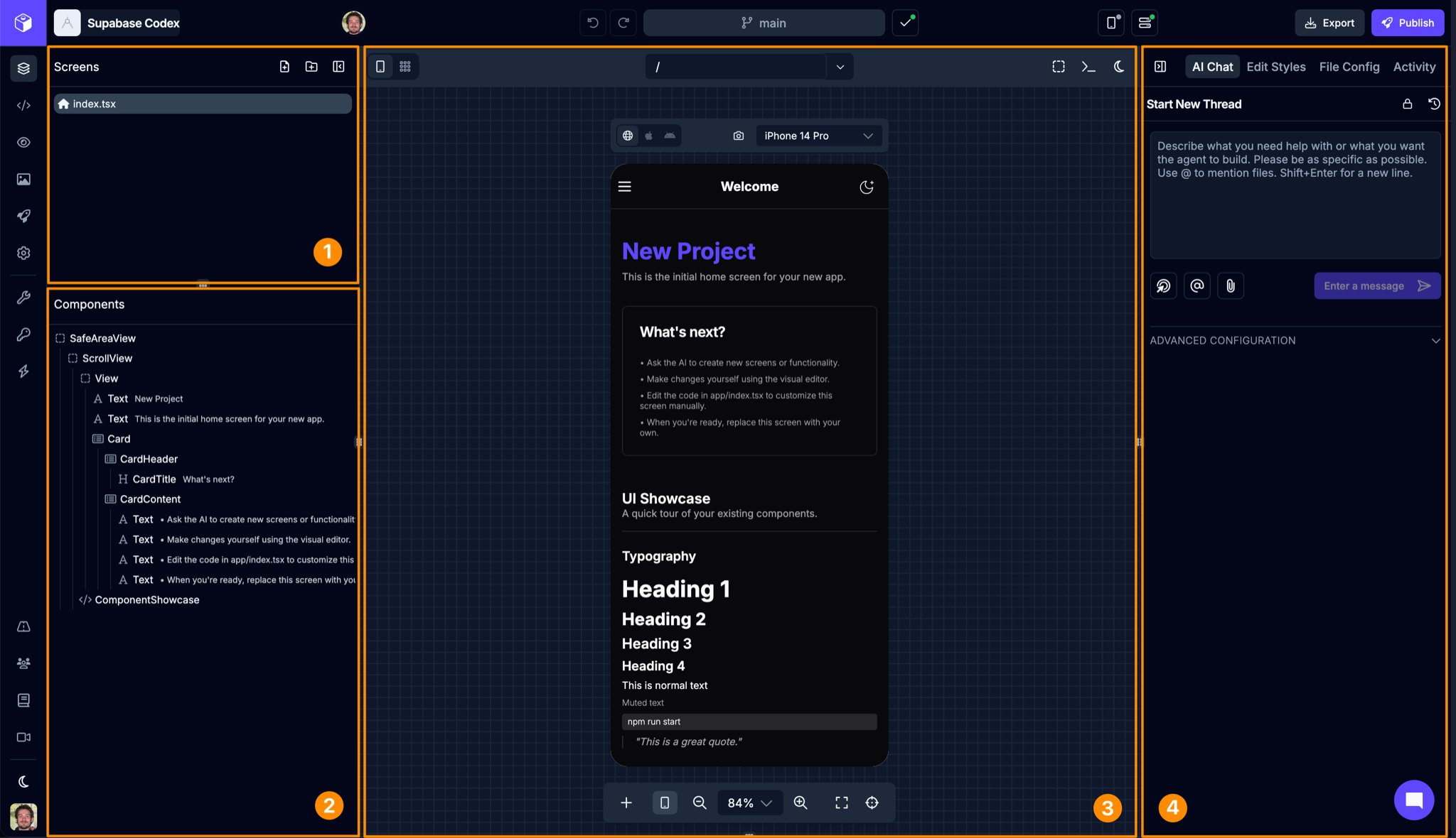
| # | Name | Description |
|---|---|---|
| 1 | Screens List | A list of all the screens in your app |
| 2 | Component Tree | The components used on the selected screen |
| 3 | Preview Panel | A canvas where you can preview your app on different devices |
| 4 | Utility Panel | Access AI chat, component styling, and other functionality |
Screens List
Section titled “Screens List”Screens are the base element of your app and contain any number of components that make up the user interface (UI). Every app needs at least one screen. The screens in your app are listed here. You can also add more screens or folders directly. The Screens List is also where your app’s navigation structure is managed, since the way screens and folders are arranged determines the routes and flows available in your app.
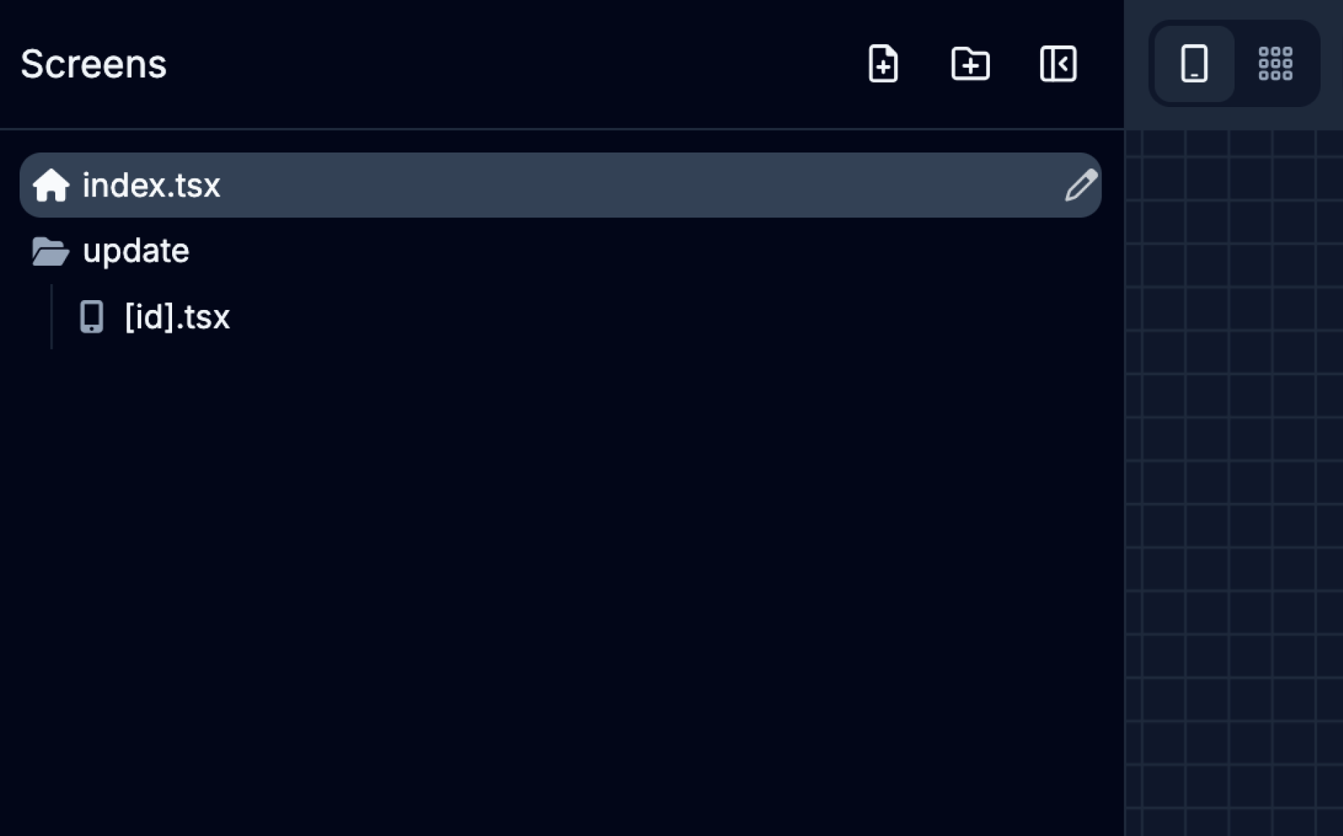
| Icon | Action | Description |
|---|---|---|
 | Add Screen | Adds a new Screen to the app |
 | Add Folder | Adds a new Screen Folder to the app |
Component Tree
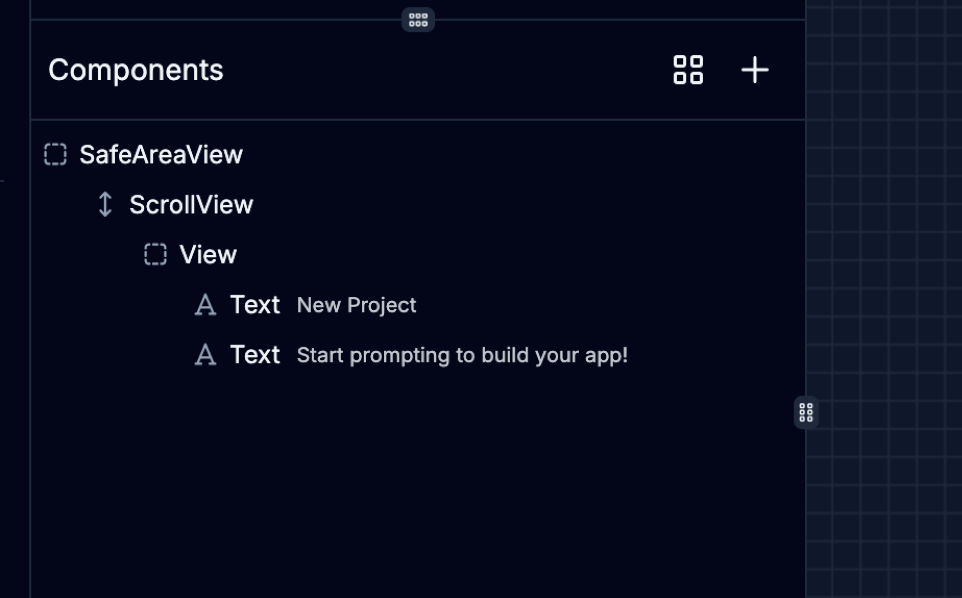
Section titled “Component Tree”Each screen is built-up out of smaller components in a hierarchy from top to bottom. Components can sometimes also be nested within/below another ‘parent’ component. The Component Tree is a visual representation of the component hierarchy on the selected screen.
From here, you can select components on the screen which will update the context of the Utility Panel on the right side of the builder - including the Style and Content tabs.
The tree and the preview follow each other. Hovering a row highlights its component in the preview, and hovering a component highlights its row. Selecting a component in the preview opens any collapsed rows above it and scrolls to its row. Clicking a row scrolls the preview to that component when it’s out of view. While you drag something over a collapsed row, hold it there for a moment and the row opens.
Some rows in the tree group components instead of being components themselves. A Conditional Branch holds content that only appears when a condition is met, and shows the condition next to its name. A List holds content repeated for each item, such as items.map. A row named after a prop, like renderItem or ListHeaderComponent, holds the components passed to another component through that prop. A row named after a function or variable holds the components it returns. Select a component inside any of these rows to edit it.
When a condition switches between two sets of content, its Conditional Branch has a When true row and an Otherwise row, so you can see what appears in each case. Hover over a Conditional Branch to read its full condition. To change a branch, hover over its row and click an icon, or right-click the row:
- Add else branch, on a condition that only shows content when it’s true (
condition && ...in code), adds an empty Otherwise row. Drag components into it, or drop new ones onto it from the Add Components panel, to show them when the condition is false. - Remove branch, on a When true or Otherwise row, removes that side and keeps the other one.
- Delete removes the whole Conditional Branch.
To see what a screen shows in a case you can’t easily reach, like an empty list or a signed-out user, you can force a condition in the preview without changing your code:
- On a When true or Otherwise row, click the eye icon to show that side. Click it again to go back to the real condition.
- On a condition that only shows content when it’s true, each click of the eye moves from Auto (the real condition) to always shown, then always hidden, then back to Auto.
The preview reloads with your choice. While a condition is forced, its eye stays highlighted even when you’re not hovering over the row, it’s checked in the right-click menu, and a bar above the tree shows how many conditions are forced. Click Reset in that bar to clear them all. The eye appears once the preview has run that condition, so a row inside content that isn’t showing won’t have one. Forced conditions only affect the preview, never your code or published app, and they’re cleared when you reload the builder.
Conditions that fall back to other content (written with || or ??) can’t be changed or forced from the Component Tree.
When a screen uses one of your own components from another file, such as <StatusCard /> from components/StatusCard.tsx, you can see what it renders without leaving the screen. Hover over its row and click the tag with its file name, or right-click the row and choose Show contents. A row named after the file appears underneath, marked Read-only, with that component’s contents listed below it on a teal band. These rows are read-only: selecting one highlights it in the preview, but you can’t move, delete, or restyle it from the screen. To change it, hover over the row and click its Edit in StatusCard.tsx icon, choose the same item when you right-click the row, or double-click the row. That opens the component’s own file, where changes apply everywhere the component is used.
Duplicate, copy, and paste
Section titled “Duplicate, copy, and paste”To duplicate a component, hover over its row and click the Duplicate icon. Right-click the row for Duplicate, Copy, and Paste after. Paste after stays unavailable until you’ve copied a component. You can also select a component in the tree or the preview and use the keyboard: ⌘D duplicates, ⌘C copies, and ⌘V pastes (Ctrl+D, Ctrl+C, and Ctrl+V on Windows). The shortcuts do nothing when no component is selected, and they don’t apply while you’re typing in a text field.
- Duplicate adds a copy of the component, children included, right after it. If the component has a text
key, the copy’s key gets a number on the end, such as-2, so each key stays unique. - Copy keeps the component so you can paste it on this screen or another one.
- Paste after adds the copied component right after the selected one. If the selected component is the outermost one on the screen, the copy goes inside it instead. When you paste onto another screen, Draftbit adds the imports the component needs and updates relative image paths, such as
require("../assets/logo.png"), for the new screen’s folder. If it uses something only its original screen defines, such as a state variable, a warning names it so you can add it to the new screen.
Duplicating and pasting next to a component works when it sits directly inside another component. A component that makes up a whole condition or list item can be copied, but not duplicated in place.
When you drag a component from the Add Component panel onto the tree, drop it on the middle of a row to place it inside that component, or near the top or bottom edge of a row to place it before or after.
You can also drag it straight onto the preview. The screen makes room for it as you drag, showing a faded copy when the screen already shows one, such as a Text or an Image, or a labeled space otherwise. The space stays until the new component appears. Text, icons, images, and other components that show their own content take the drop before or after them instead. Drops go into the file that’s open, so to add something inside one of your own components, open that component in Components mode first. The new component is selected once it’s added, so you can style it right away.
Moving a component follows the same placement rules, whether you drag its row in the tree or the component itself in the preview. In the preview, dropping a View on a Text puts it before or after the Text, since a Text can’t hold it. In the tree, a move like that is refused, and a message says why. A component inside a list, a condition, or a prop can only move within it, because moving it out would leave that part of the screen empty or break the values it uses, like the list’s current item.
| Icon | Action | Description |
|---|---|---|
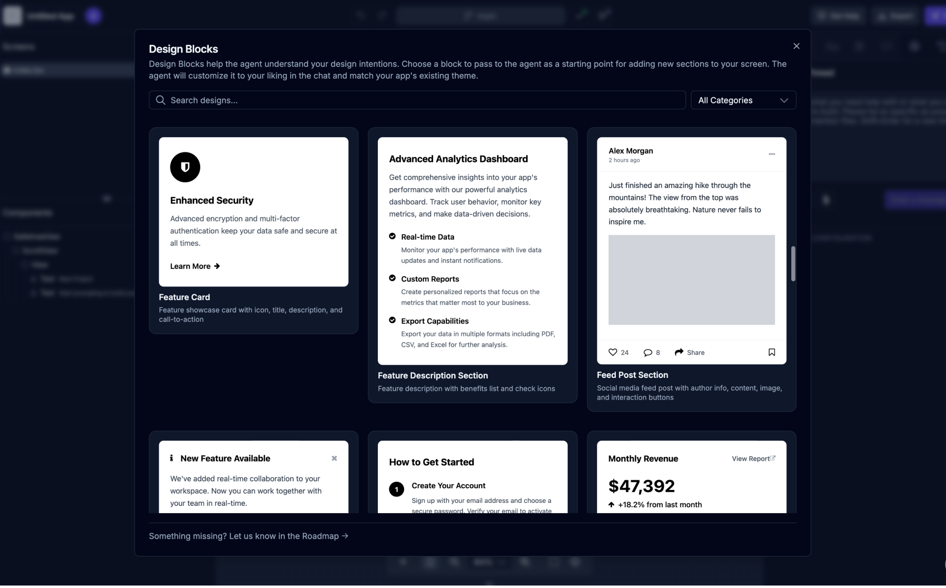
 | Design Blocks | Open and browse the Design Blocks gallery |
You can also open and browse the Design Blocks gallery using the button. Design Blocks help the agent understand your design intentions. Choose a block to pass to the agent as a starting point for adding new sections to your screen. The agent will customize it to your liking in the chat and match your app’s existing theme.
App Previews
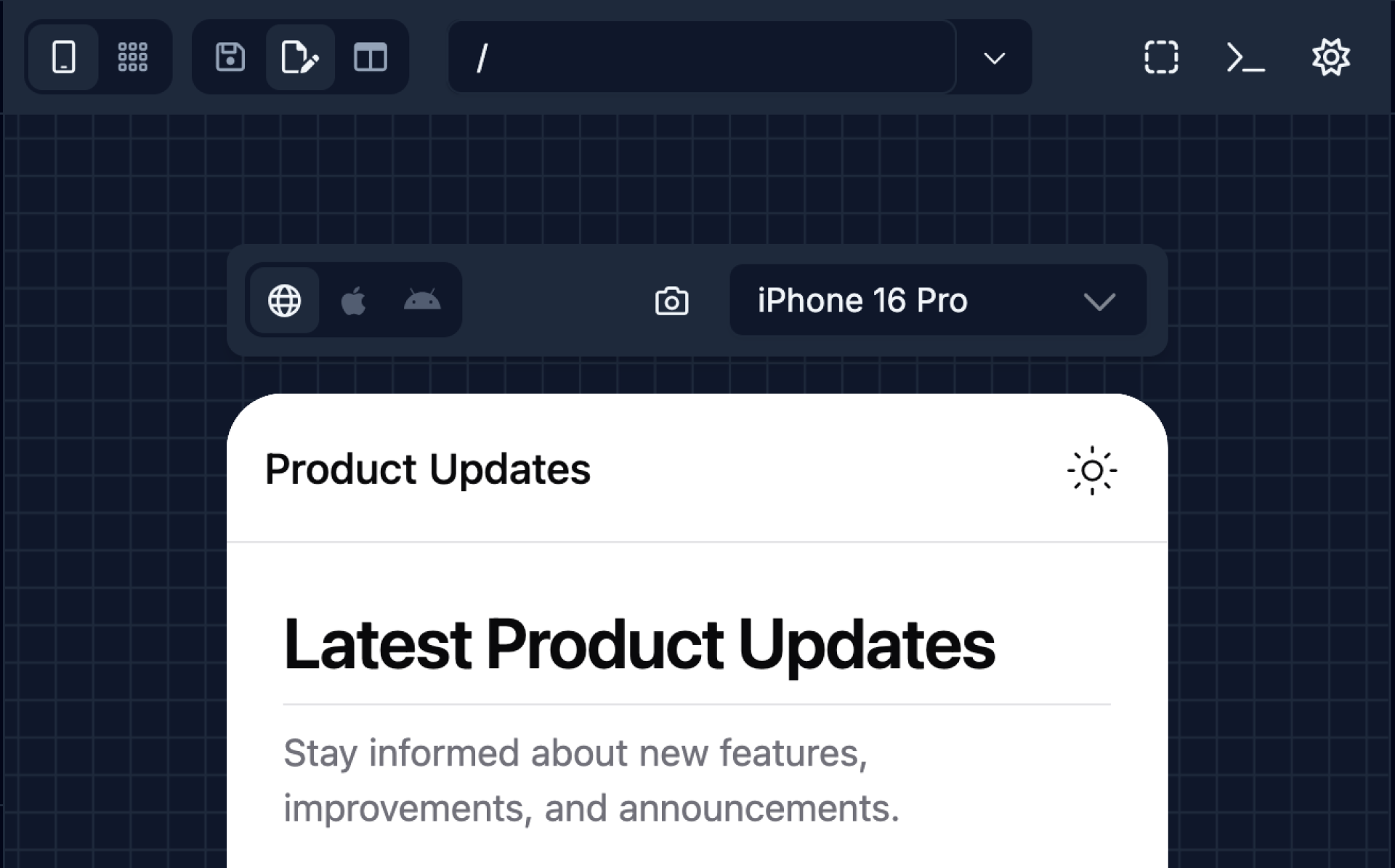
Section titled “App Previews”App Previews are a powerful way to preview your app as you build it. You can preview your app on different devices and screen sizes, and see how your app looks and behaves on different devices.
Draftbit offers both in-browser device previews via web and native iOS and Android simulators as well as the ability to preview your app on real iOS and Android devices using the Draftbit Preview app for iOS and Android.
In-Browser Previews
Section titled “In-Browser Previews”Draftbit offers a powerful app preview mode that lets you see and interact with all the screens in your app at the same time on an infinite canvas.
Within the Preview Panel in the center of the Builder, you can add one or more preview devices so that you can see changes being made as they happen in real-time on different types of devices. Pan and zoom to get a better view, choose between web (laptop/desktop) and native (iOS/Android) devices, change the device orientation (landscape/portrait), and switch device sizes.
| Icon | Name | Description |
|---|---|---|
 | Route View |
|
 | Enable Selection Mode | Highlight and select components inside the preview |
 | Show Preview Logs | View build output and errors while working in preview |
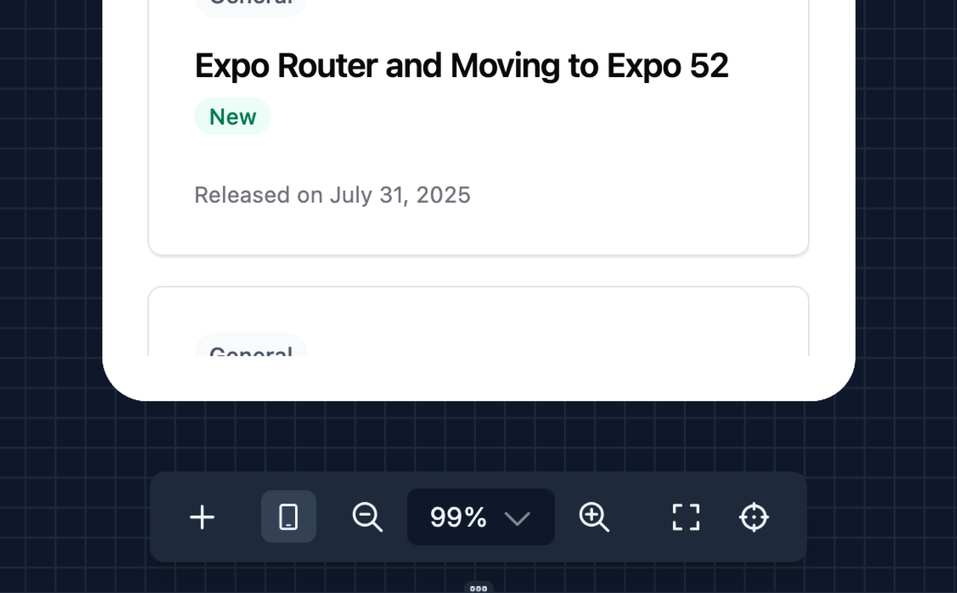
| Icon | Name | Description |
|---|---|---|
 | Add Device | Adds a new preview device to the preview canvas. |
 | Zoom Out | Reduces the level of zoom in the preview area |
 | Zoom In | Increases the level of zoom in the preview area |
 | Fit All Devices | Adjusts the zoom level so that all preview devices fit within the visible preview area |
 | Reset Zoom | Resets the preview zoom level to 100% |
Routes in imported and connected apps
Section titled “Routes in imported and connected apps”The routes list and the All Routes view come from your app’s route files. For apps you import without migrating, and apps in a connected GitHub repository, Draftbit can read routes when the app uses one of these routers:
| Framework | Router | Route files |
|---|---|---|
| Expo | Expo Router | app/ |
| React Router on Vite | Framework mode with file-based routes (@react-router/fs-routes) | src/app/routes/ |
| TanStack Router on Vite | File-based routing, through the TanStack Router Vite plugin or TanStack Start | src/routes/ |
| Astro | Astro pages | src/pages/ |
If your app uses a different router, the routes list and the All Routes view are hidden. The preview still works, and you can type any path into the address bar. The app checks in the top bar explain why routes aren’t shown:
- Expo apps without Expo Router: Ask Agent to Fix moves your screens to Expo Router.
- React apps on Vite: Ask Agent to Fix moves your pages to React Router file-based routes in
src/app/routes/. If your React Router app keeps its routes inapp/, the agent moves them tosrc/app/. - Other frameworks, such as Next.js, or Vue and Svelte on Vite: there’s no fix to apply, so the preview stays on a single route.
When the agent is done, click Recheck in the app checks. Routes appear without saving first.
Preview Screenshots
Section titled “Preview Screenshots”You can take screenshots of your app previews by clicking the  button. This will attach a screenshot of the screen in the preview to the current chat thread.
Useful for referencing specific design changes or UI elements to change on the screen or when debugging issues.
Editing Text in the Preview
Section titled “Editing Text in the Preview”Double-click any text in a preview to edit it inline. Your change is staged like any other edit, so you can save or discard it from the top bar.
On-Device Previews
Section titled “On-Device Previews”Using the Draftbit Preview app for iOS and Android, you can preview your app on real iOS and Android devices. Simply click the  button and scan the QR code to open the app and preview on your device.
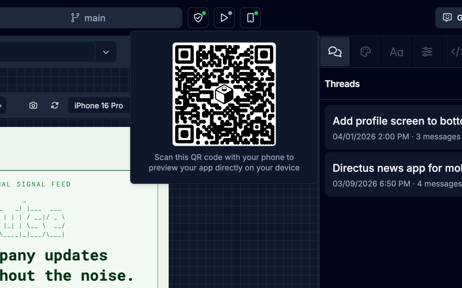
Imported and connected Expo apps get the QR code too. The Draftbit Preview app runs your code with its own built-in set of native libraries, so a screen that needs a native library it doesn’t include won’t load there. Build native previews to test those screens in a simulator.
Utility Panel
Section titled “Utility Panel”Within the Utility Panel on the right side of the Builder, you can access these features:
| Icon | Name | Description |
|---|---|---|
 | Chat Tab | Interact with the AI Agent to build your app. |
 | Styles Tab | Control the visual appearance and layout of the selected component. |
 | Content Tab | Update the content of the selected component. |
 | Code Tab | Edit the code of the selected component. |
 | Config Tab | Configure the selected component. |
 | Activity Tab | View commit history and other activity for the app. |
 | Updates Tab | View the latest product updates and announcements. |
AI Chat
Section titled “AI Chat”Switch to AI Chat tab using the
The AI Chat tab in the Utility Panel is where you can interact with the AI Agent, giving it instructions on what to build in your app.
Create a new thread using the  button. You can provide additional context to the agent in your chat messages by including a specific component selection, file reference, image attachment, pasted image, or supported file.
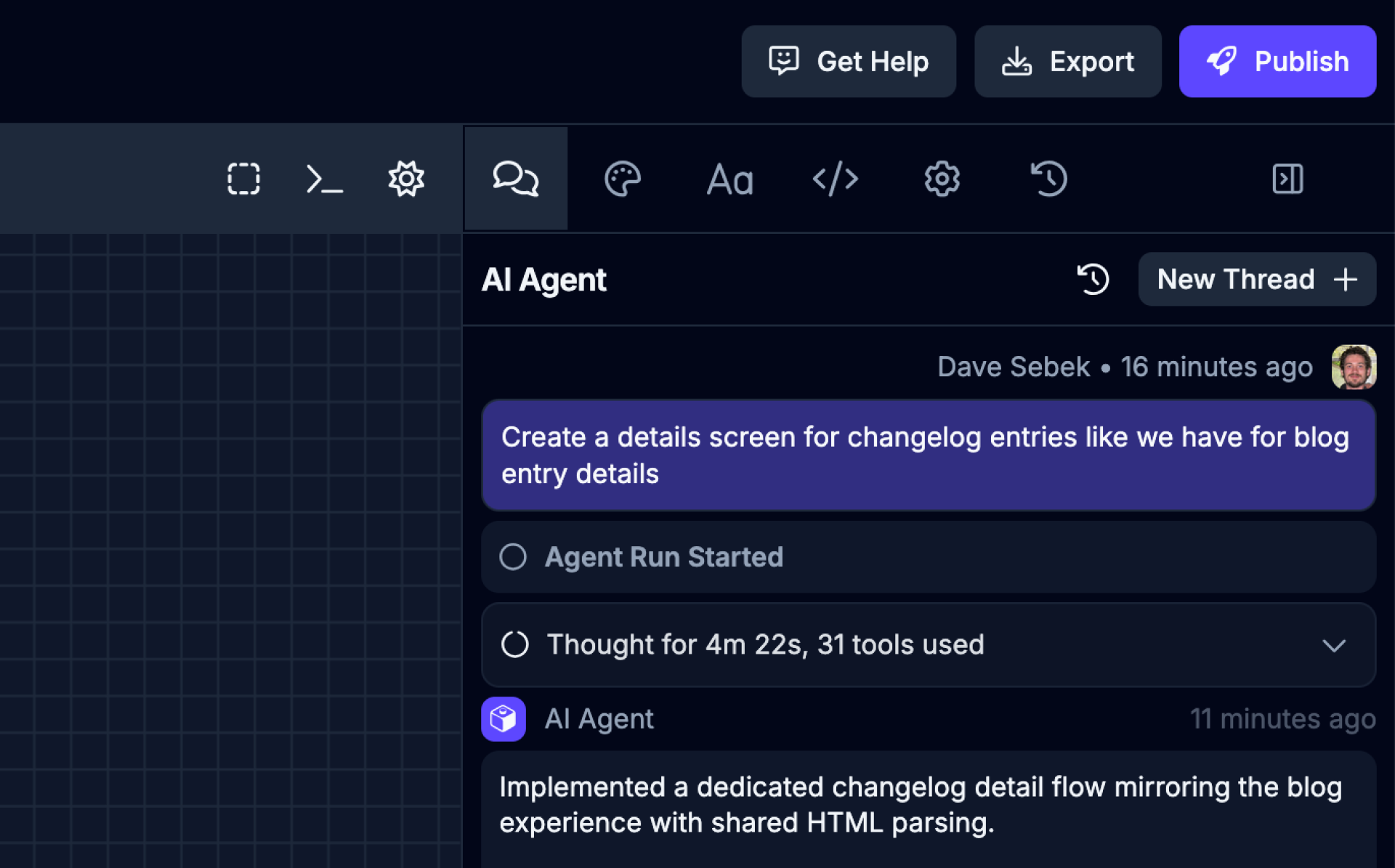
| Icon | Name | Description |
|---|---|---|
 | Add component | Select a component from the canvas to add it to your message. |
 | Add reference | Reference files and assets from your project in your message. |
 | Add attachment | Attach an image or supported file to provide context for your message. |
 | Add saved prompt | Use a saved prompt from the Agent Customization view. |
 | Thread history | View and manage all your previous AI chat threads |
When the agent needs your input
Section titled “When the agent needs your input”If the agent needs more information to keep going, it pauses the run and surfaces a “Draftbit needs your input” panel inline in the chat. The panel can ask one or more questions at a time. Pick an answer for each, then submit to resume the run — your selected answers are persisted with the thread, so you can refer back to them later.
Advanced Configuration
Section titled “Advanced Configuration”The Advanced Configuration section allows you to configure the AI Agent and model to use for the task. You can select the Agent and model from the dropdown menus.
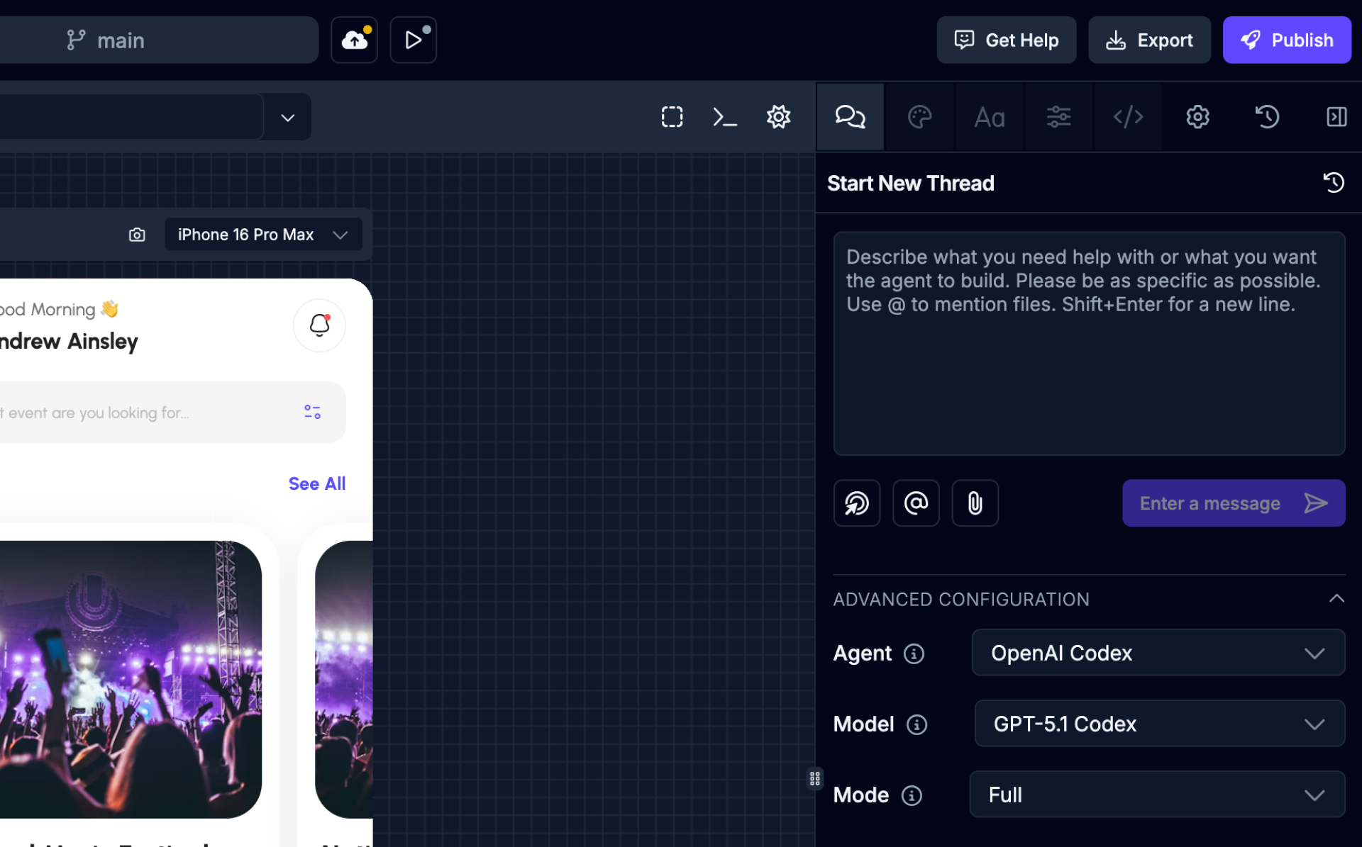
| Name | Description |
|---|---|
| Agent | The AI Agent to use for the task. Anthropic Claude Code (default), OpenAI Codex, Google Gemini (upcoming). On the Free plan, threads that use Draftbit credits run Codex; Claude Code needs a paid plan or your own Claude subscription or API key. |
| Model | The model to use for the task. Options depend on the Agent selected. Claude Code threads start on Claude Opus 5.5 and Codex threads start on GPT-6.1 Sol, whether you use Draftbit credits, your Claude or ChatGPT plan, or your own API key. Some ChatGPT plans don’t include every Codex model. When ChatGPT rejects a model, the error explains that your subscription may not support it. Choose another model, or select View ChatGPT plans to review the available plans on ChatGPT’s website. Retired models no longer appear in the list. On the Free plan, models that use Draftbit credits are limited to OpenAI models. |
| Subagent model | For Claude Code threads, choose the model used by helper subagents. Automatic preserves Claude Code’s route-specific helper defaults; selecting a model pins that choice for the thread. |
| Mode | The mode to use for the task. Full or Read Only. |
Styles
Section titled “Styles”Switch to Styles tab using the
Use the Styles tab to control the visual appearance and layout of the selected component. Values map to NativeWind utility classes.
The top of the tab has a Content section for everything the selected component shows. A chip next to the section title names the kind of content — Text, Image, Video, Audio, Lottie, WebView, Link, Icon, Input, Button, Section, or the component’s own name — and the section lists a field for each thing the component displays:
- Text for the text between the component’s tags, including on elements like paragraphs and buttons.
- Words such as Title, Subtitle, Label, Description, Placeholder, Helper text, and Starting value.
- The destination or media it shows: an image, video, audio file, or Lottie animation; a link; an icon; a web view’s Page URL; or a Video ID.
- Leading icon, Alt text, Poster image, Screen reader label, Name for initials, and Open in new tab.
A text field grows up to eight lines as you type. Fields the Builder recognizes for a component show up even when they’re not set yet; for any other component, a field appears for each property it already uses. A component with nothing to show has no Content section at all.
Each kind of field works a little differently:
- Image, video, audio, and Lottie fields show a thumbnail, the file name, and where it comes from — Project Assets, a file in your repo, or the web. Select Change to choose a different file from Project Assets, upload one, or paste a URL. An unset field shows “No image” (or the matching label) with Add.
- Link fields name the screen a link points to and its path, or the domain for a web link, or
the raw value for another kind of link, such as
../,#,?,mailto:, ortel:. The field shows “Unknown screen” when the path doesn’t match a screen in your app, or “Matches N screens” when more than one screen shares that path. Select Change to search for and pick a screen, enter a URL, open the screen in preview, or, for web links, open it in a new tab. Only screens without dynamic segments are listed. - Icon fields show the icon, its name, and its library. Select Change to search the icon set the component uses; a Recent row remembers icons you’ve picked recently on this browser. A name that isn’t in that set shows “Not in the icon set”. If the Builder doesn’t recognize the component’s icon library, the field is a plain text box for the icon’s name instead.
- Open in new tab is a switch, for web links (
<a>tags and links in web apps). If the link’s target is set to something other than a new tab, the switch shows that instead, read-only.
Select ↺ next to a field’s label to remove that property, for properties the panel can still show once they’re empty. Clearing all the text in a text field keeps the property with empty text — the field shows “Empty” rather than “Not set”. Image, link, and icon fields ignore an empty value, so use ↺ to remove them instead.
Text that mixes words with values from code, such as {count} {count === 1 ? "task" : "tasks"} left,
stays editable. Type the words around each value in place. Click a value that picks between two
words to change either word. Click any other value to swap it for something else on the screen,
such as a prop, state, or data from a hook. Select Insert variable (the { } button) next to the field to
add a value at the end, or type { to add one where you’re typing. Your edit shows in the preview once it’s saved, and this text
can’t be edited directly in the preview.
Plain text can show a value too: select Insert variable (the { } button) next to the Text field,
or type { where it should go. Pick a prop, state, data from a hook, or another value on the screen.
When a value comes from code — for example it depends on a condition, calls a function, contains other components, or is set (or could be overridden) by props passed into the component — the field shows the value as read-only, with the reason, and an Edit in code button that opens it in the Code tab. If an edit to a field can’t be saved, a message under it explains why; fix the problem and send the same value again.
On a phone, pickers and menus like these open as a bottom sheet with a Done button instead of a popover.
Below Content, a Breakpoint section holds the breakpoint toggle, for apps that use a Tailwind config. All applies everywhere, and each device icon applies from that width up (hover an icon to see its width) — a dot on an icon means that breakpoint already has overrides. A hint under the toggle names which screen sizes the current choice applies to.
If the selected file has a syntax error, the Styles tab shows a message with Open in code editor instead of its sections.
Sections are ordered for the component you select. For example, Typography comes first for text, and Layout comes first for views. The most useful sections for that component start open, along with any section that already has styles. A dot on a section header means it has styles set.
A highlighted label means a value is set on the current breakpoint. An outlined label means the value is inherited from another breakpoint. Click a highlighted label to see where it’s set or reset it, or ⌘-click it to reset it right away.
A blue label with a branch icon means the style depends on a condition in your code. The value next to it shows what each side of the condition uses; click it to change either side with the usual control.
Opening the Styles tab switches the preview into Design mode. In Design mode, clicking an element in the preview selects it instead of interacting with your app, and the panel header shows the selected element after the components it sits inside. Click one of those parents to select it. When there are more than two, the outer ones are under …. Switch the preview back to Preview to use your app normally. Press ⌘I (Ctrl+I on Windows) to switch between Preview and Design, including while you’re using your app in the preview.
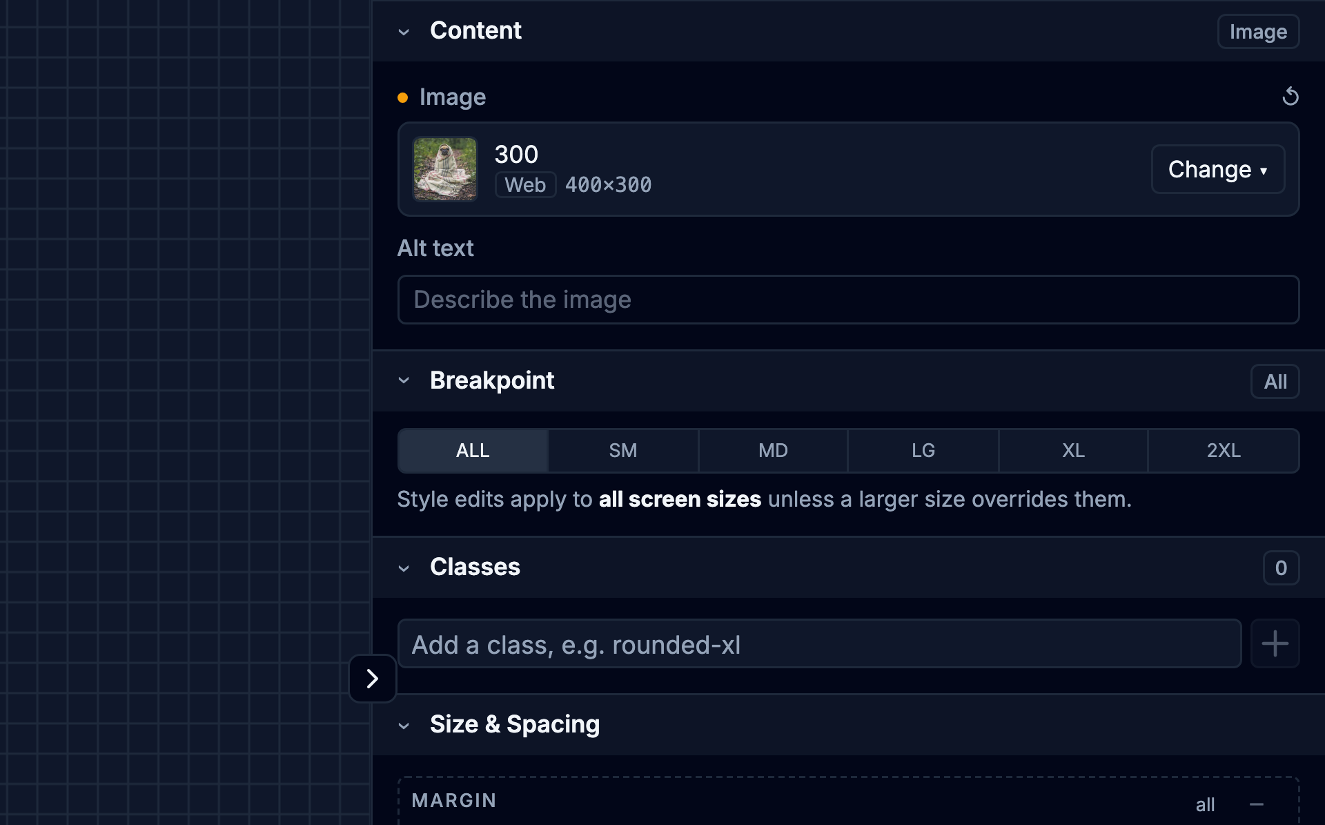
| Section | Description |
|---|---|
| Classes | View, add, and remove the utility classes applied to the component. Press Enter to add a
class, and hover a class to remove it. Classes written as text inside a class helper such as
|
| Layout | Set display, and for flex containers the direction, alignment, justification, gap, and grow/shrink. |
| Size & Spacing | Edit margin, padding, width, and height in one box model, plus min and max width and height. |
| Background | Set the background color. |
| Border | Adjust border width, radius, style, and color. |
| Position | Control relative or absolute positioning, offsets, z-index, and overflow. |
| Effects | Set opacity. |
| Typography | Change the font, weight, size, color, alignment, transform, and decoration. |
Content
Section titled “Content”Switch to Content tab using the
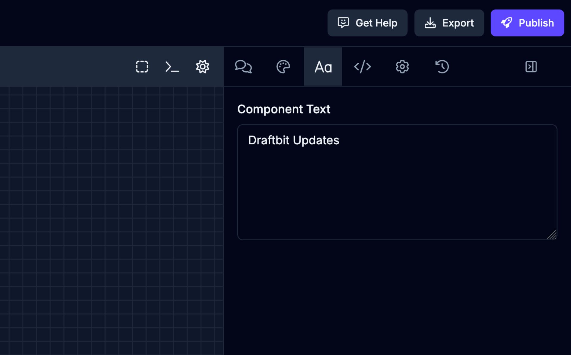
Some components, like Text or Button, accept a value. If you have selected a component in the Component Tree which can accept a text value, the Content tab will become available. This is a quick way for you to update the value without needing to ask the AI Agent or manually edit the file in the Code Editor.
Properties
Section titled “Properties”Switch to the Properties tab from the Utility Panel. It’s next to Styles.
The Properties tab lists the props the selected component accepts, read from its TypeScript types, so you can set them without asking the AI Agent or opening the code. The header shows the selected component and its parents, the same as on the Styles tab.
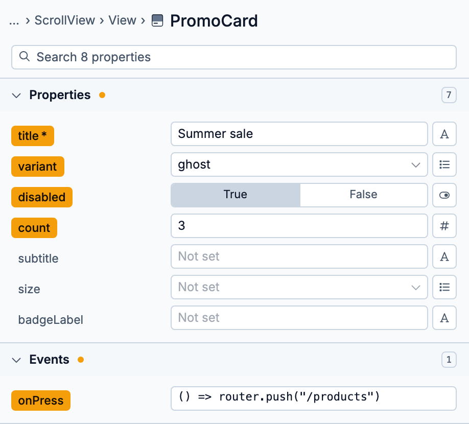
Props are grouped into collapsible sections. Properties holds the component’s own props and starts open. Events (onPress and other handlers), Styling (style, className), Accessibility, and Advanced (Android, iOS, and TV-only props, plus internal ones like ref) start collapsed unless one of their props is set. Each section shows how many props it has, and a dot marks sections with props set on this component. Within a section, props that are set come first, then required ones.
A prop’s name is highlighted when it’s set on the component, and required props are marked with *. Click the name to see its full type or remove the prop from your code. You can also ⌘-click (Ctrl-click on Windows) a highlighted name to remove it.
Each prop gets an input that fits its type:
| Input | Used for |
|---|---|
| Text | string props. Changes are saved when you pause typing, press Enter, or leave the field. |
| Number | number props. |
| Toggle | boolean props. Choose True or False. |
| Select | Props that accept a fixed list of values, such as "primary" | "secondary". |
| Code | Any JavaScript expression, such as a variable or a function. Press Esc or Done to close. |
When a prop accepts more than one kind of value, use the button at the end of its row to switch inputs. Every prop can use Code.
Use the search field at the top to filter props by name. Press Esc to clear it.
Switch to Code tab using the
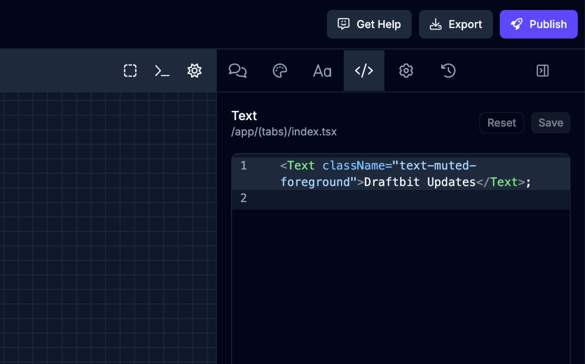
The Code tab allows you to edit the code of the selected component directly in the browser. This is a quick way for you to make changes without needing to ask the AI Agent or manually edit the file in the Code Editor.
Config
Section titled “Config”Switch to Config tab using the
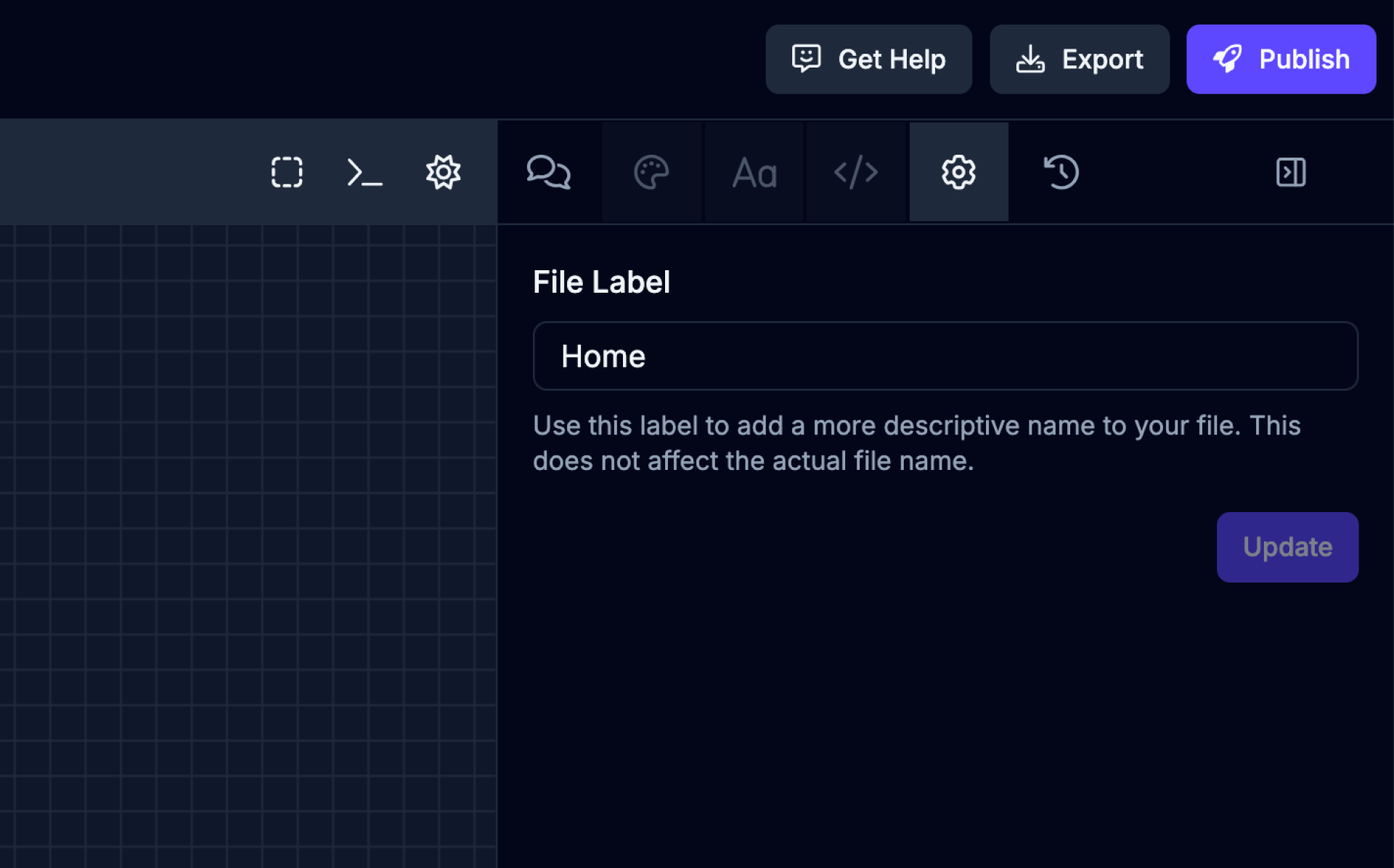
The Config tab has additional configuration options depending on the selected screen or component.
| Name | Description |
|---|---|
| File Label | Use this label to add a more descriptive name to your file. This does not affect the actual file name. |
Activity
Section titled “Activity”Switch to Activity tab using the
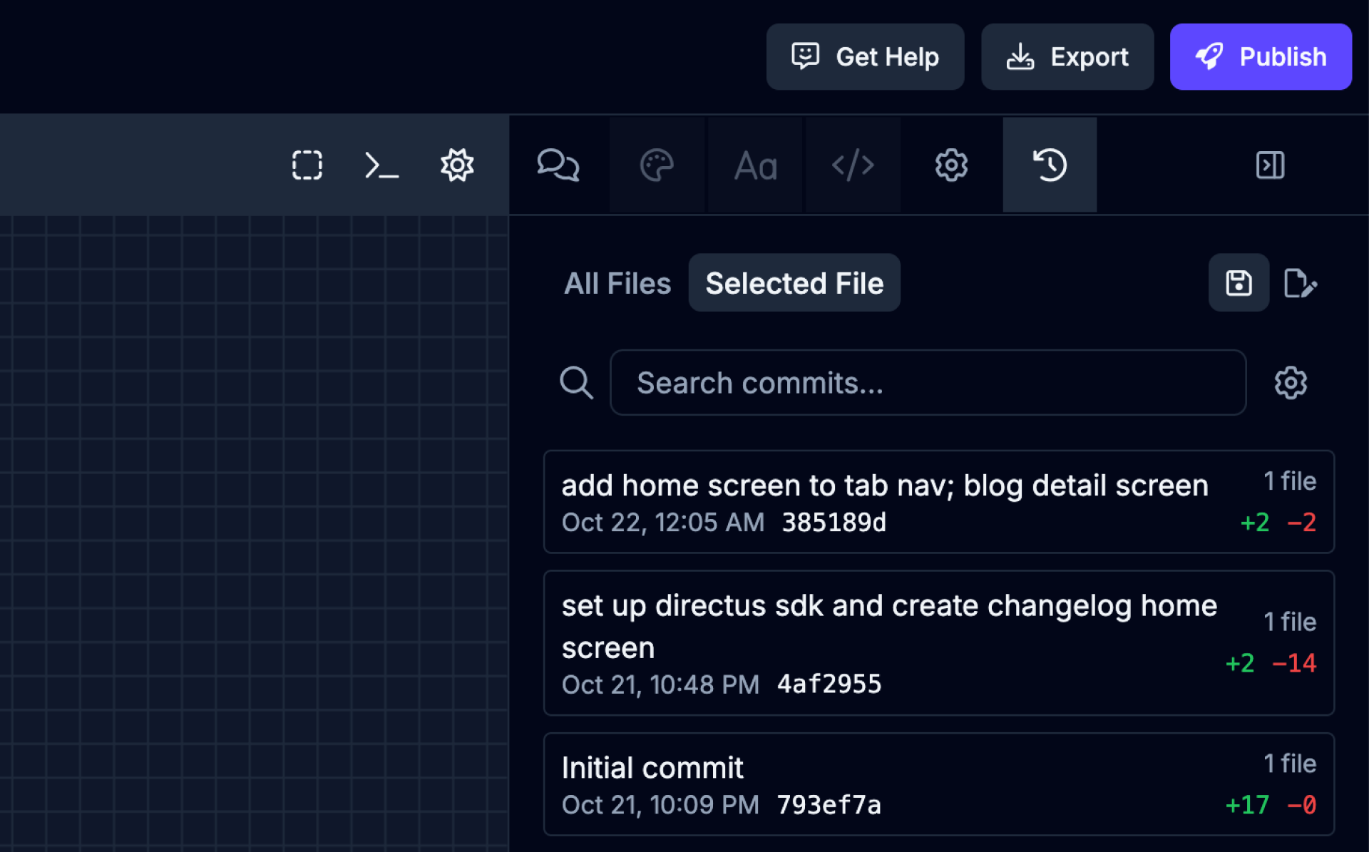
The Activity tab will let you view and manage recent actions, events, or changes related to your app and its components. This can include AI agent actions, user-made edits, file modifications, and other important events within your project. The Activity tab also helps with accountability and collaboration by allowing team members to stay up to date with what’s happening in the project.
Updates
Section titled “Updates”Switch to Updates tab using the
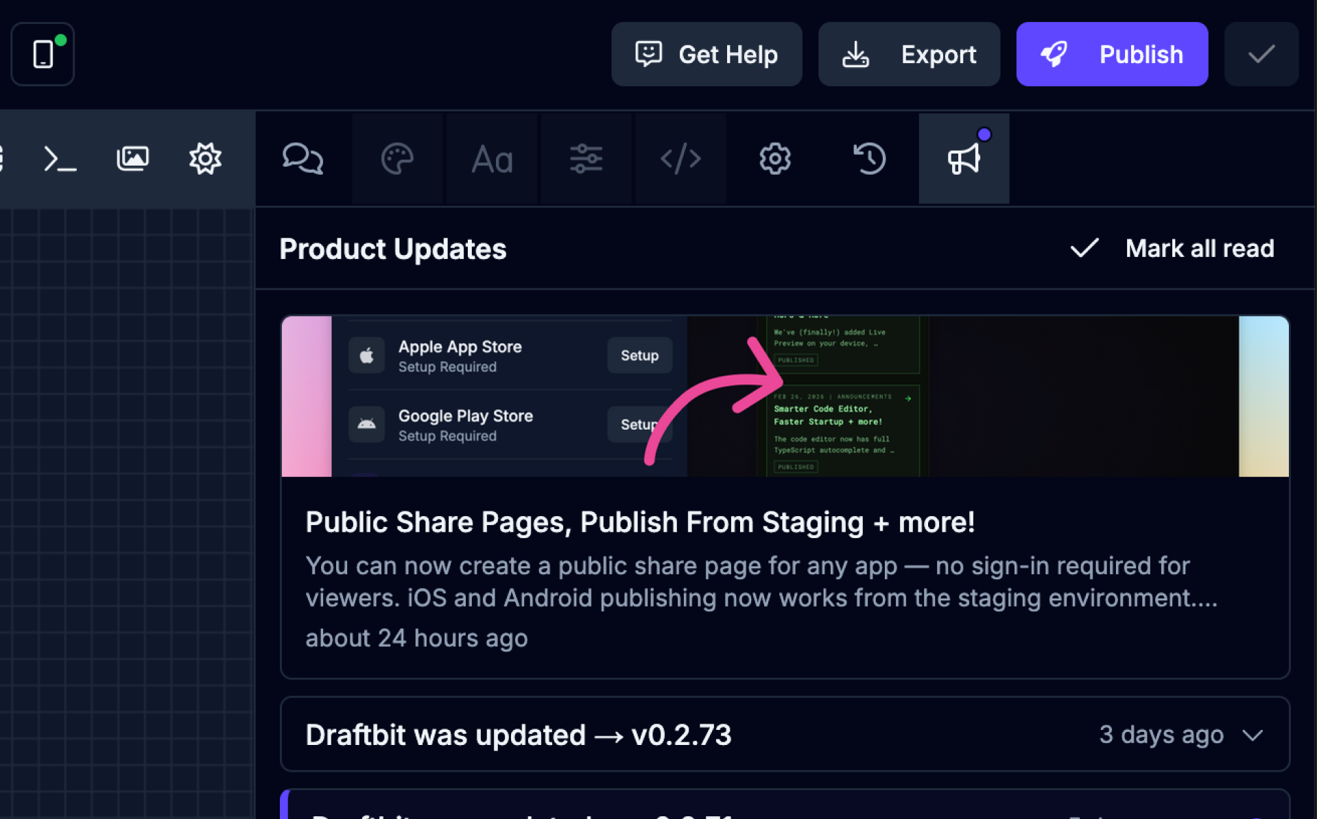
The Updates tab will let you view the latest product updates and announcements. This can include new features, bug fixes, and other important announcements from the Draftbit team.
Collapse Panels
Section titled “Collapse Panels”On desktop, you can collapse the side panels to give the preview more room. Click the chevron on the edge of a panel to collapse it. The panel becomes a narrow rail labeled with the panel’s name and what it currently holds:
- Screens & Components shows the selected screen or component file.
- Agent & Editing shows the active tab, such as Agent or Styles.
- In the Code Editor, Project Files shows the open file.
- In the API console, Endpoints shows the selected endpoint.
Hover over a rail to see its full label. Click the rail to open the panel over the canvas, and press Escape or click outside it to close it. Rails on the left close on their own after you pick a file, screen, or endpoint. To dock a panel again, click the chevron at the top of its rail.
Saving Changes
Section titled “Saving Changes”Your edits and the agent’s changes are kept as you work, but they don’t become part of your app’s history until you save them. When you have unsaved changes, the Save button in the top bar of the Builder shows how many files changed. Each save creates a save point you can roll back to later. To check your changes in the preview before saving, see Comparing Builds.
Click Save to open the Save Changes dialog:
- Review your changes. The file list shows each changed file with the number of lines added and removed. Select a file to see its diff, in a Unified or Split view on larger screens. Changed images appear as Previous and Current versions side by side.
- Describe the save. Under Save details, enter a Title that summarizes your changes, and add a Description if you want more context. Draft with AI writes them for you from your changes.
- Save. Click Save (the button shows how many files will be saved) to create the save point.
Saving keeps a version in Draftbit. It doesn’t push your code to GitHub; see Connecting to GitHub for that.
If you’d like to discard your changes and go back to your last save point, click Discard & Revert in the same dialog and confirm.
Reverting Changes
Section titled “Reverting Changes”If you decide you want to go back to a previous save-point, you can easily roll back your changes. Click the  icon in the top bar of the Builder to open the save history for your app.
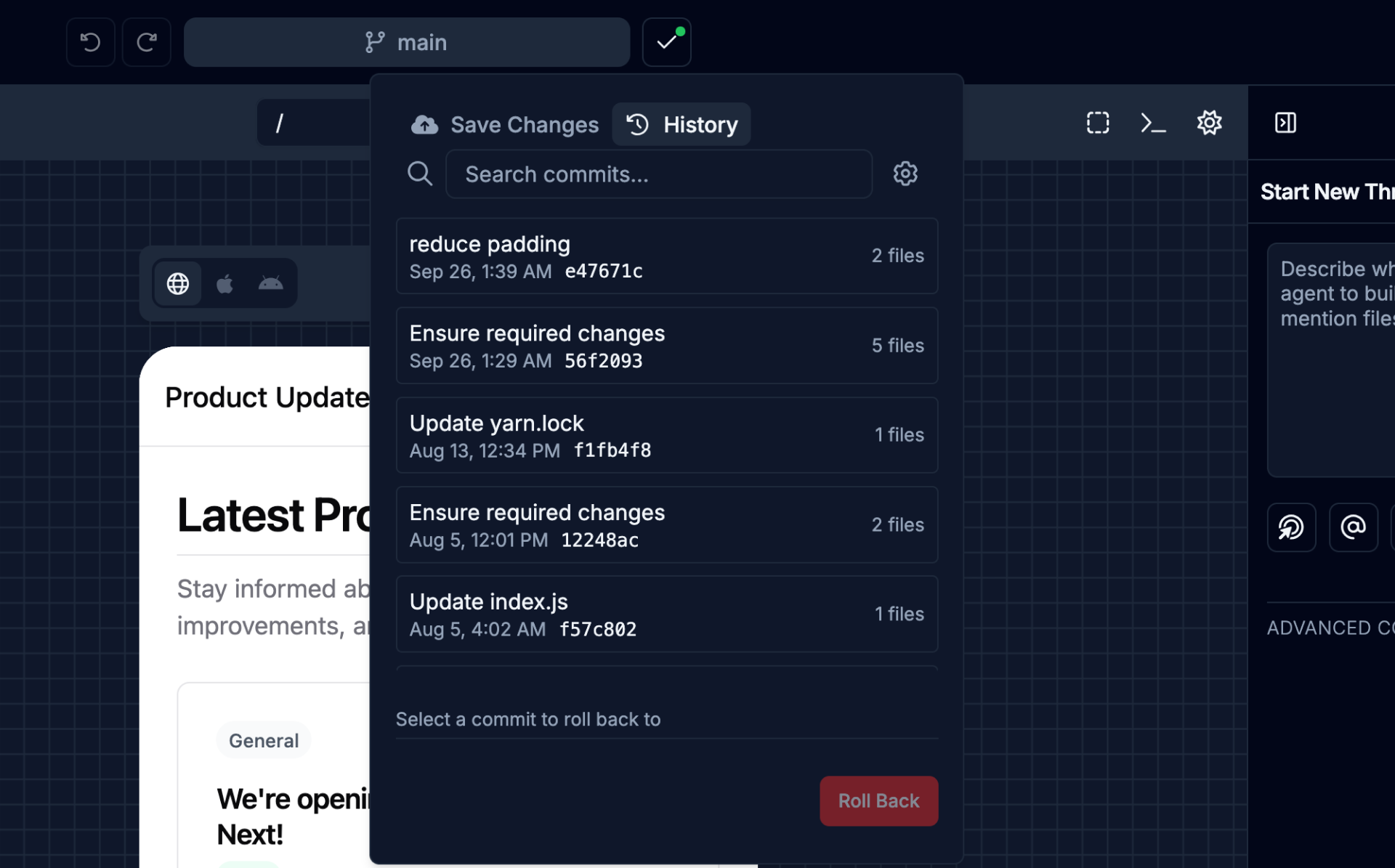
Here you can choose a save-point in your history and once selected will show you which files were changed at that time. Once you locate a point to restore, click the  button.